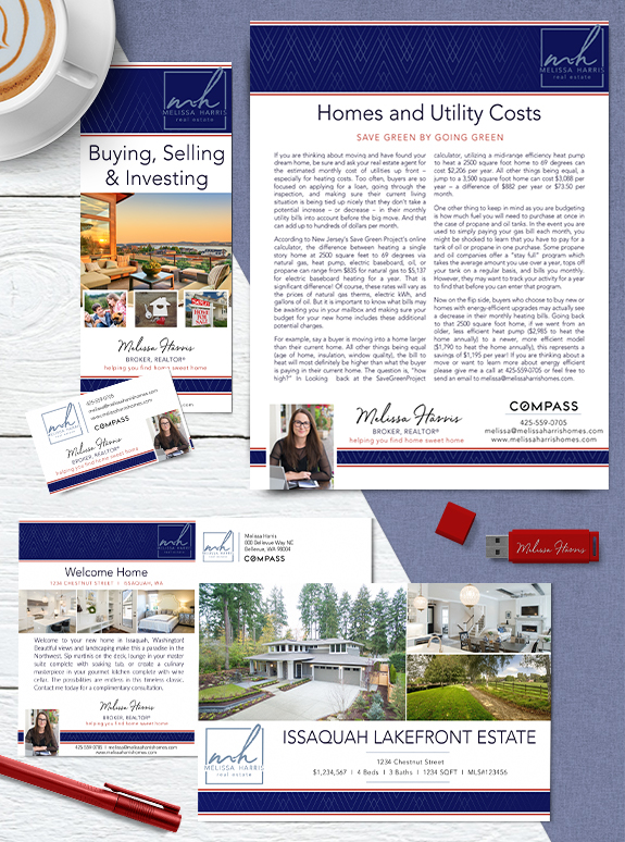
Melissa Harris’s new Mastery Brand combines her understated style with a hint of artistic patterns for a bold and unique statement. The tone-on-tone geometric pattern in the header draws the eye towards her hand-written monogram logo. Melissa’s tagline “helping you find home sweet home” is a nod to her Midwestern roots. The powerful combination of […]
Posts Tagged ‘white’
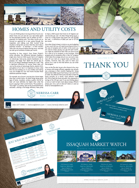
Branding Spotlight: Neressa Carr
Neressa Carr’s love of the Pacific Northwest coastline was the key inspiration for her new Mastery brand. Neressa chose imagery of our local coastline, beach strewn pebbles, sun-bleached driftwood, and Adirondack chairs with a view. Even the white-washed wood texture in her footer conveys the modern and easygoing Puget Sound lifestyle. Her hexagonal monogram is […]
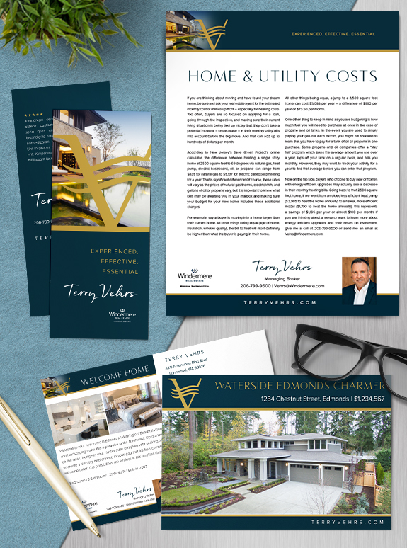
Branding Spotlight: Terry Vehrs
With over three decades of experience, Terry Vehrs’ new Mastery Brand creates a elegant and commanding backdrop for his marketing campaigns. His gold monogram, floating over a modern home image, conveys his specialty in waterfront communities. Fields of teal-navy lend strength and sophistication while a rough brush font adds personality and approachability. The simplicity of […]
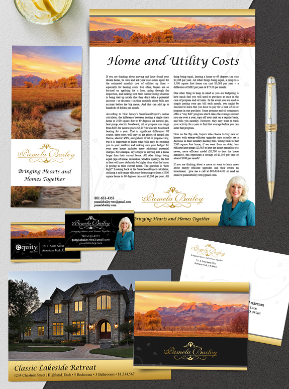
Branding Spotlight: Pamela Bailey
Pam’s new branding is a refreshing spin on a classic Lones Group brand! We first designed Pam’s brand in 2009, and recently when she joined the Mastery graduation class of 2019. Pam’s whole business changed when she moved to Utah, so we adjusted her brand to showcase beautiful local imagery. We used her former gold […]
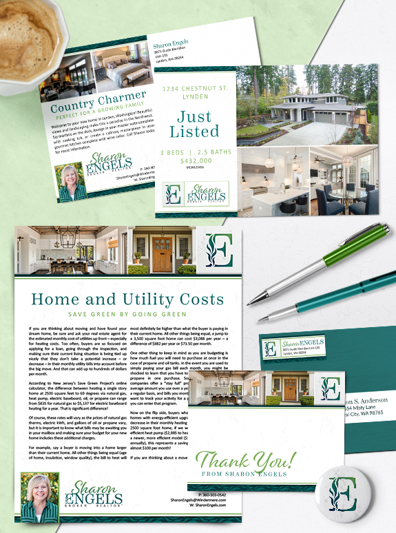
Branding Spotlight: Sharon Engels
One of our Whatcom County neighbors, Sharon Engels, has boosted her business identity with a new Semi-Custom PRO brand. The country-lifestyle photos on her agent-marketing pieces perfectly reflect the aesthetic of her community. We used a serif font to ensure headline legibility, and a whimsical script font to add a personal touch to every piece. […]
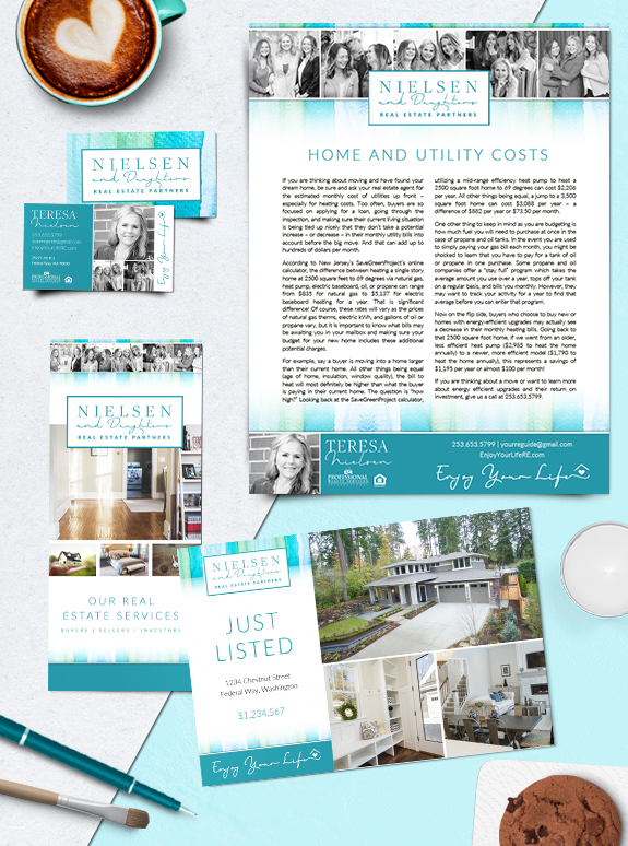
Branding Spotlight: Teresa Nielsen & Daughters
A genuine family business, Teresa Nielsen and her daughters wanted something very personal and approachable in their Mastery brand. Teresa’s personal mantra is “enjoy your life”, and the unique use of candid shots in a black-and-white brings her message to life. The Nielsen team wanted fun, bright colors in their brand such as teal, aqua, […]
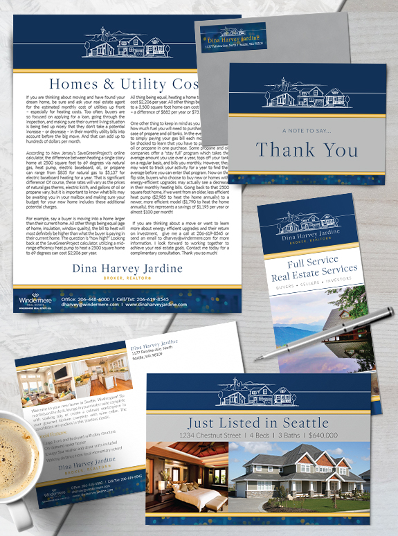
Branding Spotlight: Dina Harvey Jardine
Today our Branding Spotlight highlights the Semi-Custom PRO design of Dina Harvey Jardine, from Seattle, Washington. Dina’s love of the nighttime city lights is captured in the bokeh image in her footer, as well as in her color palette of navy and yellow with hints of gray. Dina’s brand fits the urban Pacific Northwest and […]
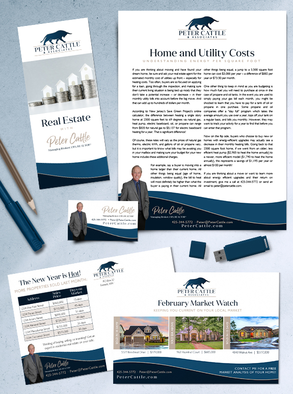
Branding Spotlight: Peter Cattle
Peter Cattle’s new custom brand captures his professional experience, honesty, and skills as an advisor. His logo, inspired by his last name, embodies the power of investing in real estate as well as his confidence when at the negotiation table. The gentle curved footer mimic’s the logo’s horns to carry the theme throughout the design. […]
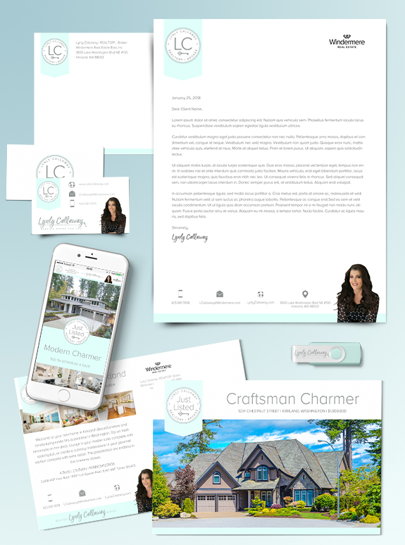
Branding Spotlight: Lynly Callaway
Today, our Branding Spotlight features Lynly Callaway’s refreshed brand. Lynly is the type of agent who has a strong sense of modern design and a competent business style. After using her original Lones Group brand for almost a decade, she decided she had moved away from the doors and dark lines and colored background of […]
Branding Spotlight: Marie Strong
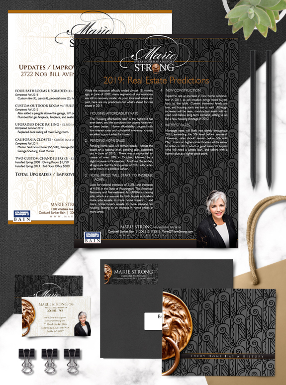
One of our branding super-stars, Marie Strong has a bold and classic brand that accentuates her passion for working with and preserving historical homes. From her classic font selection to the tone-on-tone pattern in the background, her brand balances vintage aesthetic with modern utility and strength. An understated structure, with slim header and footer bars, […]