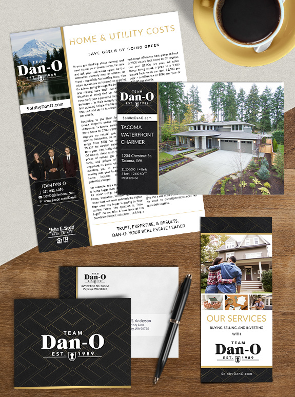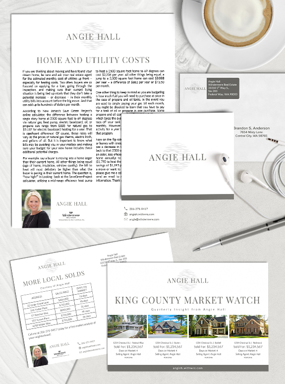
The starting point: Angie Hall started her real estate career in 2016, and needed a brand that would complement her clients’ properties without overpowering the page. She wanted a brand that was clean, fresh and calming. The target audience: With an eye on her ideal price-point, Angie wanted a brand that would appeal to clients […]
Posts Tagged ‘white’
Branding Spotlight: Barbara Clark
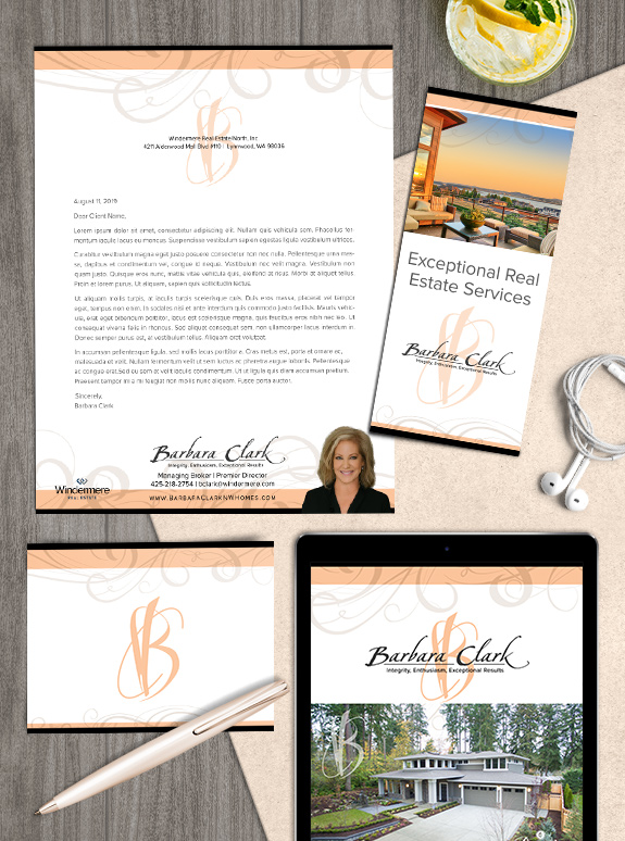
The starting point: After ten years using her well-known brown and gold brand, Barbara Clark decided she was ready for a brand refresh. The target audience: She specializes in luxury and waterfront properties, and has a reputation for her impeccable taste in interior design and staging. On top of that, she always provides 5-star service […]
Branding Spotlight: Lisa Berg
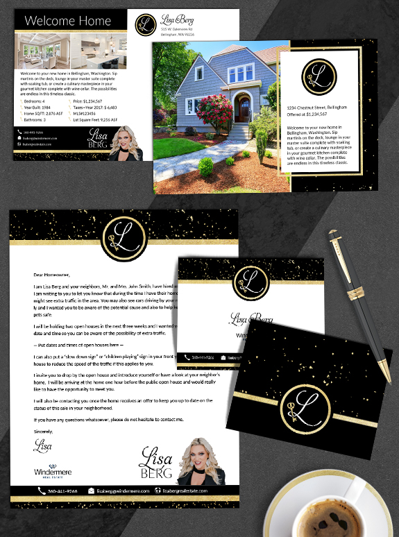
The starting point: Lisa needed a logo that was as bold and dazzling as her personality. She is well-known in the Whatcom County community due to her high-visibility marketing efforts, community involvement, and her graciousness to other brokers. Her original logo featured a hand drawn key, but she wanted a key emblem with more Victorian […]
Branding Spotlight: Les & Kathy Scott
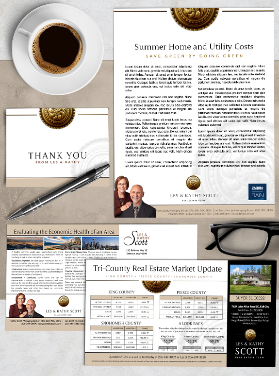
The starting point: Les and Kathy Scott had a brand designed with us several years ago, but realized it was time to freshen up their look. Their original brand was dark and luxurious, but as their business evolved, they felt the black background and simple name treatment was no longer a perfect fit. They needed […]
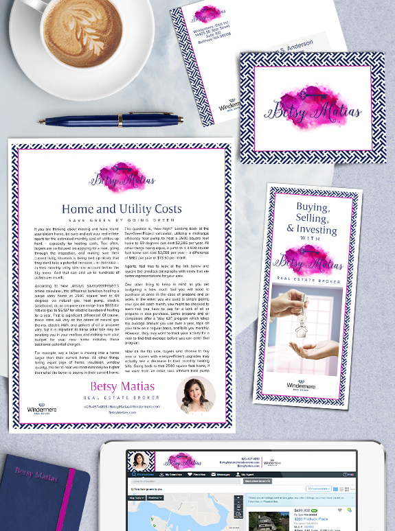
Branding Spotlight: Betsy Matias
The starting point: When she started out with branding, Betsy already had her artistic watercolor logo that connected her background in art education for children with her experience and passion for real estate. Our goal was to create a bold brand that conveys the same fun energy. The target audience: Betsy had her focus set […]
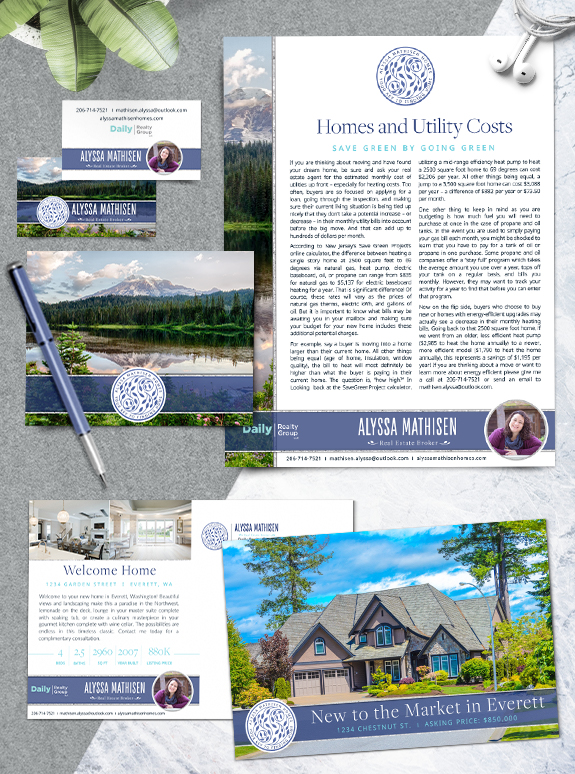
Branding Spotlight: Alyssa Mathisen
Alyssa Mathisen came into Mastery hoping for a brand that would help her stand out without looking too busy or eclectic. We delivered with a bold and classic sidebar design that highlights the natural beauty of the Pacific Northwest. Hammered silver trim adds a touch of luxury to the blue-violet footer. With a splash of […]
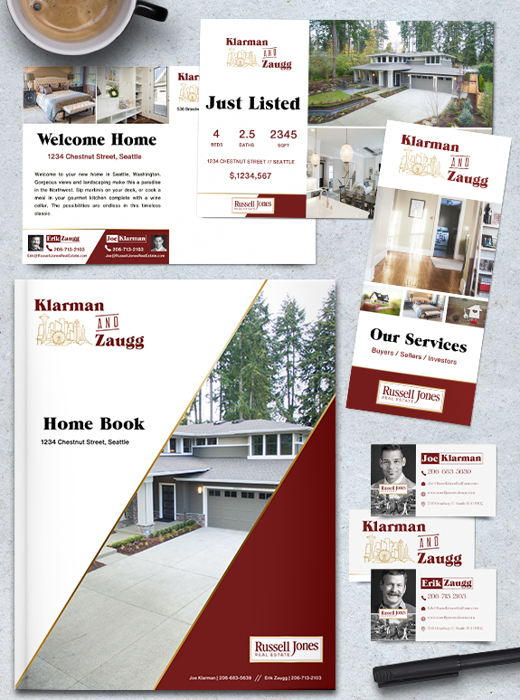
Banding Spotlight: Klarman & Zaugg
Erik Zaugg and Joe Klarman, team leaders of the Russell Jones brokerage in the heart of Seattle, envisioned a personal brand design inspired by pulp fiction magazines–like the comic book-style magazine printed in the early to mid-1900’s. We started by creating a logo with text similar to the magazine headlines, and a custom Seattle Skyline […]
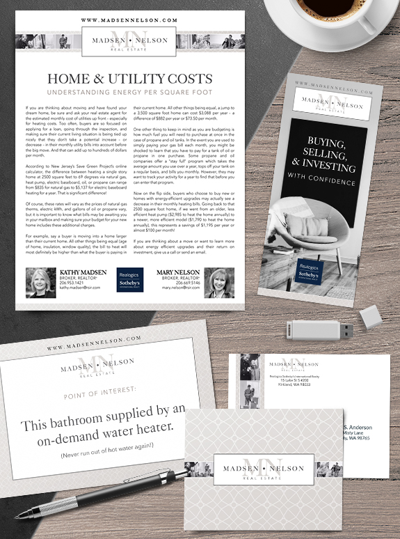
Branding Spotlight: Kathy Madsen & Mary Nelson
Kathy and Mary wanted a design that was cutting edge but still classic. Both love the emotional power of luxurious black-and-white photography, and so their brand includes a filmstrip of lifestyle photos in the header. The overall palette of pale taupe and charcoal grey keep the design warm, but let the content and property photos […]
Branding Spotlight: Liz Suver
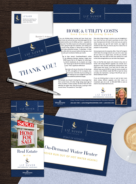
Liz Suver wanted a cohesive look to streamline her busy business, so she picked a strong and contemporary brand from our Semi-Custom Pro gallery. We used her elegant monogram logo in the header of the design to retain her former band equity, which creates a stylish and memorable look. The subtle tone-on-tone pattern behind her […]