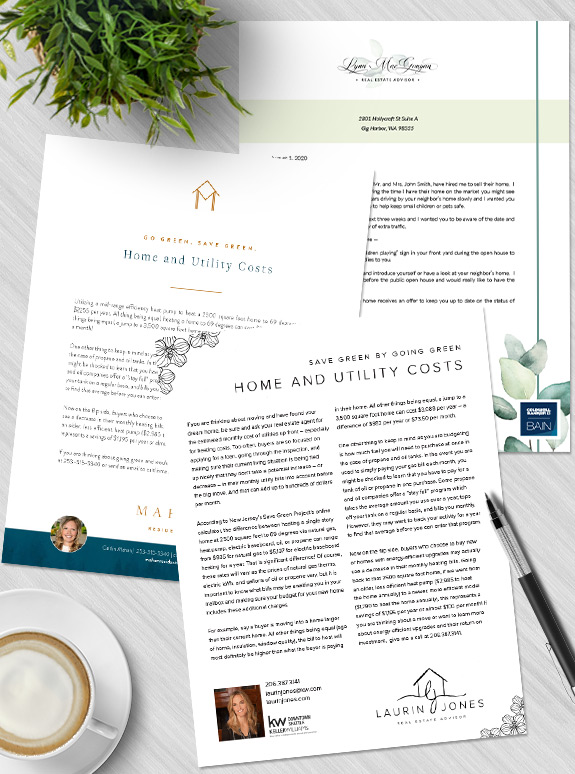
The last style in our tour is probably the most popular: Understated. With the minimalism trend dominating design in many industries, lots of people are leaning towards the simplicity and clean lines of understated styles. Understateds have a “less is more” approach to design, finding delight in serenity and grace. The key to an effective […]
Posts Tagged ‘understated’
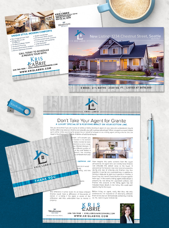
Branding Spotlight: Kris LaBrie Brand Refresh
Kris LaBrie refreshed her first brand to streamline the structure and lock-in an iconic logo. The logo was the primary focus of her brand refresh. As the roofline intersects the monogram, the down-stroke of the L becomes a chimney and the horizontal leg becomes the foundation of a house. With a window filling the space […]
Branding Spotlight: Cindy Peschel-Hull
Starting Point: Cindy Peschel-Hull branded with us in 2018 and still loves her luxurious gold and black brand. To bring it up-to-date, she just needed a quick logo refresh to make it more personal and better serve her clients. The Strategy: The biggest change was the monogram logo, which now features Cindy’s “C” in a […]
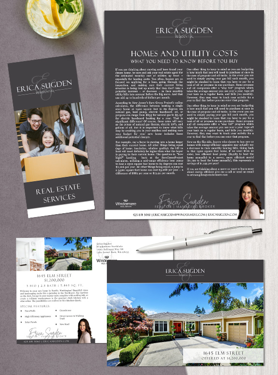
Branding Spotlight: Erica Sugden
Starting Point: With a background as a lender, Erica transitioned into real estate before taking time to raise and grow her young family. Excited and ready to re-enter the workforce after being a stay-at-home mother for two years, Erica was ready for a brand that incorporated the elegant script monogram she’d used previously with the […]
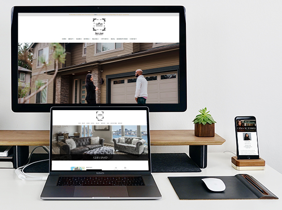
Branding Spotlight: Uzma M. Hamid’s Website
Uzma M. Hamid recently launched her new branded website with easy navigation and mobile-friendly layout. Her website features stunning photography of her in action with clients to make it more personal. Now the central hub of her online presence, Uzma’s website is a resource for her past, present, and future clients. Our web design team […]
Branding Spotlight: Tammy Wright
The starting point: Tammy Wright jumped into the custom branding process with a vision for a clean and luxurious brand. As someone who is all about people and relationships, she also wanted to incorporate the idea of planting roots in community. Her new design gives her all of the above. The strategy: She selected a […]
Branding Spotlight: Cheryl Nygaard
The starting point: Cheryl Nygaard has branded with us for many years, recently refreshed her brand for a brighter and more modern design. She was especially interested in a logo that she could could use outside of print-branding templates. The strategy: Bright blue and gold stand out in the mail or in a digital setting. […]
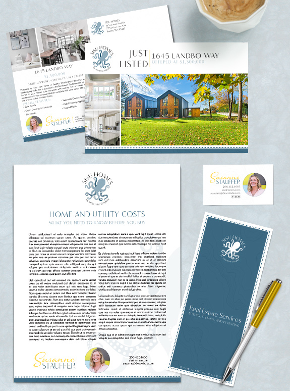
Branding Spotlight: Susanne Stauffer
The starting point: Born in Finland, Susanne is drawn to minimal, Nordic design and all things outdoors. From hiking and boating to snowboarding and beyond. She started the branding process with a delightful eclectic request: she wanted to include an octopus into her brand. The target audience: “Sisu” literally translates to “go” in Finnish, but […]
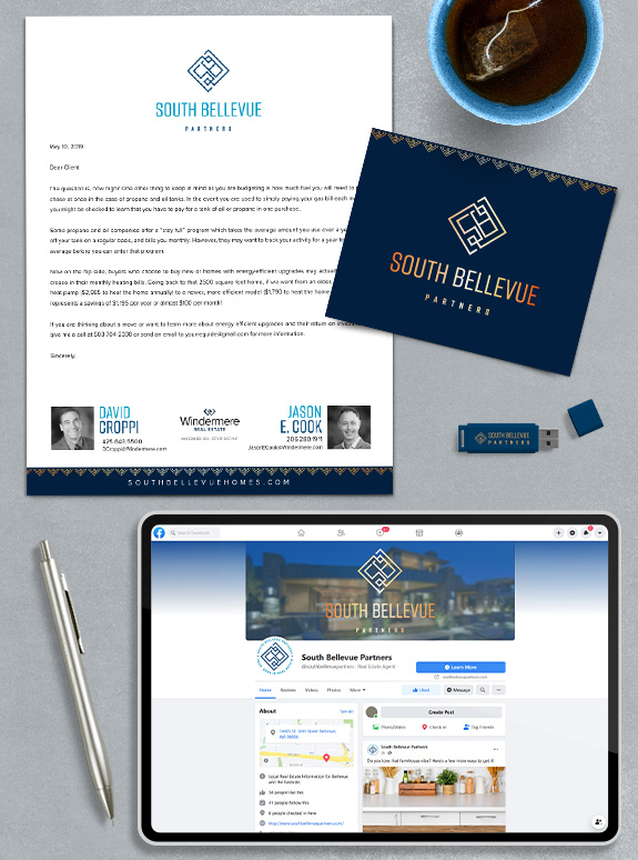
Branding Spotlight: South Bellevue Partners
The starting point: When David Croppi and Jason Cook decided to join forces and create South Bellevue Partners, they needed a unified look for their joint marketing. The target audience: While the name of their group identifies the location, their new branding needed to draw in their past clients and attract future clients in. This […]
Branding Spotlight: Chris Byler
The starting point: With an strong logo already in place, Chris selected the Semi-Custom Pro branding package to give his business a solid foundation and streamline his workflow. The target audience: He wanted a design that would augment his current brand equity and appeal to new clients making important life transitions, whether that is a […]