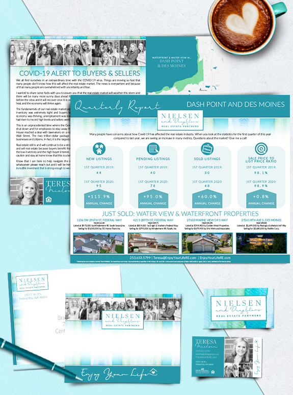
The starting point: Today, we’re revisiting Teresa Neilsen’s beautiful teal brand as she focuses on streamlining the value of her geo-farm marketing. The target audience: Teresa is building her niche in waterfront and water-view properties between Des Moines and Dash Point. The strategy: Clean but content-rich postcard mailers make a splash in every mailbox.
Posts Tagged ‘texture’
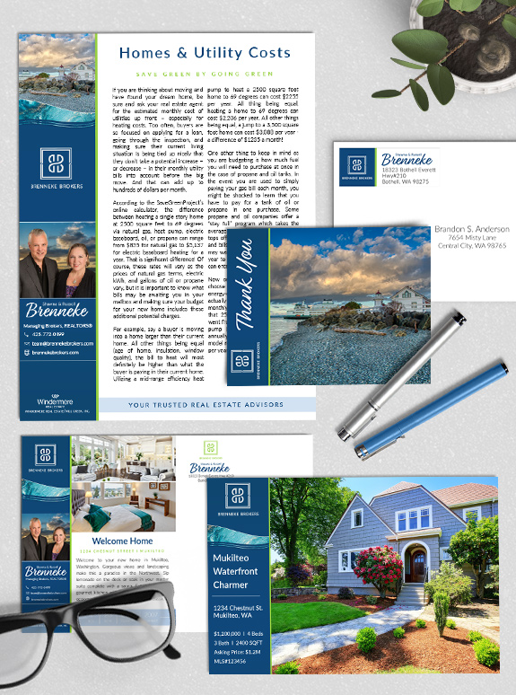
Branding Spotlight: Shawna & Russell Brenneke
The starting point: Shawna and Russell have been in the business for many years and wanted a custom brand to take their business to the next level. Their personalities perfectly complement each other, and their design needed to highlight their teamwork. The strategy: They selected a Custom branding package to get the maximum versatility and […]
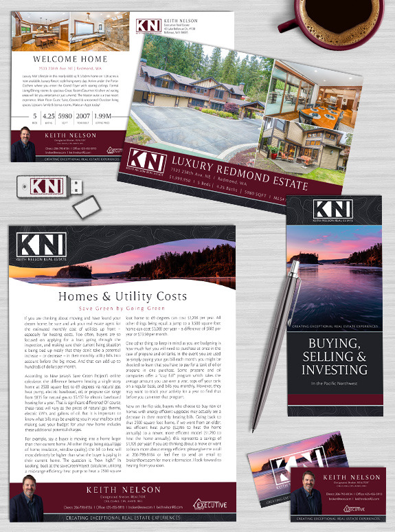
Branding Spotlight: Keith Nelson
The starting point: Keith is an industry expert with over 40 years of real estate experience. He is a work-hard-play-hard kind of guy, with a deep love of the natural environment of Washington state, classic cars, motorcycles, and boats. He joined Mastery with the goal of refining and systemizing his personal brand. The strategy: The […]
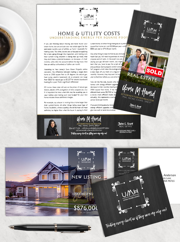
Branding Spotlight: Uzma Hamid
The starting point: As a former lawyer, Uzma has a very analytical and detail-oriented personality. She needed an elegant design to support it that would resonate well with her tech-savvy sphere. The target audience: Many of her clients work in the tech industry, so she needed to keep her branding minimal and functional. At the […]
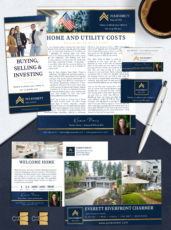
Branding Spotlight: Karmin Pincus
The starting point: Karmin built brand equity with a strong logo before Mastery, and now she needed an equally strong brand to support it. When considering her clients’ needs, she wanted to emphasize her extensive knowledge, reliable service, and authenticity. The target audience: As a veteran and military wife, she is personally familiar with the […]
Branding Spotlight: Yashu Toprani
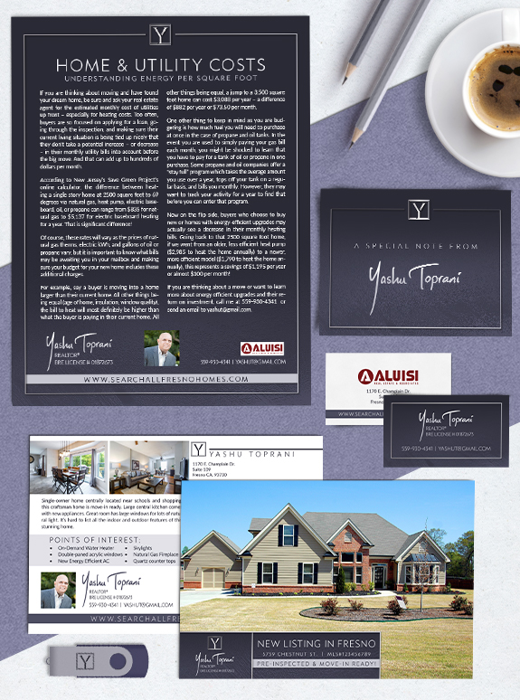
Yashu Toprani is a self-described simple and straight-forward agent in Fresno, California. He wanted a Custom brand that was sleek and polished to help break the ice with new clients and build brand equity with current and previous clients. His design features a pinstripe frame over a rich navy background that gently fades into a […]
Branding Spotlight: North by Northwest
North by Northwest, owned and operated by Paul Hanken, Steve Clark, and Keven Dares II, is “A Brokerage of Investors for Investors.” All three partners have extensive experience building real estate portfolios, and wanted to create a professional resource for like-minded clients. Their Mastery brand needed to be unique and locally targeted. Their logo features […]
Branding Spotlight: Teresa Nielsen & Daughters
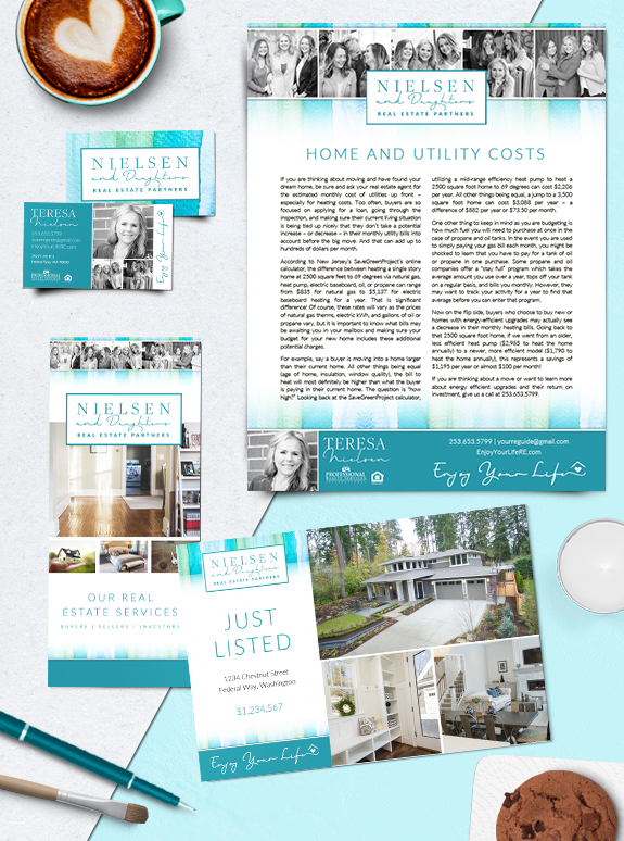
A genuine family business, Teresa Nielsen and her daughters wanted something very personal and approachable in their Mastery brand. Teresa’s personal mantra is “enjoy your life”, and the unique use of candid shots in a black-and-white brings her message to life. The Nielsen team wanted fun, bright colors in their brand such as teal, aqua, […]
Branding Spotlight: Ann Hoppe
Ann Hoppe naturally has a sunny disposition, and she wanted her Semi-Custom PRO brand to reflect that. Tropical blues paired with warm sand textures create a brand that is attractive and delightful to the eye. An elegant script font adds a personal touch to her name, while a strong all-caps serif makes her headlines easy […]