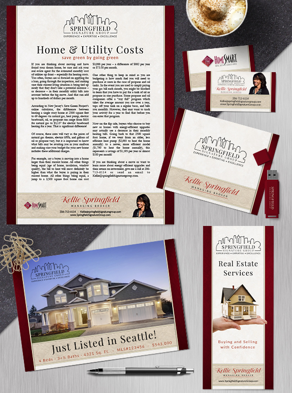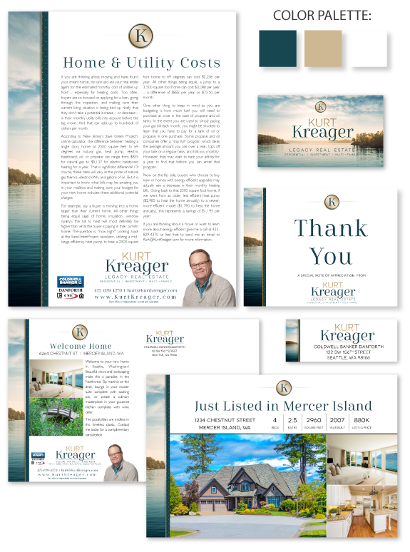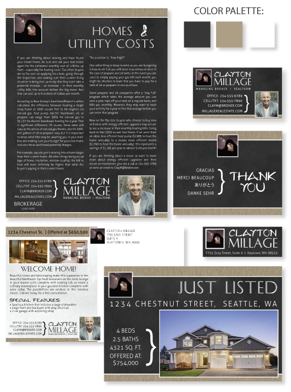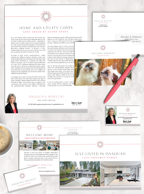
The starting point: Birmin cat mom, Angelina Wallent is an enthusiastic agent with a unique sense of style. With more than fifteen years of success and experience under her belt, Angelina was ready for a brand that would help her stand out and elevate her success in the next chapter of her business. The target […]
Posts Tagged ‘tan’
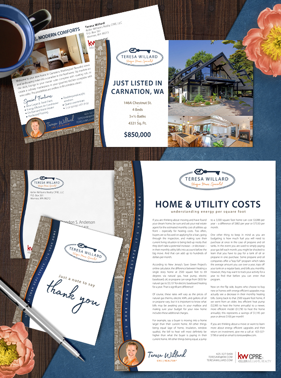
Branding Spotlight: Teresa Willard
Teresa jumped into her custom mastery brand with both feet and came away with an incredible customized icon collage to tell her story. As an expert in matching unique houses with the perfect owners, this personal pattern includes horses, keys, doors, windows, houses, plants, mountains and more. It is colored with muted tone-on-taupe shades to […]
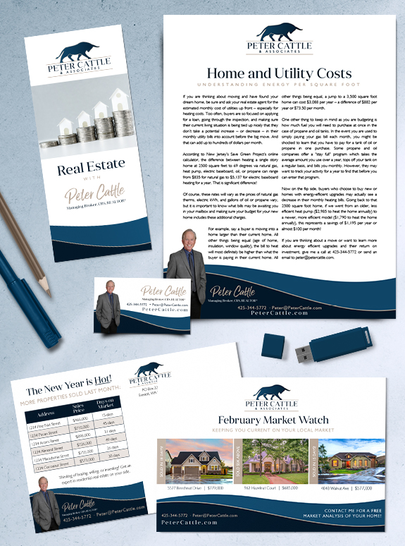
Branding Spotlight: Peter Cattle
Peter Cattle’s new custom brand captures his professional experience, honesty, and skills as an advisor. His logo, inspired by his last name, embodies the power of investing in real estate as well as his confidence when at the negotiation table. The gentle curved footer mimic’s the logo’s horns to carry the theme throughout the design. […]
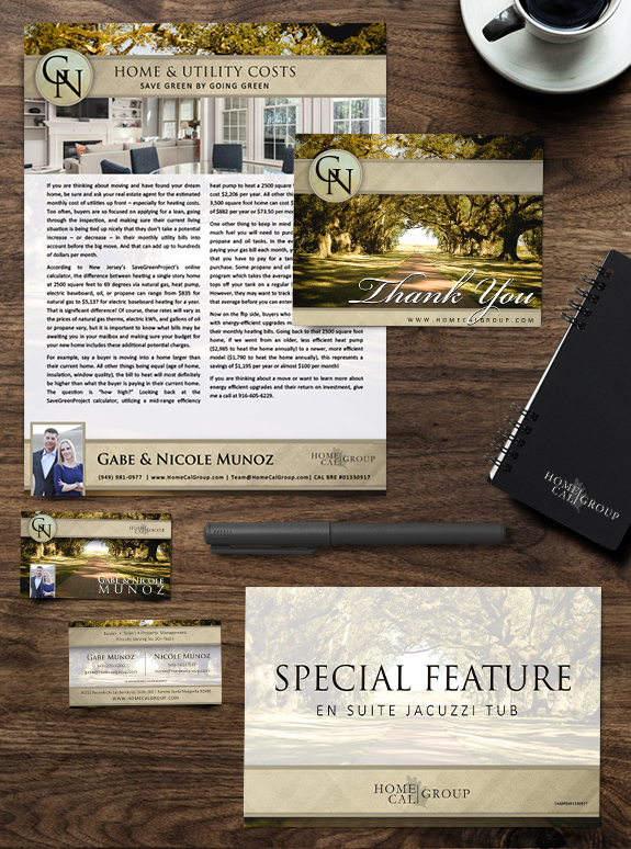
Branding Spotlight: Gabe & Nicole Munoz
MASTERY clients Gabe and Nicole, owners of HomeCal Group brokerage and property management company in Southern California, are a great example of how effective a driven go-getter team can be. Their brand consists of a filtered southern California pathway flanked by local oak trees, with sand colors and bold, elegant fonts. During their time in […]
Branding Spotlight: Semi Custom Pro #159
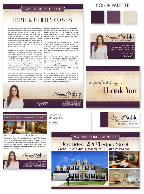
This week’s branding spotlight features our Semi-Custom Pro branding design template #159. This design uses a simple linear layout with a custom frame for your perfect tagline. The pattern overflows from the header and footer into the warm texture of the background. The high-contrast palette of deep eggplant and taupe adds dramatic flair to an […]
Branding Spotlight: Mark Peterson
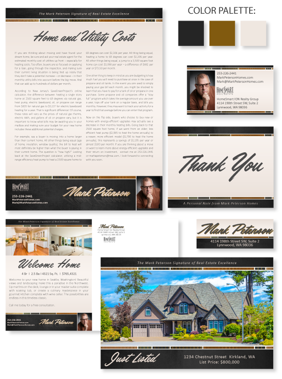
This week’s Branding Spotlight features the design of MASTERY agent Mark Peterson, from Lynnwood, Washington. Mark came to the branding process with a mental brand image of “rugged luxury.” The timeless earth-tones create an inviting platform for his content, with crisp white lines between each shape. The charcoal header and footer add weight and contrast. The […]
Design Spotlight: Semi-Custom Pro #131
This week’s design spotlight features our Semi-Custom Pro branding design template #131. This design is ready to be customized to fit your unique design style and give you the marketing versatility and consistency you need to take your business to the next level. The area in the upper left-hand corner is set aside for a […]
Design Spotlight: Marilyn Ferris
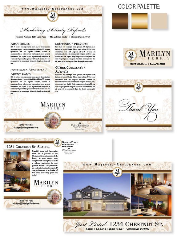
This week’s design spotlight features the brand of our CUSTOM SIGNATURE client Marilyn Ferris, from Seattle, Washington. Marilyn worked in high-end cosmetics retail, and needed a brand that fits her classy style. She wanted an elegant and understated design that centered around a unique monogram. It is repeated as a chic watermark on select pieces. […]