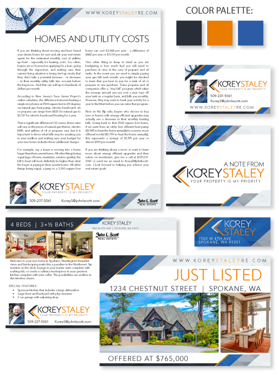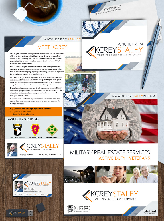
In honor of Veteran’s Day, we’re featuring the brand of 22-year army vet Korey Staley from Spokane, Washington. The target audience: Korey handles real estate of all shapes and sizes on a daily basis, but for a special project, he chose to leverage his personal experience to help other veterans and those on active duty. […]
Posts Tagged ‘sans-serif font’
Branding Spotlight: Korey Staley
This week’s Branding Spotlight features the design of MASTERY agent Korey Staley, from Spokane, Washington. Korey has a dramatic yet understated design style and wanted an unique brand with local appeal. The crisp angles and understated low-poly texture in his design reflect Korey’s professional business style as well as his more adventurous side. Korey’s color […]
Branding Spotlight: John Haines & Missi Huff
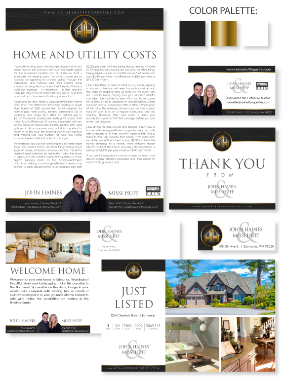
This week’s design spotlight features the brand of MASTERY agents, John Haines and Missi Huff. John and Missi make the perfect team by balancing Missi’s experience with John’s fine-tuned people skills. They wanted a brand that reflects their professional confidence as well as their warm personalities. John and Missi’s emblem logo is comprised of their […]
Design Spotlight: Kris LaBrie
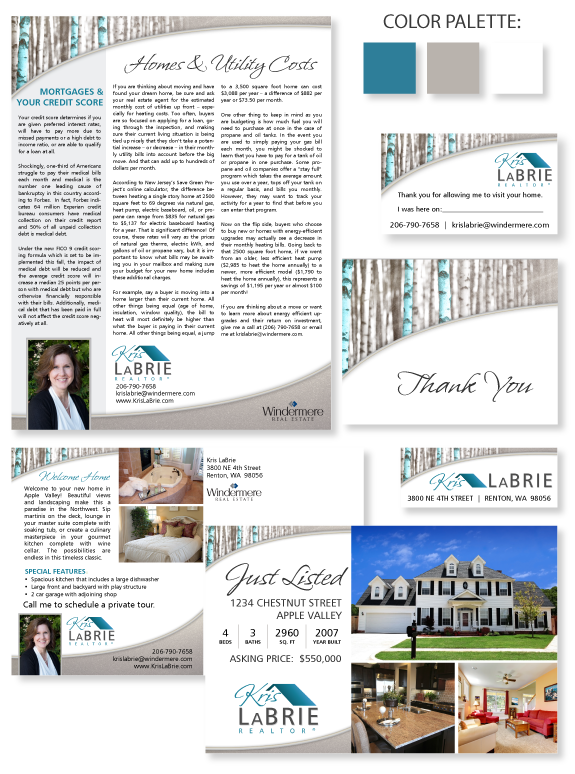
This week’s design spotlight features the brand of MASTERY agent Kris LaBrie, from Renton, Washington. Kris’ ideal brand image was light, refreshing, and timeless. When she took our design style analysis, her results were Bold and Understated in almost equal portions – an unusual combination! This contradiction in design style was actually an opportunity to […]
Design Spotlight: Gary Nims
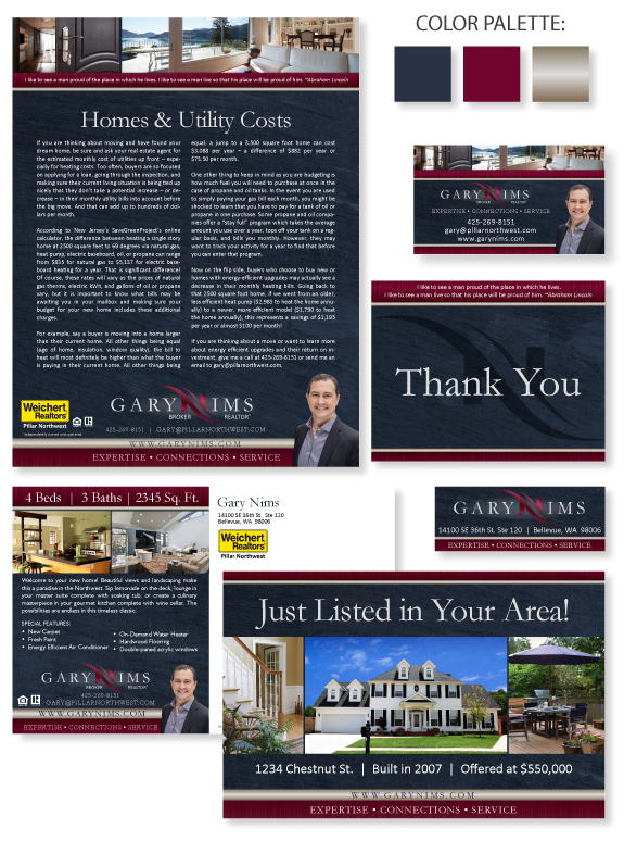
This week’s design spotlight features the brand of MASTERY agent Gary Nims, from Bellevue, Washington. Gary is building a family business with his wife Stacy and daughter Laura. Together, they wanted to create a memorable brand that would help their business grow. They chose a bold navy and maroon color palette and accented it with […]
Design Spotlight: Powder Room – Refreshed!
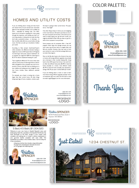
This week’s design spotlight features one of our Semi-Custom branding design template “Powder Room” with a fresh and soothing color palette. Formerly, this design featured pink sandstone in the sidebars and background, which (while beautiful) overwhelmed the entire design. In this refresh, we have scaled back the colors to make the content area clean white […]
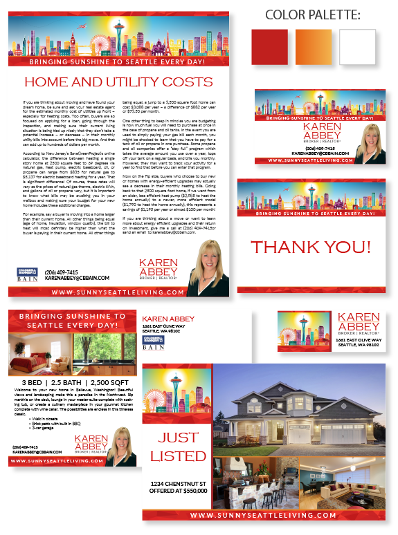
Design Spotlight: Karen Abbey
This week’s design spotlight features the brand of MASTERY agent Karen Abbey, from Seattle, Washington. Karen wanted her brand to reflect her bright and sunny personality, as well as her passion for Seattle. Previously, she used a brightly colored Seattle skyline image for many of her marketing pieces. She wanted to update the image and […]
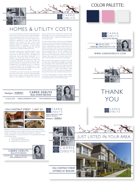
Design Spotlight: Carrie DeBuys
This week’s design spotlight features MASTERY agent Carrie DeBuys, from Seattle. Carrie is a luxury condo specialist and has over 25 years of real estate experience in King County. She loves establishing new relationships with buyers and sellers. She wanted a brand that would be elegant, minimal, and memorable. Carrie utilized her brokerage’s navy blue […]