Ann Hoppe naturally has a sunny disposition, and she wanted her Semi-Custom PRO brand to reflect that. Tropical blues paired with warm sand textures create a brand that is attractive and delightful to the eye. An elegant script font adds a personal touch to her name, while a strong all-caps serif makes her headlines easy […]
Posts Tagged ‘sand’
Branding Spotlight: Gabe & Nicole Munoz
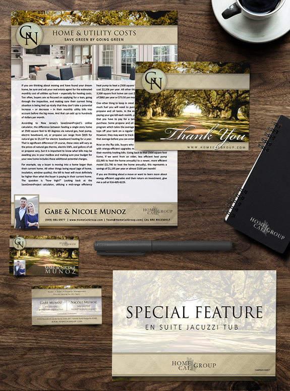
MASTERY clients Gabe and Nicole, owners of HomeCal Group brokerage and property management company in Southern California, are a great example of how effective a driven go-getter team can be. Their brand consists of a filtered southern California pathway flanked by local oak trees, with sand colors and bold, elegant fonts. During their time in […]
Branding Spotlight: Cathi McLeod
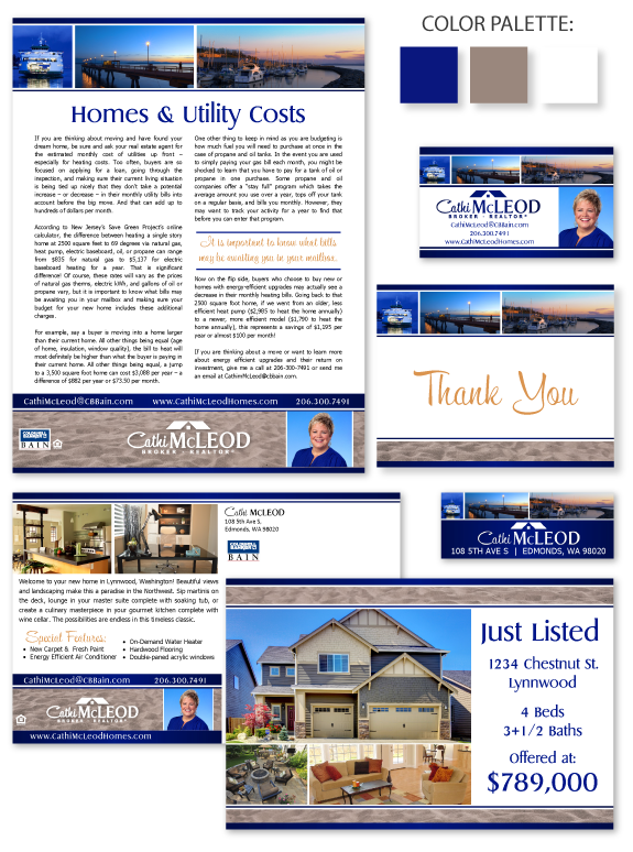
This week’s Branding Spotlight features the design of MASTERY agent Cathi McLeod, from Edmonds, Washington. Cathi desired a memorable brand that features scenic imagery and conveys the beauty of the water surrounding Edmonds. She brought an established logo into the branding process, which we updated with a vintage script font and modern semi-serif font to […]