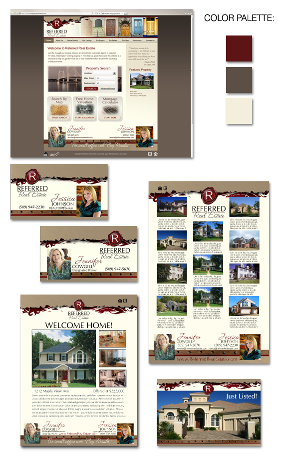
Jennifer Cowgill and Jessica Johnson of Referred Real Estate in the Tri-Cities had built a strong brand a few years ago. But they decided it needed a little bit of updating. The new brand highlights the ruby red of the polished Referred Real Estate logo, incorporates an eye-catching handwritten script, and highlights their love of […]
Posts Tagged ‘real estate design’
Ask Denise: Design Style
Q: Denise, what is your design style? Has your design style changed over the years? A: My primary style is “dramatic”, and my secondary style is “elegant”. And no – my style hasn’t really changed. Your design style remains fairly constant throughout your life. If you like high-contrast design as a youngster, you’ll likely be […]
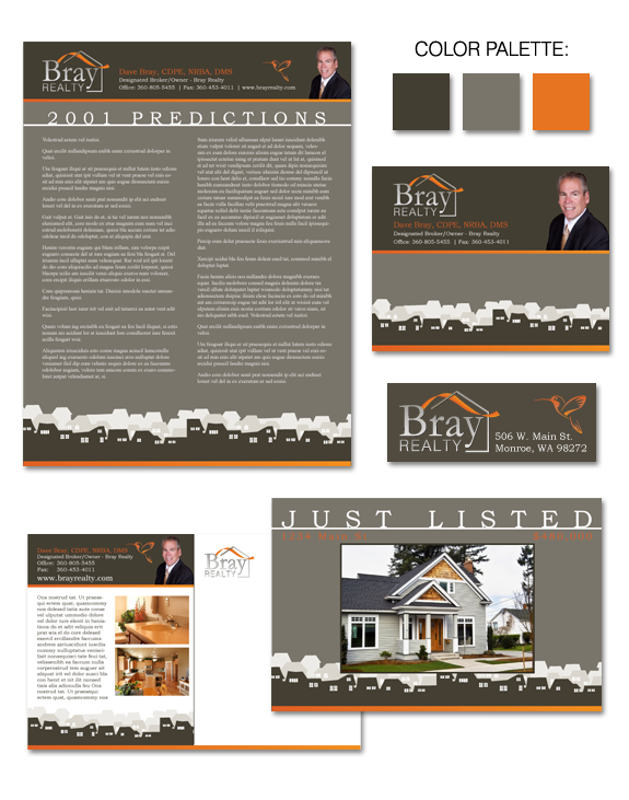
Design Spotlight: Dave Bray
Dave Bray came to us looking for a brand with high impact, high functionality, and high visibility. Drawn to a classic design style, Dave wanted to also incorporate tasteful contemporary elements. Because Dave works primarily with banks and investors, he needed a clean, professional image – but one that would stand out in the crowd. […]
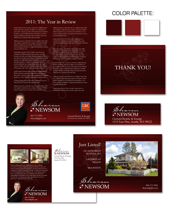
Design Spotlight: Sharon Newsom
The brand we developed for Sharon Newsom has a rich and welcoming flavor, while maintaining an air of simplicity. While Sharon’s personal style leans toward elegant and dramatic, it was important to her to have her brand remain a backdrop which allows her to showcase her clients’ properties. The use of a watermark allows Sharon’s […]
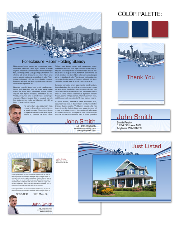
Design Spotlight: “Urban Explosion”
A fun, modern take on a Seattle-based brand, “Urban Explosion” takes a Seattle image in a whole new direction. We’ve used the iconic skyline as a backdrop, but have added a fun graphic element that has moved this design from very classic to a bit eclectic! A touch of the mid-century (via the “swoosh” and […]
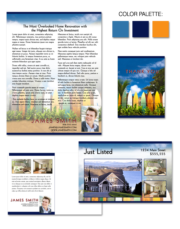
Design Spotlight: “Hang 10”
Do you sell real estate in a beach community … or are you simply dreaming of fun in the sun? The “Hang 10” evokes a strong sense of fun and whimsy, and is a great brand for those who are young … or young at heart. Whether you want to create your custom “Signature” brand […]
Design Spotlight: “Mahogany Accents”
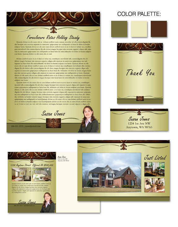
The “Mahogany Accents” brand is inspired by a classic motif. Although it combines both brown and green, the brand doesn’t feel heavy or dated. Instead, it draws on the positive attributes of green (a sense of calm and safety) and brown (feelings of reliability and approachability) in a fresh, new way. Whether you want to […]
Why Savvy Agents Brand
I’ve been flooded with questions and comments about real estate logos and branding in the last 30 days. We had such positive response to our recent “before and after” contest … and it made me realize that I need to talk about the power of branding more regularly. I’m a proponent of branding because it […]
Ask Denise: Branding Contest
Q: I loved the brand contest you guys did (the one where Francine Viola won). Are you going to have another contest? A: Yes we are! I’m glad that you enjoyed seeing Francine’s “before” brand … and the two “after” brands we created for her. Our readers really enjoyed this feature, so we plan on […]
Design Spotlight: Dan & Amber Soria
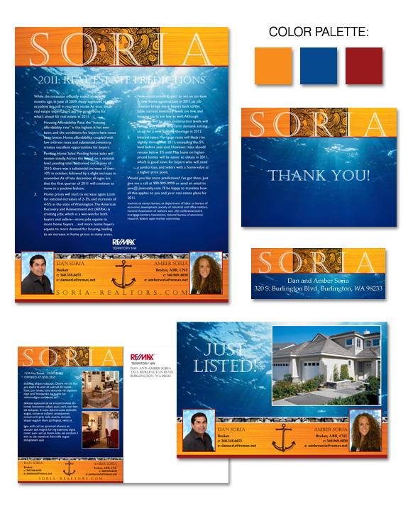
Dan and Amber Soria were looking for something truly unique for their custom brand – a look that incorporated a nautical thing without making the viewers squawk “Arrrrrr, matey”. The Sorias were seeking saturated colors, and a structured format. Something frilly and feminine was out of the question. Instead, they wanted a bold and streamlined […]