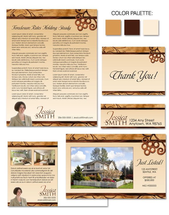
What happens when you mix a love of wood details with a love of wine? “Wooden Inlay”, that’s what! This brand includes references to the beauty of inlaid wood design, while simultaneously tipping its hat to wine lovers everywhere! The rich palette of brown, caramel, and ecru is gender neutral, appealing to both men and […]
Posts Tagged ‘real estate branding logos’
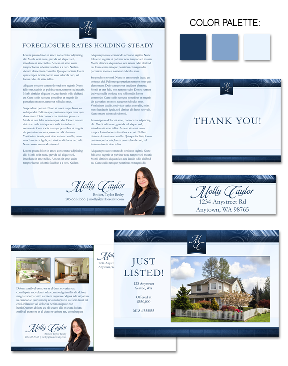
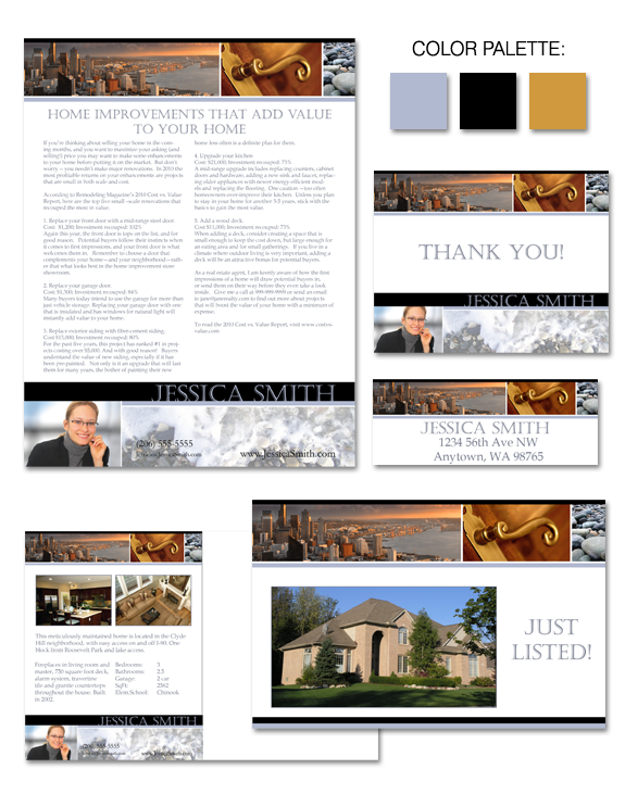
Design Spotlight: “Frosted Frames”
There’s a reason that so many of our clients gravitate to designs with a palette featuring blue. As the most gender-neutral color, blue has almost universal appeal! “Frosty Frames” offers the best of the blues — the deep blue which signifies experience, expertise, stability, intelligence and confidence … as well as a softer blue for […]
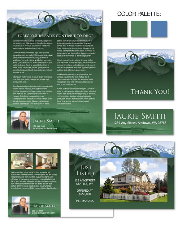
Design Spotlight: “Cascade Dreams”
“Cascade Dreams” is one of the designs we’ve recently created with a geographical emphasis. The Pacific Northwest is one of the most beautiful parts of the country, and we’ve reflected that natural beauty in this design, which includes both the mountains and the water for which this area is famous. A color palette with […]
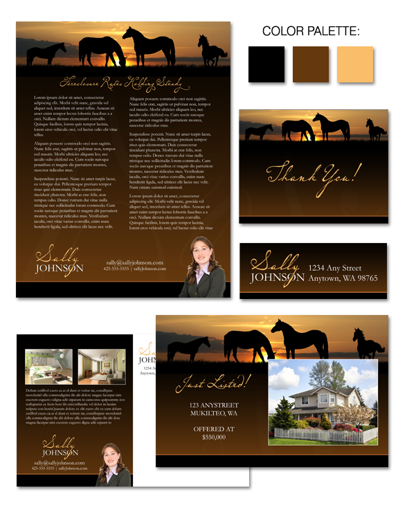
Design Spotlight: “Western Sunrise”
Do you specialize in equestrian properties? Do you work in the “west”? “Western Sunrise” is one of our newest designs, perfect for agents who specialize in horse properties or those located in locales reminiscent of these images. Caramel, gold, and deep brown combine to create a color palette that’s luxurious while still feeling genuine. […]
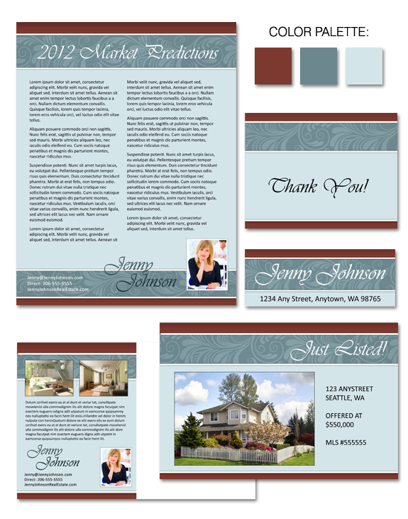
Design Spotlight: “Jacquard”
It doesn’t get more classic than feather scrolls — a design motif that’s been around for centuries! We’ve paired that classic element with a palette that had classic beginnings … to which we added our own special twist by moving ever so slightly away from a completely staid palette into something slightly more contemporary. Strong […]
Design Spotlight: “Seattle Shores”
Another design featuring Seattle’s iconic imagery, “Seattle Shores” takes a very different approach. The cool palette manages to convey a sense of calm and beauty, and the lighter tones of the brand design allow for maximum legibility with printed materials.
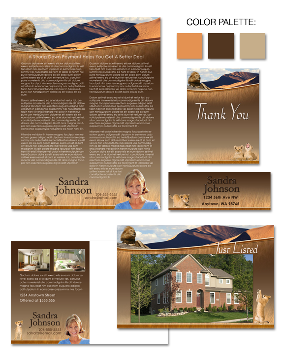
Design Spotlight: “Playtime on the Sahara”
If an eclectic theme is the look you’re going for with your branding, you won’t be disappointed with this fun and playful new addition to our Instant Image gallery, “Playtime on the Sahara”! A warm and welcoming color palette and a soft, grassy backdrop provide the perfect playground for a handful of mischievous lion cubs. Whether […]
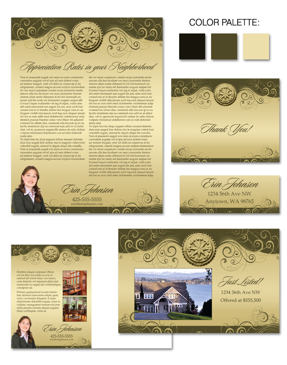
Design Spotlight: “Knobby Swirls”
“Knobby Swirls” is artful in concept, elegant and graceful in design, and effective in delivery. The muted khaki and taupe palette provide a lush backdrop for an iconic and strong architectural medallion centerpiece. Swirls add to the drama! Inherently feminine in design, Knobby Swirls is just the right balance of elegance and whimsy, and could […]
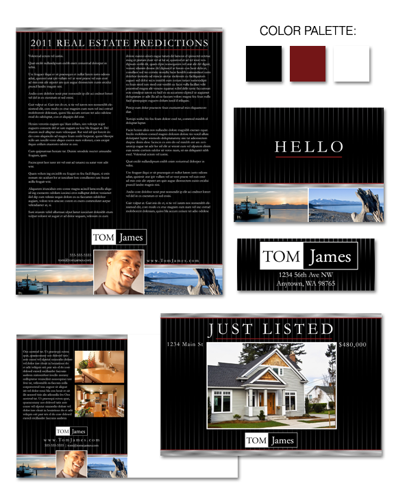
Design Spotlight: “Business on the Water”
Dark and dramatic, our “Business on the Water” design allows you to highlight your love of all things water! The pinstripe effect resonates particularly well with men, as does the strong color palette. If you’re looking for an attention-grabbing brand with a subtle nod to the waters of the Pacific Northwest, this may well be […]
Design Spotlight: “Green Glass”
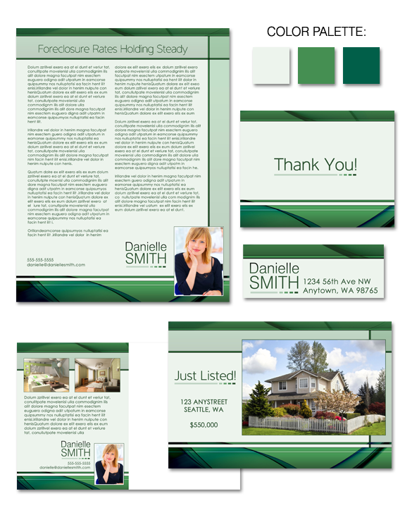
Are you looking for a brand that’s simple and clean … with complex layers of color? Look no further! “Green Glass” may be the perfect solution for you. With visual references to green sea glass, this eye-catching design imparts a sense of calm and serenity, offering both movement and a solid structure.