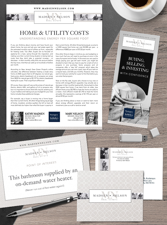
Kathy and Mary wanted a design that was cutting edge but still classic. Both love the emotional power of luxurious black-and-white photography, and so their brand includes a filmstrip of lifestyle photos in the header. The overall palette of pale taupe and charcoal grey keep the design warm, but let the content and property photos […]
Posts Tagged ‘neutral’
Branding Spotlight: Cathi McLeod
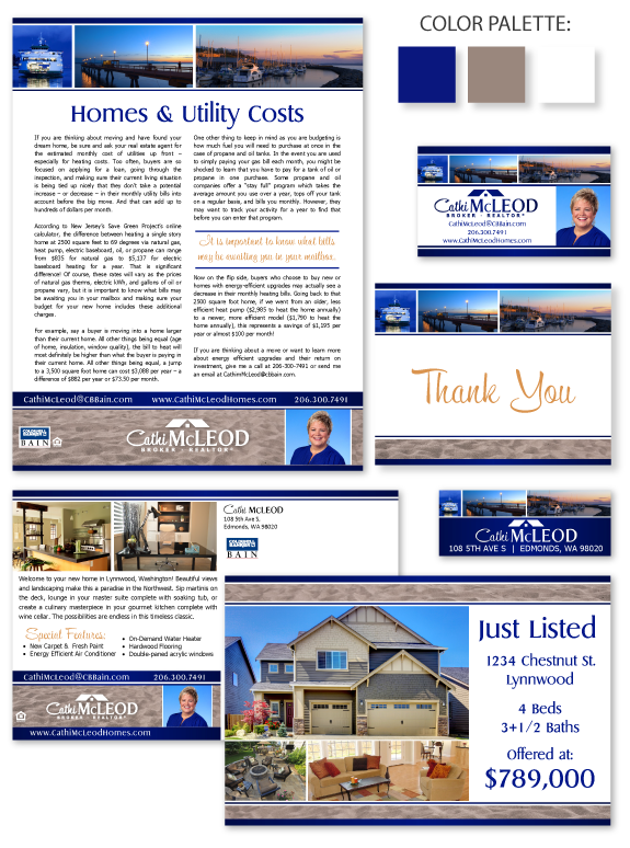
This week’s Branding Spotlight features the design of MASTERY agent Cathi McLeod, from Edmonds, Washington. Cathi desired a memorable brand that features scenic imagery and conveys the beauty of the water surrounding Edmonds. She brought an established logo into the branding process, which we updated with a vintage script font and modern semi-serif font to […]
Branding Spotlight: Mark Peterson
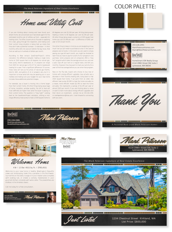
This week’s Branding Spotlight features the design of MASTERY agent Mark Peterson, from Lynnwood, Washington. Mark came to the branding process with a mental brand image of “rugged luxury.” The timeless earth-tones create an inviting platform for his content, with crisp white lines between each shape. The charcoal header and footer add weight and contrast. The […]