modern | The Zebra Blog

Posts Tagged ‘modern’

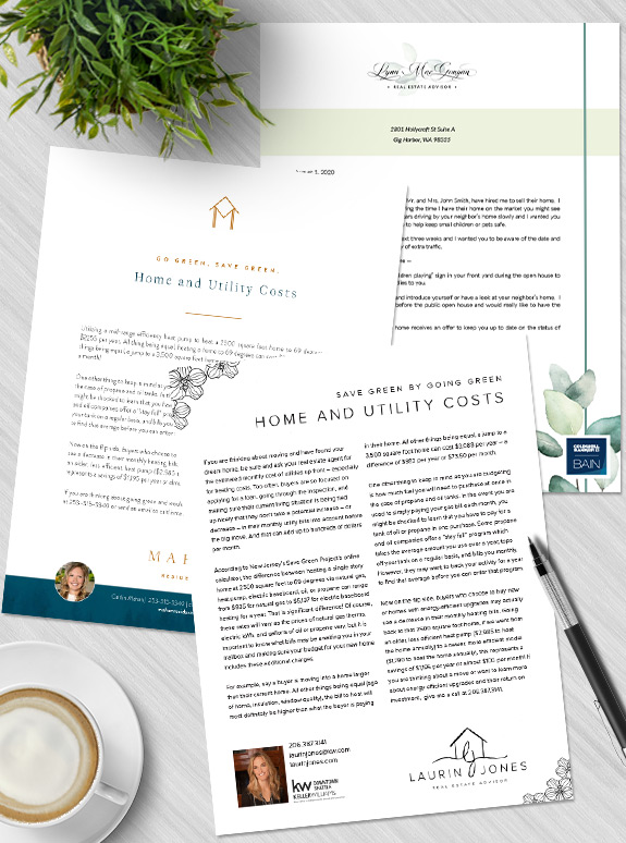
Branding Spotlight: Gina Garcia’s Digital Marketing

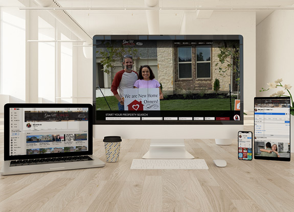
When an agent’s website matches their social media profiles, it creates a sense of reliability and official integrity. Viewers intuitively know that the care and effort that went into creating a united look means the agent is active and invested in their online presence. Gina Garcia’s digital marketing goes one step further and matches her […]

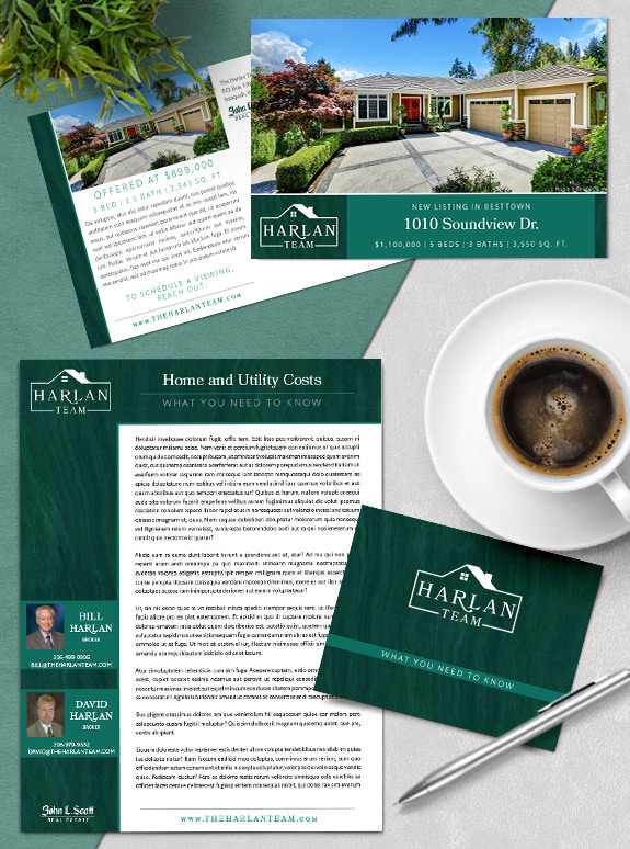
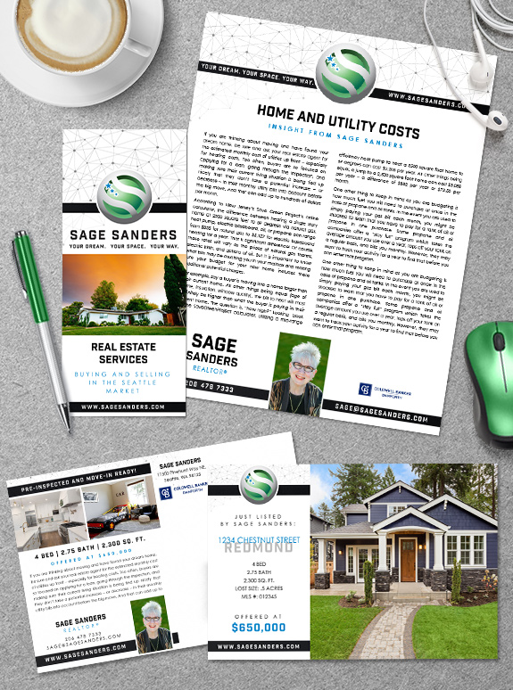
Branding Spotlight: Team Harlan

Team Harlan is a father-and-son team that has been in business for the last 20 years. They started out with a look based on their broker’s colors, and wanted to keep the rich greens moving forward. They also had a logo that needed a refresh. With these considerations as the foundation of their custom branding […]

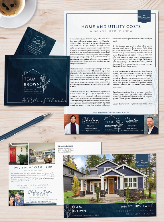
Branding Spotlight: Chelsea & Dustin Brown

Chelsea and Dustin wanted a professional look that would unite their marketing in print and digital forms, stand out from their peers, and convey their professional but approachable business style. Most importantly, it had to mesh seamlessly in their Snohomish County lifestyle and community. Their final brand achieves all that and more. It is cool […]

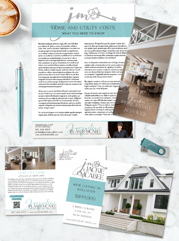
Branding Spotlight: Jackie McAbee

Jackie is a California agent that wanted a light and clean brand to unify her systems. With a few statement elements, we created a brand that is easy to work with while maintaining a unique presence. The light aqua, cream, and gray palette keeps everything bright. Upon closer inspection, the large blocks of color have […]

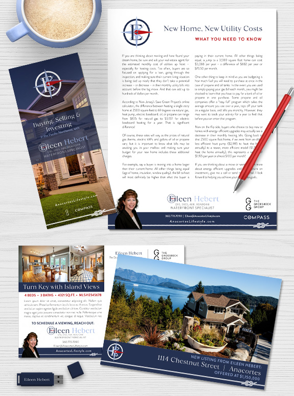
Branding Spotlight: Eileen Hebert

For the luxurious waterfront market on Anacortes, Eileen wanted a nautically inspired brand that would be easy to work with. It was important to her that her design would be modern and minimal enough to blend with her broker’s branding. Through our branding process, our design team determined that a red, white, and navy color […]

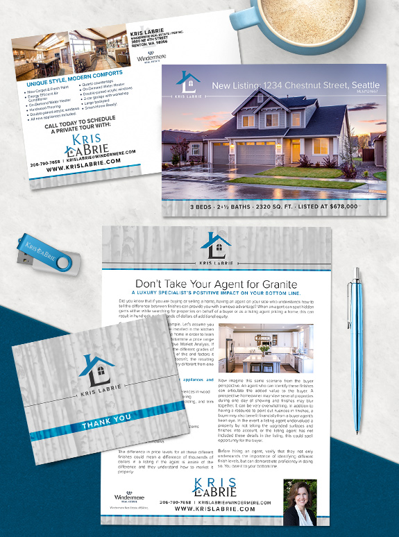
Branding Spotlight: Understated Style

The last style in our tour is probably the most popular: Understated. With the minimalism trend dominating design in many industries, lots of people are leaning towards the simplicity and clean lines of understated styles. Understateds have a “less is more” approach to design, finding delight in serenity and grace. The key to an effective […]

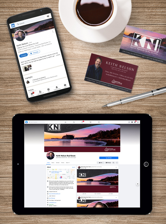
Branding Spotlight: Keith Nelson

Keith Nelson recently updated his social media presence with his new Mastery branding. The result is a unified look across multiple platforms that also harmonizes with his mailing campaigns and print marketing.  With tranquil sunset pictures and deep colors, his new social media covers and graphics are distinct and eye-catching. Even better, the social media […]

Awesome, timely advice for real estate agents. Delivered weekly.
  • Fresh trends
  • Best practices
  • Research and statistics

Enter your email and stay on top of things,


Subscribe!