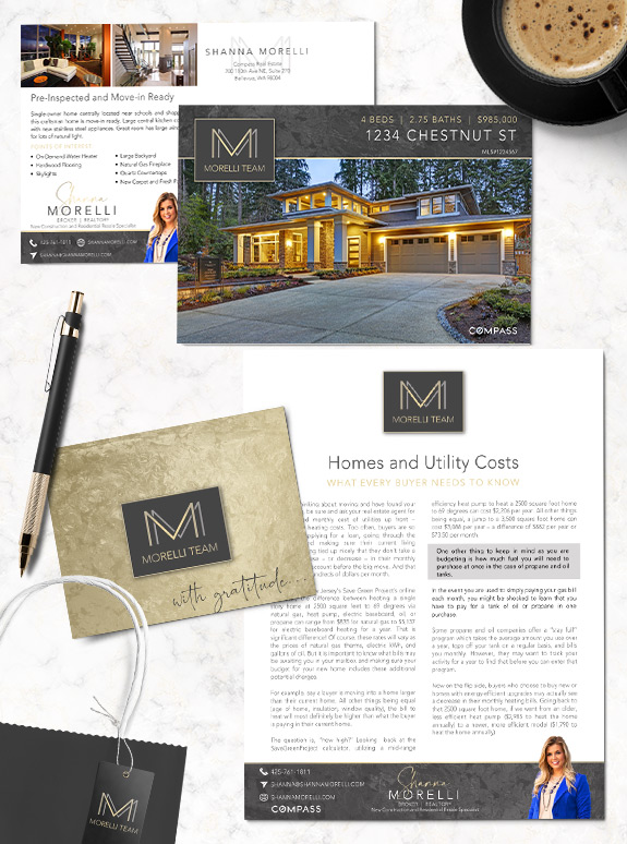
With her eye on the luxury market, Shanna wanted a brand that would help her stand out from the competition and put her content on an elegant pedestal. She selected a charcoal and champagne-gold palette, with a lavish metallic texture. Her double-M logo establishes her as the “face” of the team but also indicates that […]
Posts Tagged ‘minimalistic’
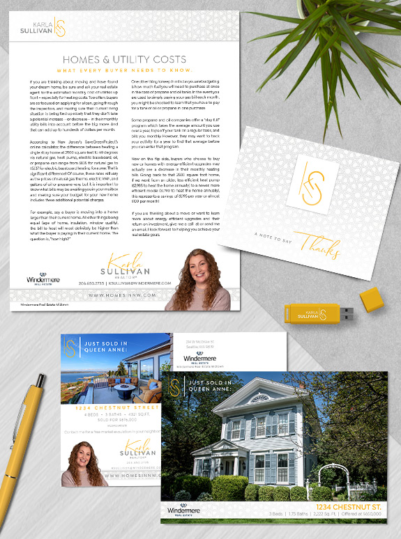
Branding Spotlight: Karla Sullivan
Posted by Denise Lones on February 17th, 2022
Karla came into branding with a bright yellow-gold monogram logo and wanted a minimal brand to support it. We kept it simple with a geometric background pattern to add interest and an accent script font for her name treatment. We just love her fresh and sunny palette, which is a welcome pop of color on […]