Pete came to us wanting a very classic look that highlighted his Tacoma, WA marketplace, but also his love of fishing. And we do mean love of fishing! In fact, he refers to his inventory analysis as “The Fishing Report” which shows “where the fish are biting”. The result? A classic brand, full of character, […]
Posts Tagged ‘marketing makeover’
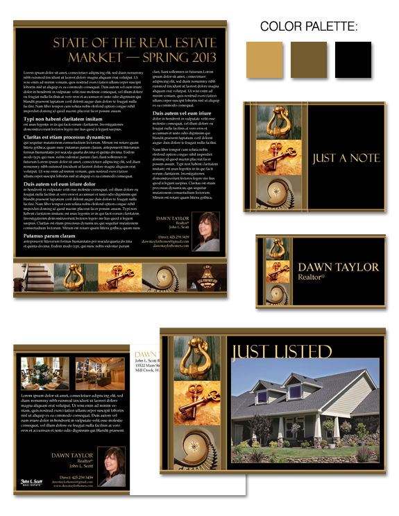
Design Spotlight: Dawn Taylor
Dawn Taylor developed a brand with The Lones Group several years ago, but her target market had changed over the years. She came to us again recently looking for a brand that would encapsulate not only her great personality, but would also match her energy and client-focused approach. Her new branding is based on the […]
Design Spotlight: Andrea Hettinga
Andrea Hettinga, one of our Instant Identity Marketing Makeover clients, originally chose the design “A Little Whimsey”, but had definite ideas of how she wanted to make the design her own and fit it to her style and personality. We started with a color palette of beach hues: blues, greens, and tan and then added […]
Design Spotlight: Allison Lomax
Allison Lomax was one of our Instant Identity clients. She came to us wanting joint branding with her husband, Mitch Lomax, that would highlight their primary area of expertise, the Eastside: Bellevue, Kirkland, and so on. They were interested in designs that would present a sophisticated professionalism, as well as a personal touch. With bold […]
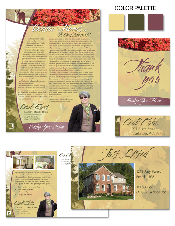
Design Spotlight: Carol Ebbs
Carol Ebbs, one of our Instant Identity Marketing Makeover Clients, choose a design from our Gallery called “Ouch!” (as it originally featured cactus photography!) Carol wanted to have a creative and artistic design that was “outside-the-box”. She was also interested in using photography to highlight the natural beauty of her location, in Clarkston, WA. During […]
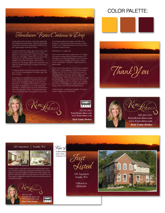
Design Spotlight: Kim Lohnes
Kim Lohnes, one of our Instant Identity clients, came to us wanting something elegant and memorable. Striking, yet refined. She also was interested in highlighting her niche market, equestrian properties, while at the same time giving a nod to her home area of Kirkland, WA. Including her color preferences of gold and burgundy we selected […]
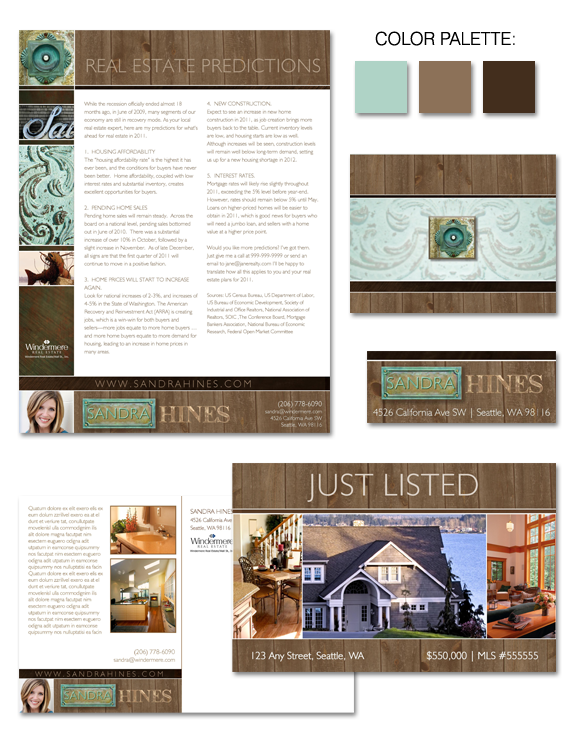
Design Spotlight: Sandra Hines
Sandra came to us wanting to develop a brand that incorporated raw “found” elements such as weathered wood and copper that had developed a blue patina. She was also drawn to a color palette that was beach-like in nature (she works in West Seattle) with blues, greens, tans and greys. Before she got started on […]
Design Spotlight: “Caramel Macchiato”
Do you think brown = boring? We couldn’t disagree more! In fact, shades of brown can be very effective, depending on the message of your brand. Brown represents stability, orderliness, confidence, and reliability — all positive traits to have, particularly in an industry which is often viewed with skepticism by consumers. We’ve elevated basic brown […]
Design Spotlight: “Touchdown!”
Why not take your love for the game to a whole new level? “Touchdown” is perfect for that agent who wants to incorporate football into their brand. There are many tie-ins between the game and real estate, making it a fun brand to play around with. This brand could be the “Touchdown” for your marketing! […]
The Evolution of a Brand
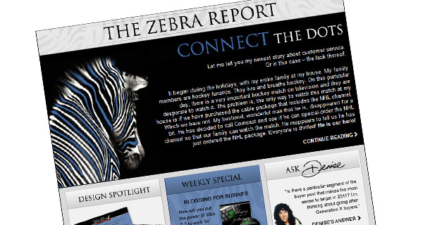
In case you haven’t noticed, the Zebra Report has been given a makeover. Even zebras need to be freshened up from time to time! Basically, this is called a branding update. It’s not changing the components, or the message, or the primary colors – it’s giving our brand a tune-up. A makeover. Our zebra has […]