Today’s design spotlight features the Instant Identity branding design, “Metallic Garden”. This design is classic and subdued in its gray to charcoal color palette, but remains visually interesting thanks to the elegant swirls and flourishes that frame the page. Shining silver, burnished bronze, and polished pewter leaves and vines intertwine to create a beautiful, artistic […]
Posts Tagged ‘marketing design’
Design Spotlight: Calming Nature
Our design spotlight today features one of our Instant Identity brands, “Calming Nature”. As the name suggests, this branding design has a serenity and natural feel that comes from the verdant color palette, the soothing nature images, the clean minimal lines and use of white space. Featuring an iconic green leaf as a trademark element, […]
Design Spotlight: Under the Sea
Just like everyone’s favorite Prom theme of the same name, “Under the Sea” shares similar characteristics: it’s fun, it’s memorable, and it’s dressed to impress! One of our favorite designs in the Instant Identity gallery, this watery theme has a universal appeal. As humans, and being over 50% water ourselves, we are naturally drawn to […]
Design Spotlight: Awesome Blossom
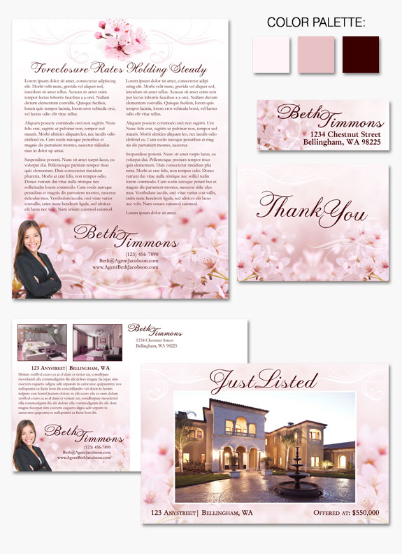
Today we’re highlighting the newest design in our Instant Identity Gallery: “Awesome Blossom”. It may not be Spring outside, but this design could inspire some serious Spring Fever! Cherry tree blossoms delicately dance with with decorative swirls across the background of this graceful, natural design. Complemented by the elegant script font, “Prints Charming” — the […]
Design Spotlight: Lavender Fields
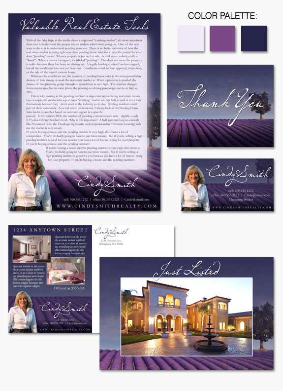
In today’s Zebra Report we are highlighting one of our favorite Instant Identity designs: “Lavender Fields”. With just a glance it is very apparent where this design gets its name! Informal and natural in feel, this design is dominated by a beautiful landscape of lavender fields accented by a lone tree. This beautiful photo lends […]
Design Spotlight: Carol Jarrett
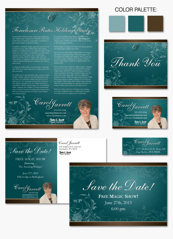
Carol Jarrett is a classic, elegant agent, focused on client care 100%. So when it came to developing a brand that was a good match for her and her clientele, she needed something that was timeless, but also had a unique flair (hence the color palette). Carol’s brand is memorable, highlights her attention to detail, […]
Design Spotlight: Fluid Gold
“Fluid Gold” is a an classic, elegant design favorite from our Instant Identity collection. A cohesive melding of golden hues dance across the page in a swirling floral display. Framing the curling brocade are straight geometric lines that play against the patterns around them. Finished off with timeless fonts and an embellished golden key as […]
Design Spotlight: Changing Seasons
“Changing Seasons” is the latest addition to our collection of Instant Identity designs. Bright and sunny, this new design captures the fun of summer, the anticipation of fall, and the promise of spring. Sky blue, burnt umber, and spring green hues frame this design in a playful, stylized take on the beauty of nature. Though […]
Design Spotlight: Stained Glass
“Stained Glass”, one of our favorite Instant Identity design choices, is a strikingly beautiful example of personal marketing done right. Artistic swirls of stained glass imagery elegantly frame a classic, professional layout of text and information. Burgundy hues mixed with cream colors create a sense of trust, permanence, and dependability while the stained glass textures keep […]
Design Spotlight: Forest Scrolls
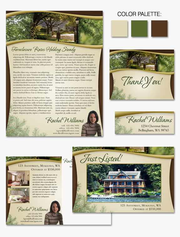
“Forest Scrolls” is the newest addition to our Instant Identity Gallery of designs. This design is a blending of natural and neighborhood imagery, earth-tone colors, and sweeping curves. Featuring Northwest evergreens and deciduous boughs elegantly framed by golden contoured arcs. Finished off with a parchment style backdrop and a forest green brush-stroke script font, this […]