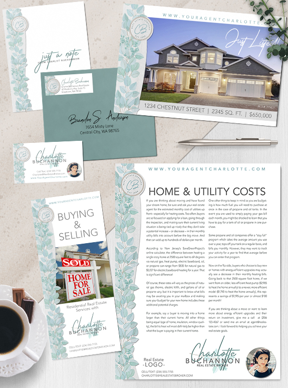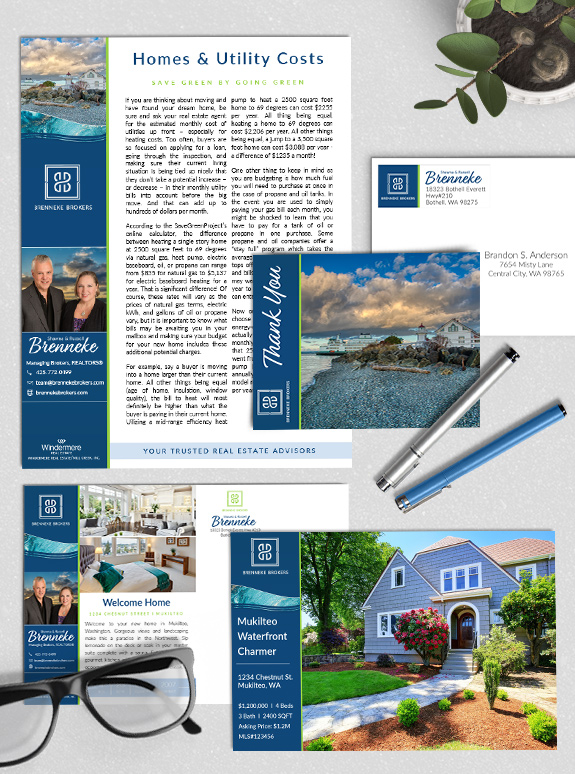
The starting point: Shawna and Russell have been in the business for many years and wanted a custom brand to take their business to the next level. Their personalities perfectly complement each other, and their design needed to highlight their teamwork. The strategy: They selected a Custom branding package to get the maximum versatility and […]
Posts Tagged ‘green’
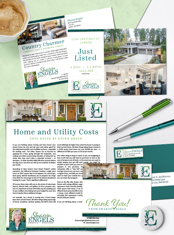
Branding Spotlight: Sharon Engels
One of our Whatcom County neighbors, Sharon Engels, has boosted her business identity with a new Semi-Custom PRO brand. The country-lifestyle photos on her agent-marketing pieces perfectly reflect the aesthetic of her community. We used a serif font to ensure headline legibility, and a whimsical script font to add a personal touch to every piece. […]
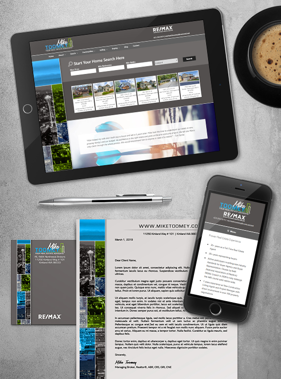
Branding Spotlight: Mike Toomey’s Website
We are proud to spotlight the launch of Mike Toomey’s new website! Mikes modern brand features bright green and blue colors with a dark gray base. The web team was able to implement his beautiful bright sidebar, which you will see as you scroll down the page. To get around his site, visitors can use […]
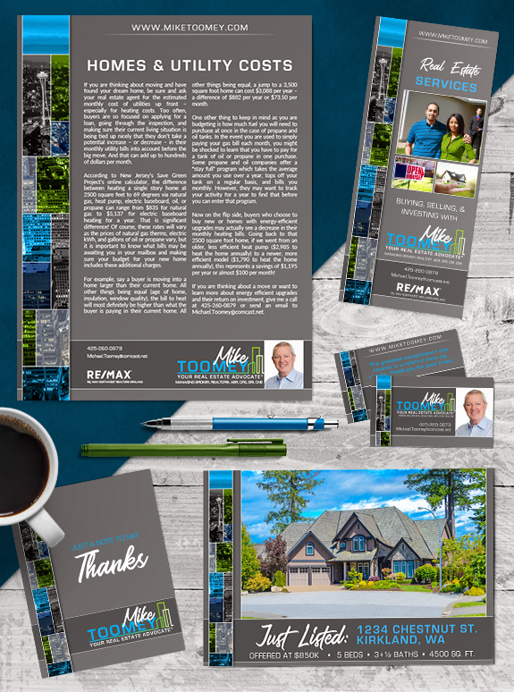
Branding Spotlight: Mike Toomey
This week’s branding spotlight features the design of Custom Branding client Mike Toomey from Kirkland, Washington. Mike is a real estate industry veteran, with over 33 years of experience and a strong ethical compass. He needed a modern brand to establish consistency and streamline his workflow. The pseudo-stained-glass effect in his sidebar is eye-catching and […]
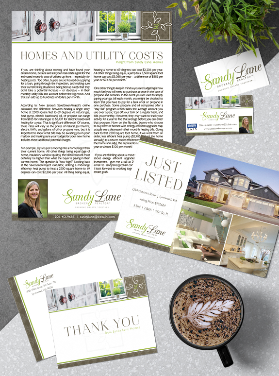
Branding Spotlight: Sandy Lane
This week’s branding spotlight features the brand and marketing of MASTERY agent Sandy Lane from Lynnwood, Washington. Sandy desired a brand that combines her love of the Northwest outdoor scenery with calming real estate imagery. The images in Sandy’s brand transmits the serene feeling of looking at calming natural view through a window, and perfectly […]
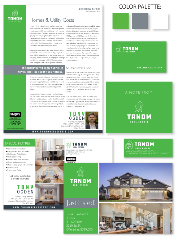
Branding Spotlight: TandM
This week’s branding spotlight features the brand and marketing of MASTERY agents, Tony Ogden and Marisa Callaghan of TandM Real Estate, from Seattle, Washington. This team wanted a brand that was understated and modern to match their established logo. Modern sidebars lengthen the design on content-rich pieces, while edge-to-edge floods of green make their smaller […]
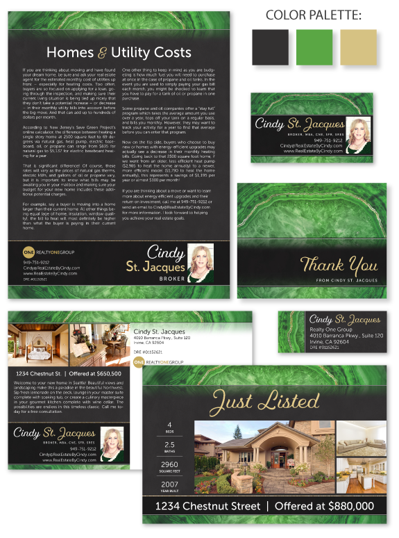
Branding Spotlight: Cindy St. Jacques
This week’s design spotlight features the brand of our Semi-Custom PRO client Cindy St. Jacques, from Irvine, California. Cindy selected design #016 from our gallery and made it her own with custom colors, fonts, and a unique foiling effect. She paired a vibrant green agate in the header and footer with her brokerage’s charcoal and […]
Ask Denise: Going Paperless
Q: “Denise, although I have moved to a more paperless system for transactions, I still find that I have mountains of old paperwork and am not sure what to do with it. Suggestions?” A: From your question, it sounds as if the new paperless system seems to be working and your challenge is your old […]