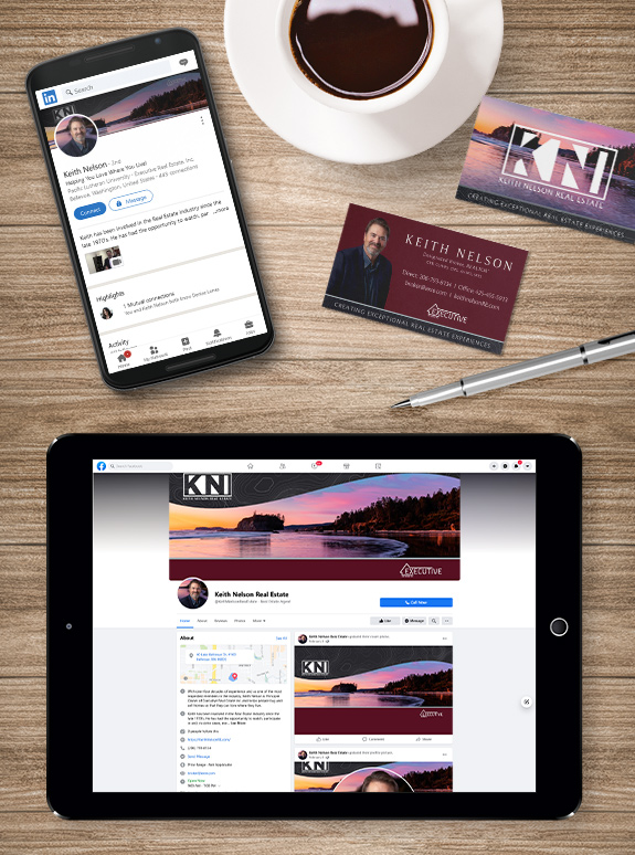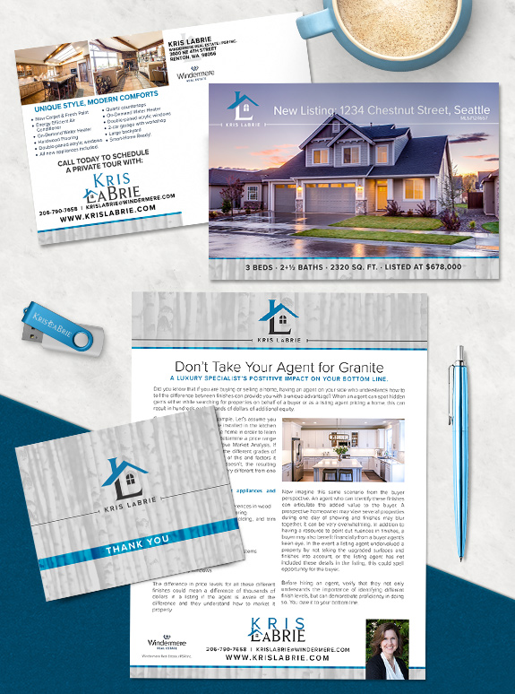
Kris LaBrie refreshed her first brand to streamline the structure and lock-in an iconic logo. The logo was the primary focus of her brand refresh. As the roofline intersects the monogram, the down-stroke of the L becomes a chimney and the horizontal leg becomes the foundation of a house. With a window filling the space […]
Posts Tagged ‘gray’
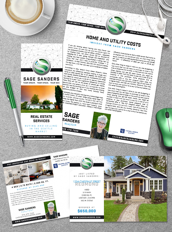
Branding Spotlight: Sage Sanders
Sage Sanders came to the branding process with an established logo that both she and her clients loved. So what was missing? The perfect support system to elevate her brand to the next level. Taking advantage of the quick turn-around of our Semi-Custom Pro program, our design team customized a simple and clean layout with […]
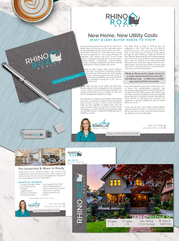
Branding Spotlight: Amy Towillis
The starting point: Amy runs her own brokerage called Rhino Roz Realty. She wanted to refresh her company’s marketing and take advantage of all the templates and systems our Impact! branding program has to offer. The strategy: When working with a brand element as strong as a rhinoceros, it’s important to keep the other elements […]
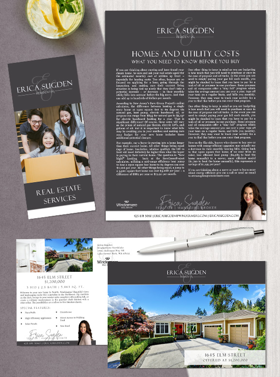
Branding Spotlight: Erica Sugden
Starting Point: With a background as a lender, Erica transitioned into real estate before taking time to raise and grow her young family. Excited and ready to re-enter the workforce after being a stay-at-home mother for two years, Erica was ready for a brand that incorporated the elegant script monogram she’d used previously with the […]
Branding Spotlight: Karen Williams
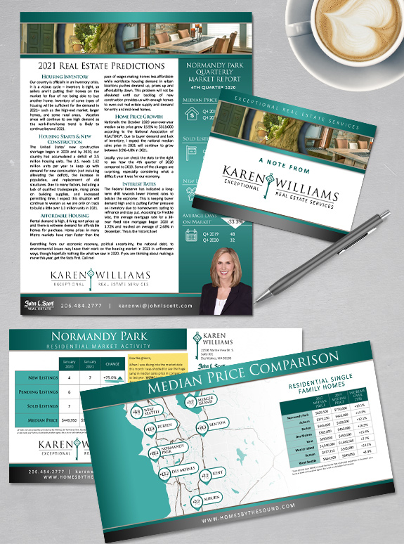
It’s a Throwback-Thursday special, and we’re highlighting Karen Williams’ brand, which is supporting her niche marketing mailers in style. Karen’s signature teal and charcoal branding makes a splash in the mail box, but it’s the value of the content that is really making waves. From annual predictions to median sale price maps, her niche clients […]
Branding Spotlight: Alicia Dietrich
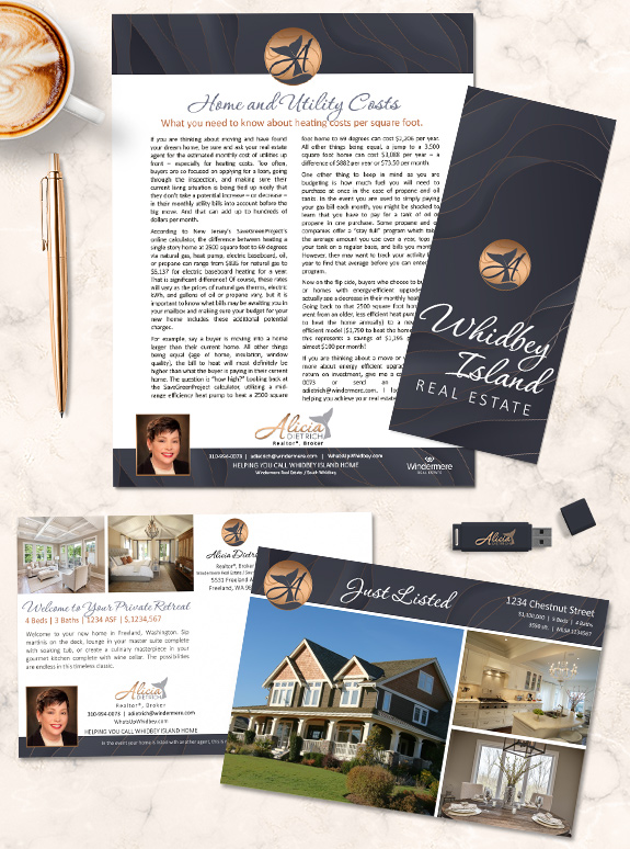
The starting point: Coming from a family of real estate agents, Alicia Dietrich wanted a professional, corporate feel brand. She caters to a variety of cultured clients mostly on Whidbey Island who are looking for a vacation destination or second home. The strategy: Looking for a luxurious palette, Alicia picked a rich purple-charcoal and combined it […]
Branding Spotlight: Ted Mansfield
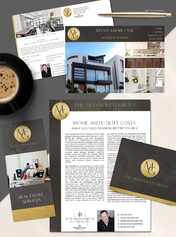
The starting point: Ted Mansfield runs his business with integrity and service as his top priorities. He wanted his new branding to communicate his dedication to going the extra mile for his clients. The target audience: Many of his clients are friends and referrals. Ted also had an Mansfield Group logo that he use for […]
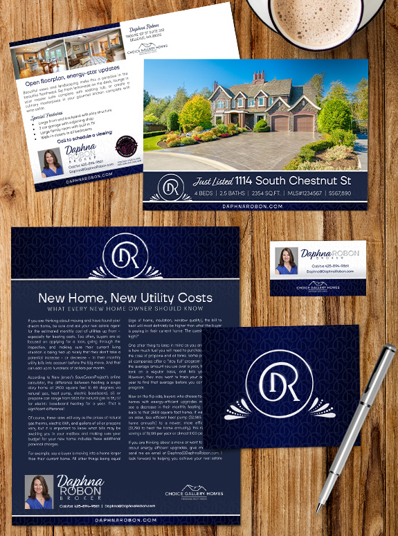
Branding Spotlight: Daphna Robon
The starting point: Daphna Robon needed a professional brand to elevate her business and marketing, so she chose a Semi-Custom PRO package. She wanted something professional and approachable with a unique monogram. The target audience: Her local sphere of influcence is familiar with her attention to detail and contract savvy. She wanted to expand her reach […]