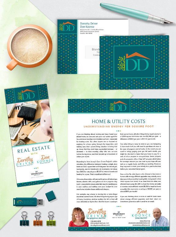
The starting point: Dorothy loves color and wanted to include all of her favorite hues in her Mastery brand. She also wanted to use dots as a major branding element, as she built brand equity with dot-patterns before. However, the final brand also needed to work well for her business partner Don and incorporate their […]
Posts Tagged ‘brush script’
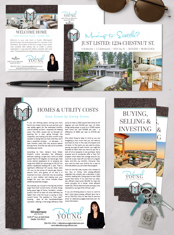
Branding Spotlight: Deborah Young
Deborah’s elegant and dramatic design style demanded a brand that would help her stand out in the luxury home market. Her spectacular wrought-iron gate logo ties the brand together, opening her business to new possibilities. Strong chocolate hues lend warmth and strength, while a pop of light aqua lightens and refreshes the page. Gentle tone-on-tone […]
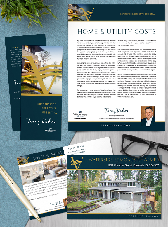
Branding Spotlight: Terry Vehrs
With over three decades of experience, Terry Vehrs’ new Mastery Brand creates a elegant and commanding backdrop for his marketing campaigns. His gold monogram, floating over a modern home image, conveys his specialty in waterfront communities. Fields of teal-navy lend strength and sophistication while a rough brush font adds personality and approachability. The simplicity of […]
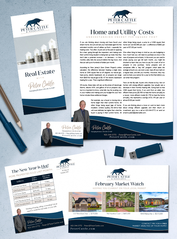
Branding Spotlight: Peter Cattle
Peter Cattle’s new custom brand captures his professional experience, honesty, and skills as an advisor. His logo, inspired by his last name, embodies the power of investing in real estate as well as his confidence when at the negotiation table. The gentle curved footer mimic’s the logo’s horns to carry the theme throughout the design. […]
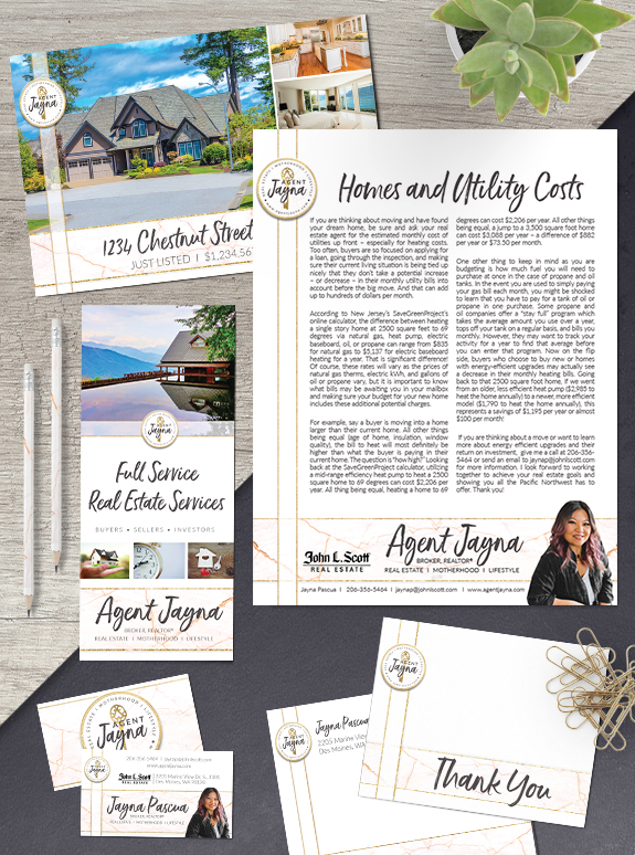
Branding Spotlight: Jayna Pascua
This week’s branding spotlight features the design of Mastery agent Jayna Pascua, from Des Moines, Washington. Jayna wanted a clean, modern brand that directed attention to her content and her logo. Her logo showcases a whimsical key, and gold accents. She selected a gold, blush, and charcoal color palette which is pulled together in a […]
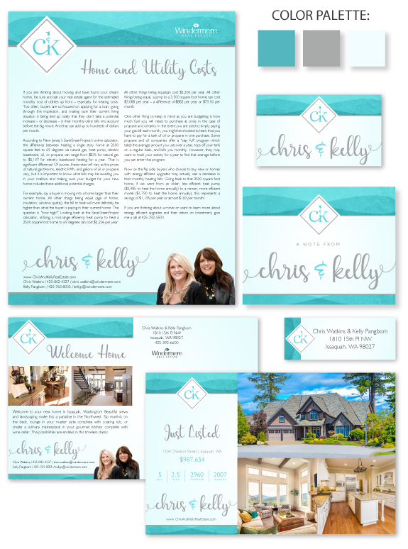
Branding Spotlight: Chris and Kelly
This week’s branding spotlight features the brand and marketing of MASTERY agents, Chris Watkins and Kelly Pangborn, from Issaquah, Washington. Chris and Kelly wanted an elegant and friendly design that would appeal to clients with adult and teenage children. The gentle stone texture in their header and footer is cleanly segmented into shades of Caribbean […]
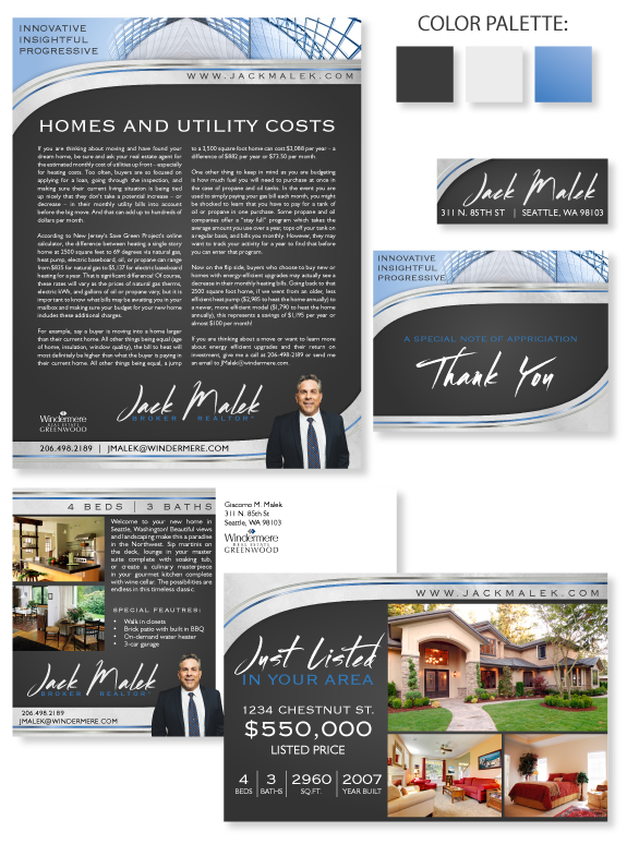
Design Spotlight: Jack Malek
This week’s design spotlight features the brand of MASTERY agent Jack Malek of Seattle, Washington. Jack loves modern architecture, especially the avant-garde use of steel, glass, and concrete in dramatic curves. The structure of his brand mimics the curves in the photos of steel-and-glass construction. A smooth concrete texture keeps the header and footer light […]
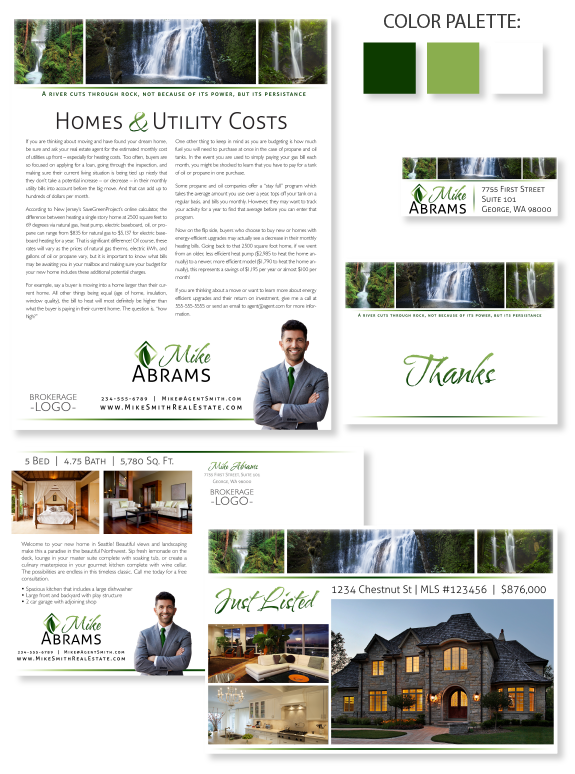
Design Spotlight: Calming Nature
This week’s design spotlight features one of our Semi-Custom Pro branding design templates, Calming Nature. This design features a panoramic photo bookend by smaller images. The subtle fades on the edges lend a dreamy look. In comparison, the property photos are crisp and bold, which helps them stand out to potential buyers. The soothing […]