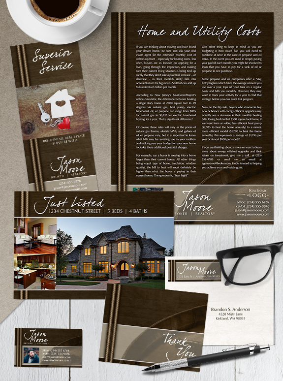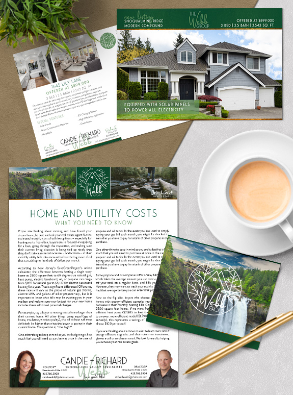
The starting point: Candie and Richard are a dynamic team who wanted a brand to make them stand out from the competition. They selected the Impact! I Want It All package and connected with our designers to make their vision a reality. The strategy: They wanted to connect with the lifestyle of their area, so […]
Posts Tagged ‘brown’
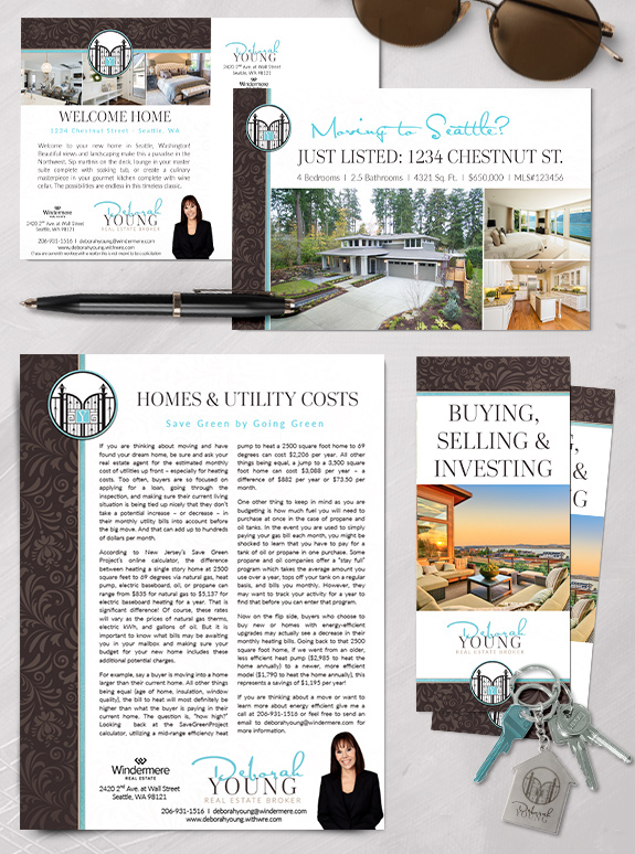
Branding Spotlight: Deborah Young
Deborah’s elegant and dramatic design style demanded a brand that would help her stand out in the luxury home market. Her spectacular wrought-iron gate logo ties the brand together, opening her business to new possibilities. Strong chocolate hues lend warmth and strength, while a pop of light aqua lightens and refreshes the page. Gentle tone-on-tone […]
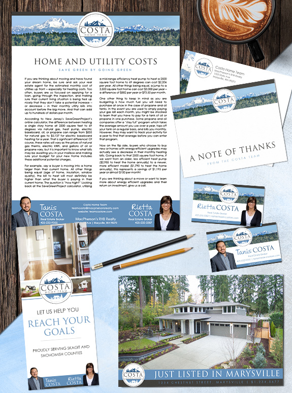
Branding Spotlight: Tanis & Rietta Costa
This week’s branding spotlight features the design of Mastery agents Tanis and Rietta Costa, from Marysville, Washington. This unique mother-and-son team really wanted to highlight the beautiful Cascade mountain range and emphasize their local expertise. The mountain panorama echos the mountain in their logo, but give prominence to marketing and property photos when needed. The […]
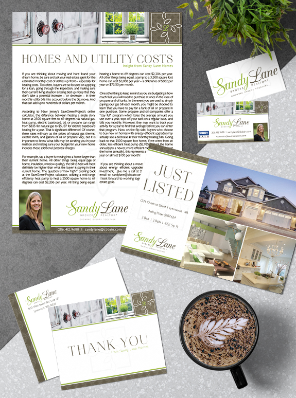
Branding Spotlight: Sandy Lane
This week’s branding spotlight features the brand and marketing of MASTERY agent Sandy Lane from Lynnwood, Washington. Sandy desired a brand that combines her love of the Northwest outdoor scenery with calming real estate imagery. The images in Sandy’s brand transmits the serene feeling of looking at calming natural view through a window, and perfectly […]
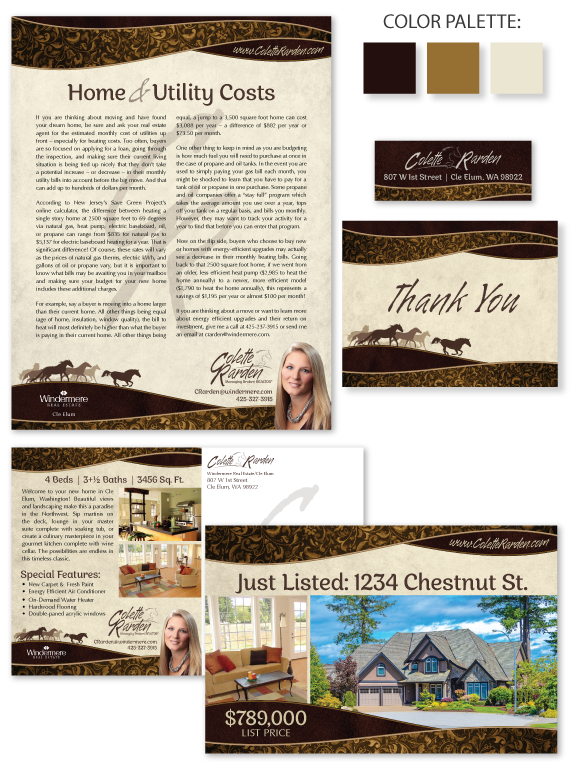
Branding Spotlight: Colette Rarden
This week’s Branding Spotlight features the design of MASTERY agent Colette Rarden, from Cle Elum, Washington. Colette requested a rustic brand with luxurious accents to showcase her expertise for rural equestrian properties. The elegant curves symbolize rolling hills or a cowboy hat brim. The Western tooling pattern adds interest and provides a touch of femininity […]
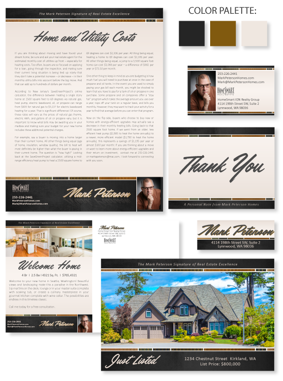
Branding Spotlight: Mark Peterson
This week’s Branding Spotlight features the design of MASTERY agent Mark Peterson, from Lynnwood, Washington. Mark came to the branding process with a mental brand image of “rugged luxury.” The timeless earth-tones create an inviting platform for his content, with crisp white lines between each shape. The charcoal header and footer add weight and contrast. The […]
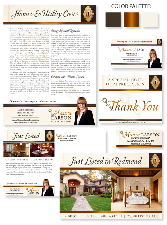
Branding Spotlight: Maura Larson
This week’s design spotlight features the brand of MASTERY agent, Maura Larson, from Redmond, Washington. Maura is a people-person with a friendly personality. Her business style is smart-casual, and her design style is elegant and simple. She desired a brand that perfectly combined her affection for connecting with her clients with her strong sense of […]
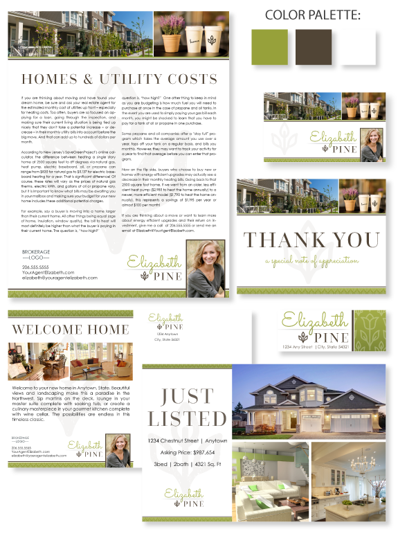
Design Spotlight: Semi-Custom Pro #120
This week’s design spotlight features our Semi-Custom Pro branding design template #120. This design is perfect for a visual agent who needs a simple but consistent design on their marketing pieces. The photo bar in the header is a great way to set the tone of your business style. In this example, we have chosen […]
Design Spotlight: Kris Holden
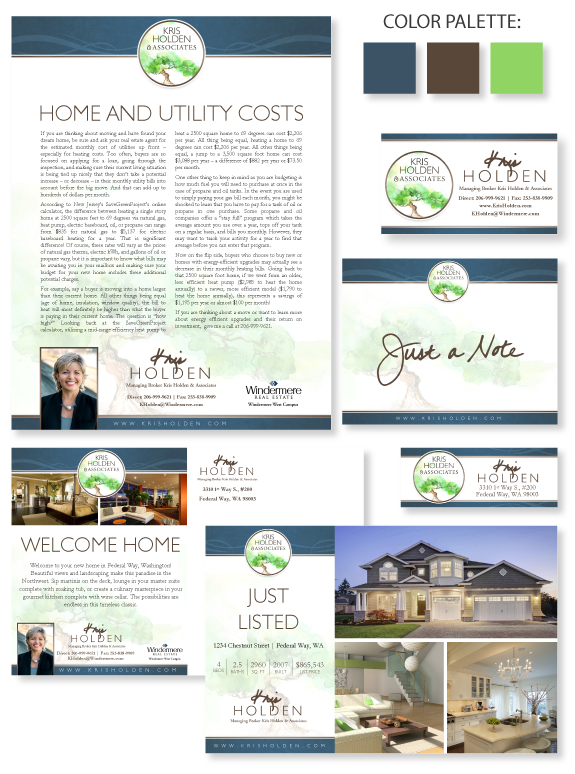
This week’s design spotlight features the brand of MASTERY agent, Kris Holden, of Federal Way, Washington. Kris started the brand process by sending our team a paint sample of her favorite shade of deep blue. We paired this blue with a warm bronze tone and a natural green. The watercolor painting of the beautiful grounded […]