branding examples | The Zebra Blog

Posts Tagged ‘branding examples’

Design Spotlight: “Business on the Water”

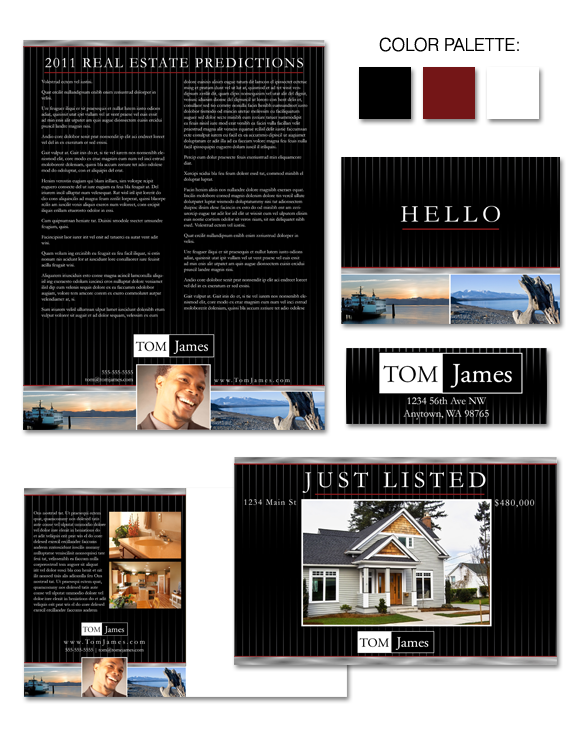
Dark and dramatic, our “Business on the Water” design allows you to highlight your love of all things water! The pinstripe effect resonates particularly well with men, as does the strong color palette. If you’re looking for an attention-grabbing brand with a subtle nod to the waters of the Pacific Northwest, this may well be […]

Design Spotlight: “Green Glass”

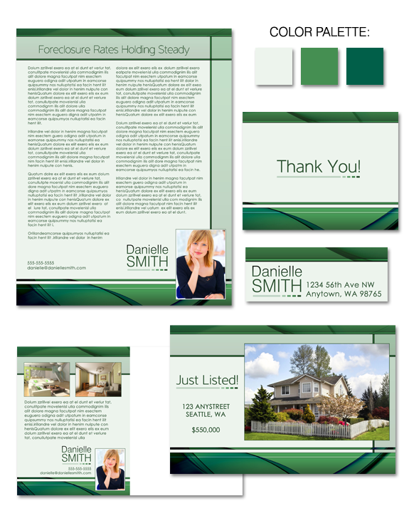
Are you looking for a brand that’s simple and clean … with complex layers of color? Look no further! “Green Glass” may be the perfect solution for you. With visual references to green sea glass, this eye-catching design imparts a sense of calm and serenity, offering both movement and a solid structure.

Design Spotlight: “Budding Willow”

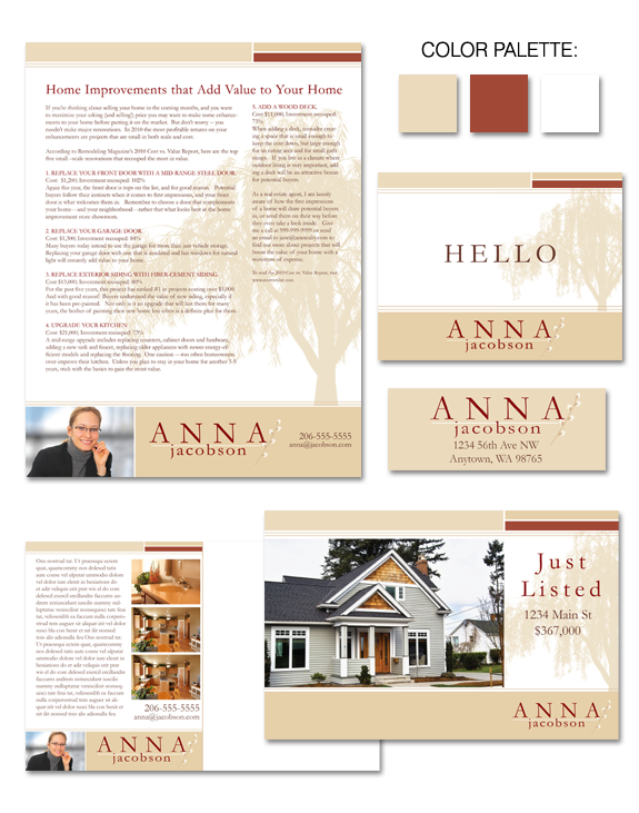
Understated design with a natural flair – that’s the beauty of our “Budding Willow” design. The neutral, natural palette allows you to showcase your listings while still conveying a sense of quality. Designs with silhouetted images provide for a high level of legibility – always a plus when you’re sharing information with clients.

Design Spotlight: “African Dreams”

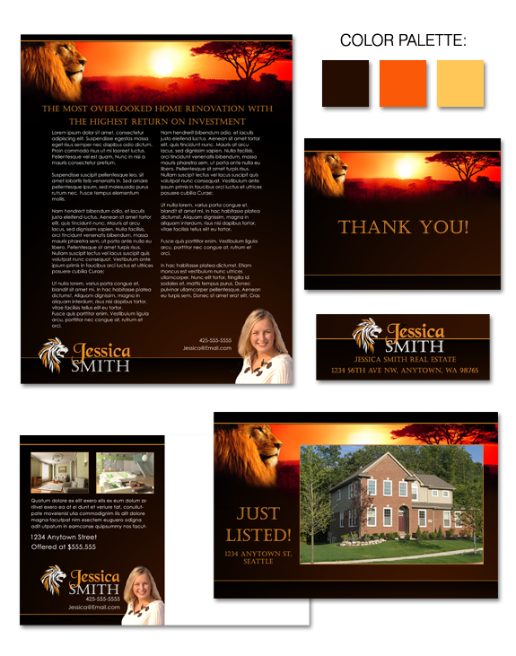
Bold imagery, and a strong color story, combine to create the “African Dreams” brand.  This high-impact brand includes a strong name treatment and a bold yet serene backdrop to help highlight all you have to offer your clients.  You won’t be forgotten when potential clients see this design!

Design Spotlight: Nina Bjornstal

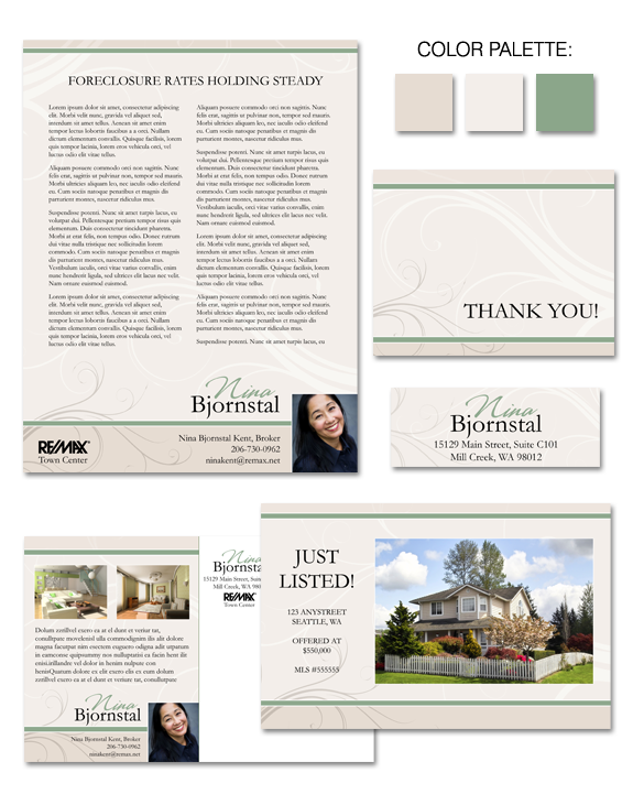
A muted palette with nuanced details was the perfect fit for Nina Bjornstal’s brand. An approachable agent skilled at explaining the complexities of today’s real estate transactions, Nina wanted a brand that emphasized her low-key, low-drama approach to the home buying and selling process. A brand like Nina’s highlights her polished and professional approach to […]

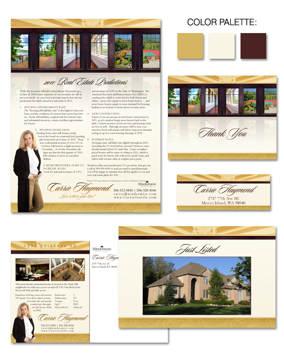
Design Spotlight: Carrie Haymond

Carrie Haymond’s recently completed brand is a study in muted beauty, and portrays a sense of substance. It was important to Carrie that her brand project in image of quality, without feeling exclusionary.  A palette of gold, supported by brown and black tones, does exactly that.  And, like many of our clients, Carrie wanted something […]

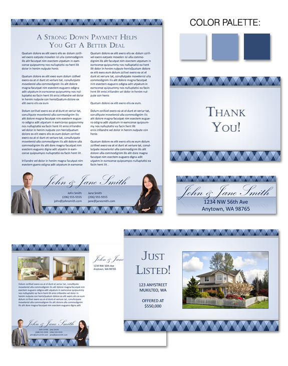
Design Spotlight: “Argyle Reflections”

Argyle Reflections takes a classic argyle pattern and provides a contemporary twist via the use of a single, unified color palette and subtle reflections throughout the design.  The use of blue, which typically represents knowledge and integrity, is an excellent choice for real estate agents. The crisp, clean design shines the spotlight on your content […]

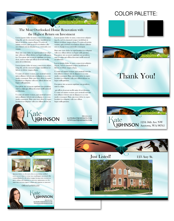
Design Spotlight: “Satin and Diamonds”

Satin and Diamonds offers a sense of whimsy and character, without verging on the childish or cartoonish. A soft, satin background contrasts with the strong accent elements and provides a depth and texture to help your listings shine. Community, area, and lifestyle photos help personalize the brand.

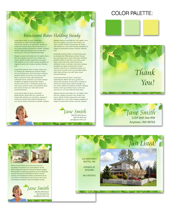
Design Spotlight: “Spring Leaves”

design-spring-leaves

A sense of calm and serenity is communicated with our Spring Leaves brand. A great solution for agents with “Natural” design styles, the brand is also appropriate for agents positioning themselves as a “green” or “eco-friendly” specialist. With its fresh and organic palette and clean lines, Spring Leaves creates a subtle structure for design without […]

Design Spotlight: “Contemporary Steel”

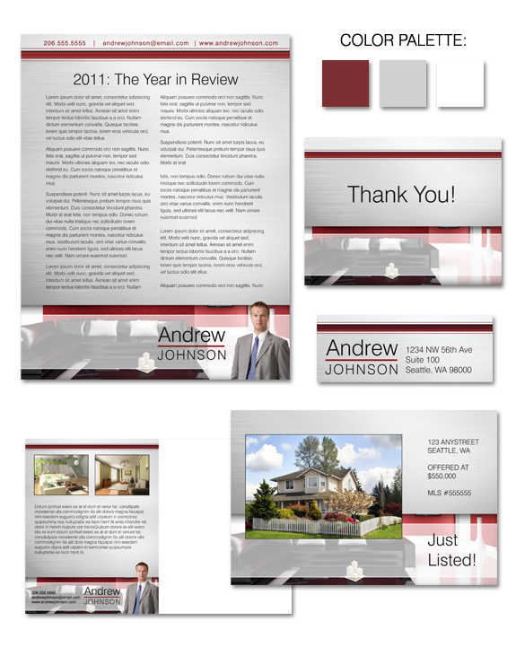
Looking for something different in your brand?  Look no further!  Contemporary Steel is a subtle design with modern lines, designed to place the focus on you and your listings.  That subtlety – coupled with a color palette of neutral brushed metal gray – allows you to showcase your listings beautifully!

Awesome, timely advice for real estate agents. Delivered weekly.
  • Fresh trends
  • Best practices
  • Research and statistics

Enter your email and stay on top of things,


Subscribe!