branding examples | The Zebra Blog

Posts Tagged ‘branding examples’

Design Spotlight: Andrea Chatard

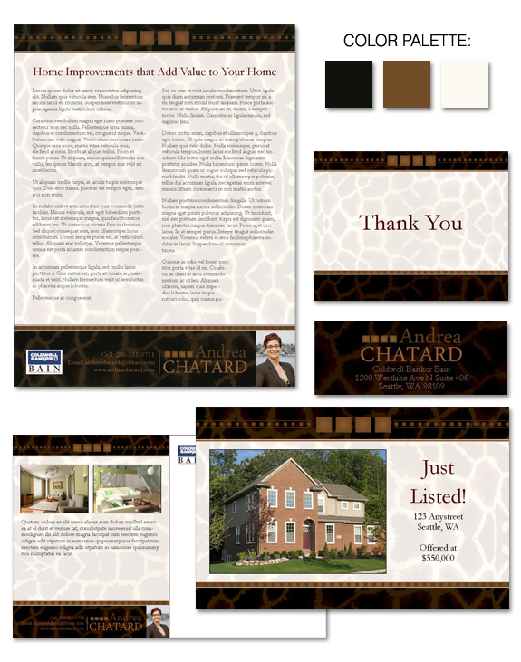
Now here’s a brand with sizzle and style — that will help keep the agent top-of-mind with clients. Andrea Chatard is part of our EVOLVE coaching group.  She’s one of those agents with personality PLUS, and she needed a brand that delivered that same message.  Using her preferred color palette of dark cocoa, warm sienna, […]

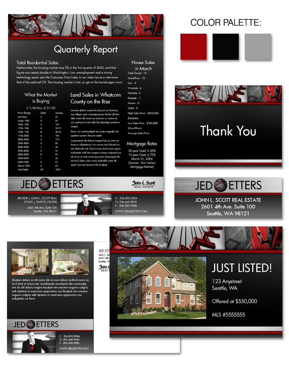
Design Spotlight: Jed Etters

A design palette of black, grey, and red creates a strong and dramatic impact. It’s not a good fit for every agent – but it was the perfect fit for Jed Etters! Jed asked us to create a memorable brand … the kind of brand that, once seen, is unforgettable. The look we created matched […]

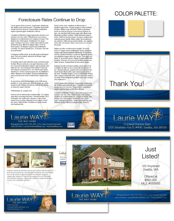
Design Spotlight: Laurie Way

What a great take on the theme of “navigation” this brand offers!  And it’s perfect for EVOLVE coaching client Laurie Way, who specializes in properties located on and around the Lake Union area in Seattle. Blue is an often-used color in branding, but our incorporation of a warm yellow-beige warms this brand it keeps it […]

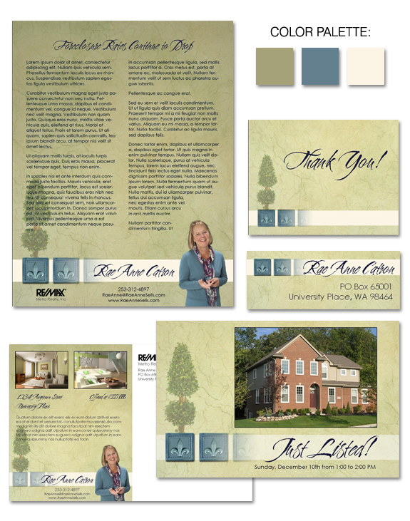
Design Spotlight: Rae Anne Catron

If the term “approachable elegance” comes to mind when you view Rae Anne Catron’s brand then we’ve done our job! Rae Anne has built a successful business due in part to her warm and welcoming way with clients.  It was important to her that her brand communicate this feeling to clients, while not being too […]

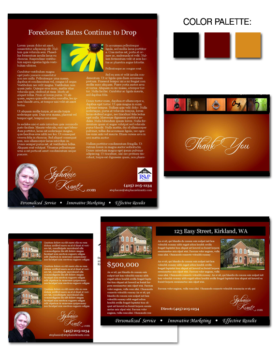
Design Spotlight: Stephanie Krantz

If you want to create a sense of warmth, sometimes a warm color palette is a good starting point! That’s exactly how we began working with Stephanie Krantz on her new business brand.  The rich golds and burgundies of Stephanie’s brand evoke an immediate response in the viewer … and the sunflower is sure to […]

Design Spotlight: “Colonial Dreams”

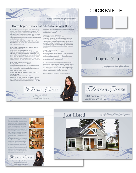
Cool as a cucumber, “Colonial Dreams” offers a serene pallete, which is an ideal backdrop on which to market not only yourself, but your sellers’ listings. Delicate scrollwork offers a subtle design touch, without distracting from the business at hand. And the secondary font and name treatment allow your style to shine! Not all parts […]

Design Spotlight: “Smooth as Silk”

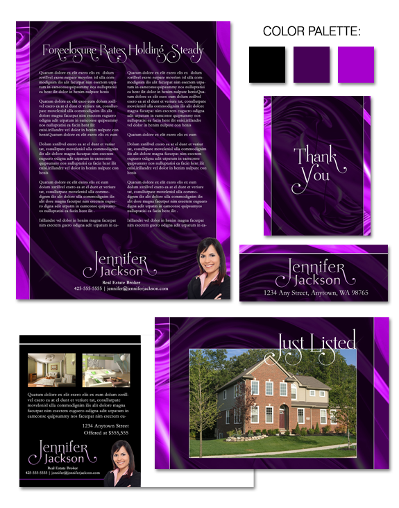
“Smooth as Silk” is our latest brand – and it’s a bold one! Here, we’ve implemented a confident take on purple.  As a color, purple blends the stability of blue and the energy of red.  When used in a saturated manner as we have here, it creates a brand impact that will appeal to artistic […]

Design Spotlight: “Nocturne in Blue”

“Nocturne in Blue” is a beautiful design, with a lyrical feeling and a sense of movement. Although the brand offers multiple rich layers of detail, the design is not intrusive.  In fact, the brand has been carefully developed to provide an ideal format to showcase your business.

Design Spotlight: “Wayward Madrona”

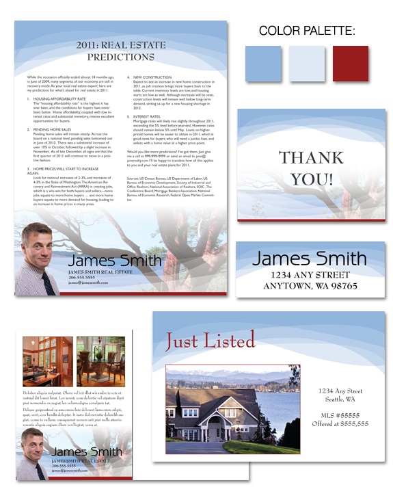
Madrona trees are unique to the Pacific Northwest portion of the United States, and are an iconic image in that part of the country, particularly in coastal areas. We’ve based the color palette for “Wayward Madrona” on a madrona tree’s most notable feature — it’s reddish bark, which regularly peels off the trunk — and […]

Design Spotlight: “Welcome to the Northwest”

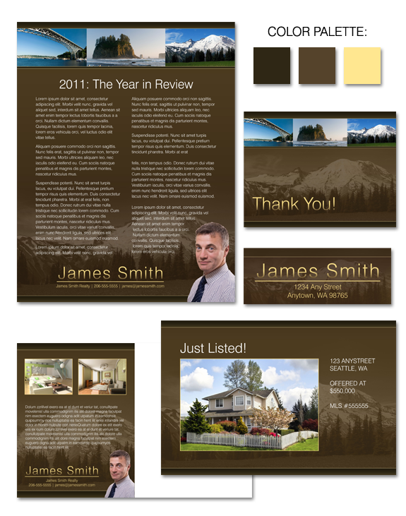
What happens when you mix rich chocolate brown, cool creamy vanilla, and a stunning backdrop of scenery? “Welcome to the Northwest”, that’s what! Washington is home to some of the most jaw-dropping scenery in the United States, and many agents who live and work in this area like to capitalize on the natural beauty in […]

Awesome, timely advice for real estate agents. Delivered weekly.
  • Fresh trends
  • Best practices
  • Research and statistics

Enter your email and stay on top of things,


Subscribe!