With social-distancing in effect, you might have some extra time to dedicate to refreshing you brand. Are there any brand adjustments you’ve been putting off, such as portrait and brokerage logo replacements? Have you been dreaming of a new logo? You grow and develop as an agent and an individual… shouldn’t your brand grow with […]
Posts Tagged ‘brand refresh’
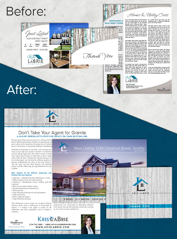
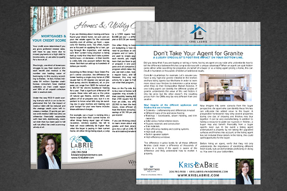
Branding Spotlight: Kris LaBrie – Brand Refresh
The starting point: Kris LaBrie is a Mastery graduate, and has been using her brand for several years now. A year after Windermere refreshed their company branding, Kris decided she needed something a little brighter and fresher to match. She especially wanted a stand-alone logo to help her marketing in areas that were not traditional print. […]
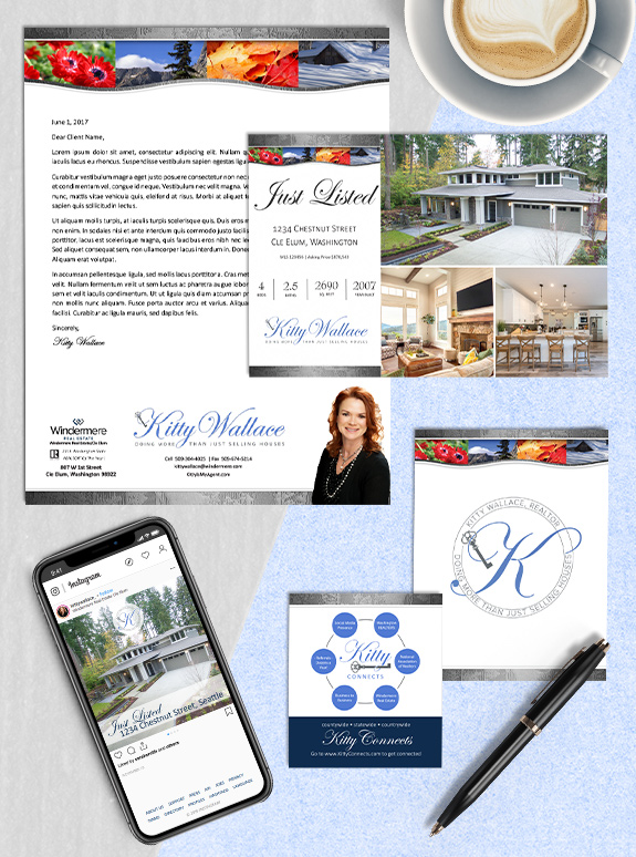
Branding Spotlight: Kitty Wallace
The starting point: Kitty already has a unique and eye-catching brand that we recently refreshed, but she wanted bring a little more color and versatility to her logo and name treatment. The target audience: Kitty is from Cle Elum, Washington, and wanted her logo to stay true to the brand equity she had already built […]
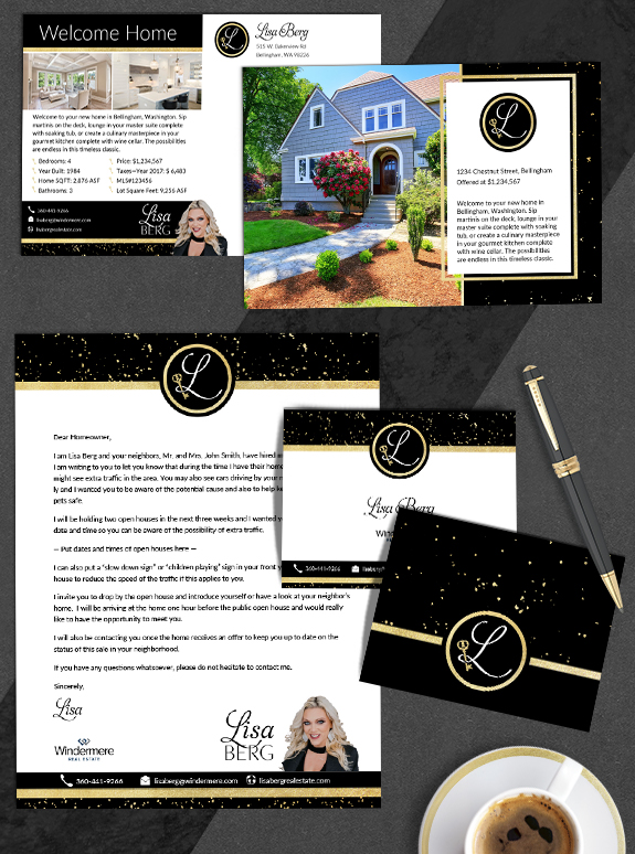
Branding Spotlight: Lisa Berg
The starting point: Lisa needed a logo that was as bold and dazzling as her personality. She is well-known in the Whatcom County community due to her high-visibility marketing efforts, community involvement, and her graciousness to other brokers. Her original logo featured a hand drawn key, but she wanted a key emblem with more Victorian […]
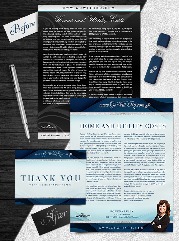
Brand Spotlight: Rowena Lusby
This week’s design spotlight features the lovely refreshed brand of Go with Ro, a Southern Washington-based team led by Rowena Lusby. Go with Ro is a powerhouse, and needed a bold brand to complement their strengths. We kept the paw print from her previous brand to highlight Rowena’s love of animal rescue. The overall result […]
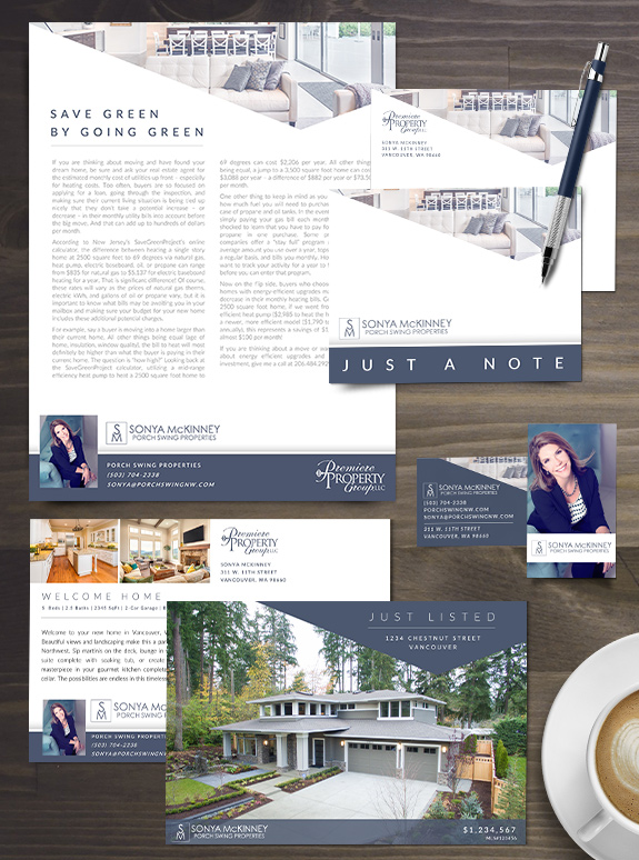
Branding Spotlight: Sonya McKinney
Sonya’s new brand is bold, modern and edgy all at once. The most unique element of Sonya’s brand is her one-of-a-kind asymmetrical header shape. She selected a gorgeous midnight blue color, which pairs perfectly with the blue-toned luxury living room inside the angled header. The background of her marketing materials is bright and open, and […]
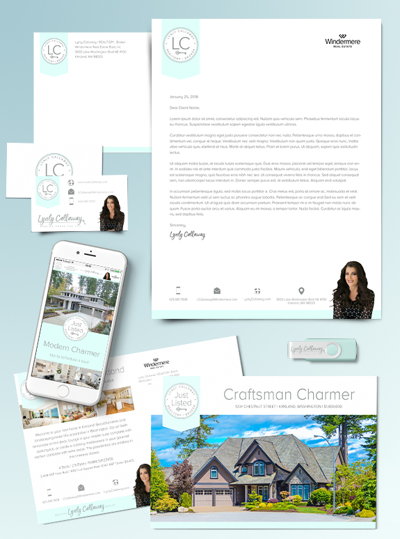
Branding Spotlight: Lynly Callaway
Today, our Branding Spotlight features Lynly Callaway’s refreshed brand. Lynly is the type of agent who has a strong sense of modern design and a competent business style. After using her original Lones Group brand for almost a decade, she decided she had moved away from the doors and dark lines and colored background of […]
Ask Denise: Considering Colors
Q: “Denise, I have a brand that I have been using for a few years. I had aligned my color palette with my company’s but I am moving companies and am not sure what to do. Do I adjust my color palette to match my new company? Stick with what I’ve got? Or adjust to […]
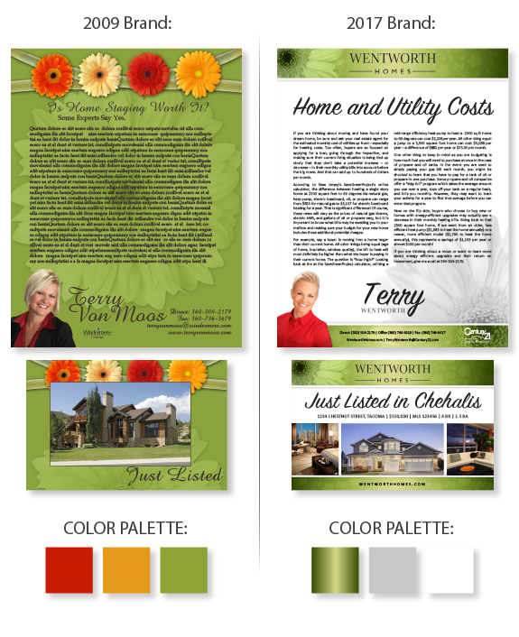
Design Spotlight: Terry Wentworth
This week’s design spotlight features the refreshed brand of eight-year Lones Group patron, Terry Wentworth from Centralia, Washington. Terry’s first brand featured strong green colors and a linked line of daises, earning the reputation as “the daisy agent” in her area. When she began the brand refresh process, it was our goal to provide more […]
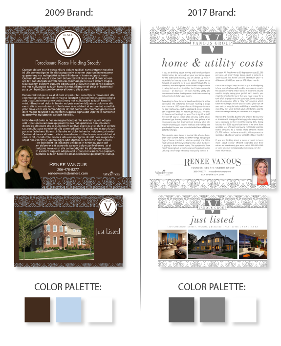
Design Spotlight: Renee Vanous
This week’s design spotlight features the refreshed brand of ENCORE member, Renee Vanous. Renee has been working to build a successful real estate team under the name “The Vanous Group” and wanted a brand to reflect her new team dynamic. Renee purchased her first brand through The Lones Group in 2009, and returned in 2016 […]