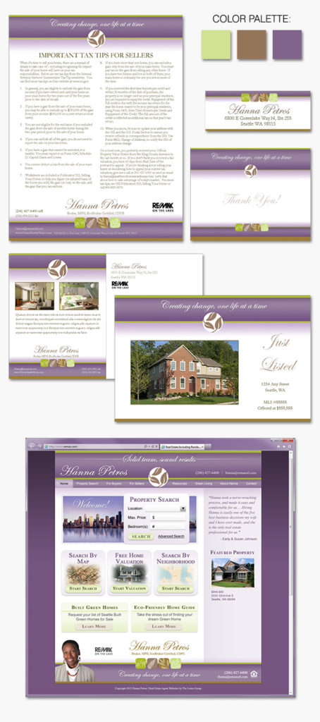
Today’s design spotlight features one of our past custom, Signature Branding clients, Hanna Petros. Hanna is a native of Seattle and enjoys being a part of the vibrant culture of the city. She wanted a design that would send a subtle “green” vibe to highlight her interests in Built Green and Eco-Friendly homes. Her branding […]
Posts Tagged ‘brand identity’
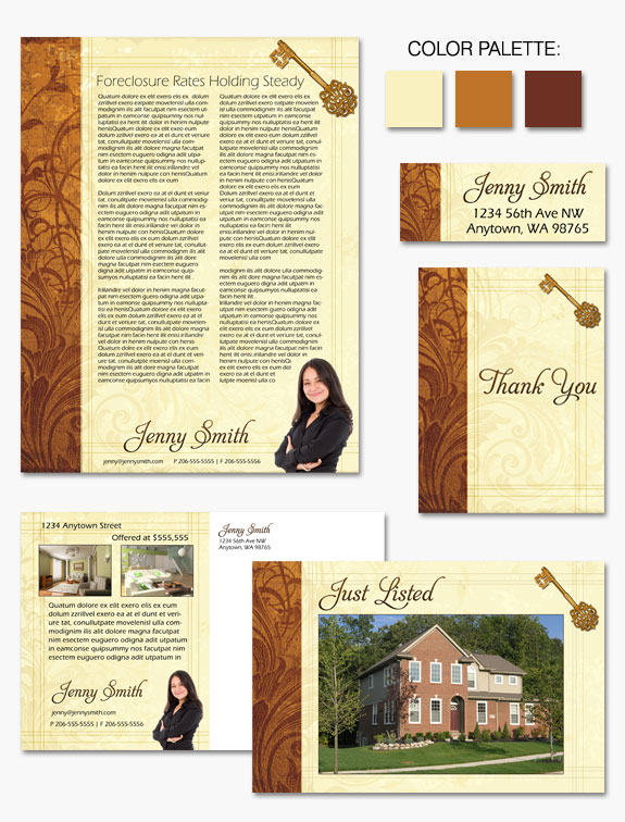
Design Spotlight: Fluid Gold
“Fluid Gold” is a an classic, elegant design favorite from our Instant Identity collection. A cohesive melding of golden hues dance across the page in a swirling floral display. Framing the curling brocade are straight geometric lines that play against the patterns around them. Finished off with timeless fonts and an embellished golden key as […]
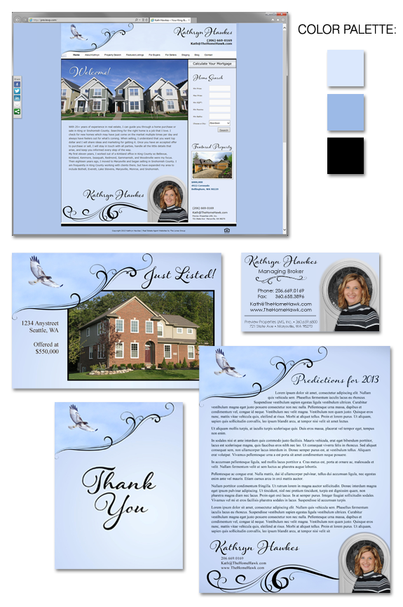
Design Spotlight: Kathryn Hawkes
Kathryn Hawkes came to us as an Instant Identity Marketing Makeover client with some creative ideas about her branding. Kath wanted feature a photograph of a hawk as a key ingredient to her branding concept – playing off of her last name. Using the sky blue hues from the photo we created a memorable design, […]
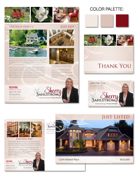
Design Spotlight: Sherry Sahlstrom
Sherry Sahlstrom was one of our Signature Makeover clients who came to us desiring a one-of-a-kind brand to set her apart and highlight her home staging expertise. Sherry’s experience in staging and interior design gave her a unique perspective on the branding process and helped us nail down the perfect design for her: classic, bold, […]
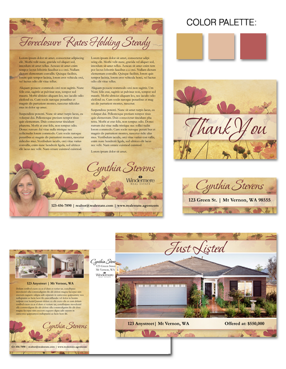
Design Spotlight: Parchment Posies
“Parchment Posies” is the most recent design available in our Instant Identity portfolio. The warm tones of antiqued parchment provide a welcoming backdrop for bright florals. Ruddy hued blossoms and delicate stems paint a picture of nature at its best that mingles effortlessly with the sunny tones of the page. Simple and tasteful, but at […]
Design Spotlight: Simplicity Squared
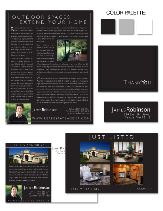
“Simplicity Squared” is the newest design available in our Instant Identity portfolio. Sleek. Black. Minimal. Simplicity Squared is a contemporary take on an understated idea: let the content and photos speak for themselves. The high contrast between the black background and white elements creates visual interest and grabs your attention. Classic, yet modern, this design […]
Design Spotlight: Michelle Woo
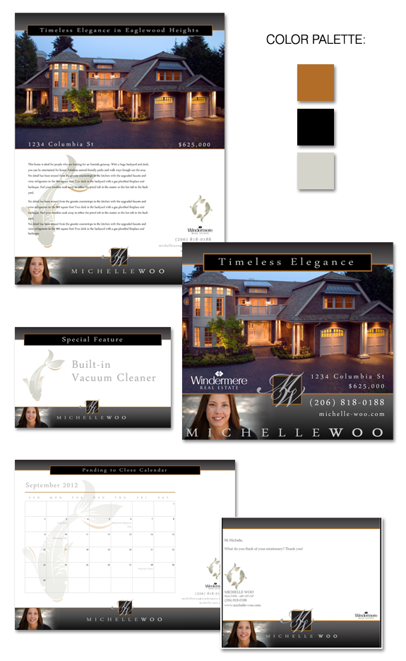
Michelle came to us wanting a dramatic and architectural-feeling brand that showcased her professionalism and business savvy. Michelle takes great care of her clients, but also likes the constant change in the industry. When she shared with us that she also liked koi, we knew exactly how to put the finishing touches on her Signature […]
Design Spotlight: “Knobby Swirls”
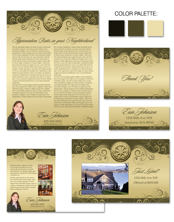
Our latest brand, “Knobby Swirls,” proves that “neutral” does not equal “boring.” The center medallion strongly provides an initial focal point, while the swirls gently draw viewer’s eyes to the corners of the piece. Because of this, it provides an excellent framework for property marketing. Lyrical in feeling, sophisticated in palette… is “Knobby Swirls” the […]
Design Spotlight: “Caramel Macchiato”
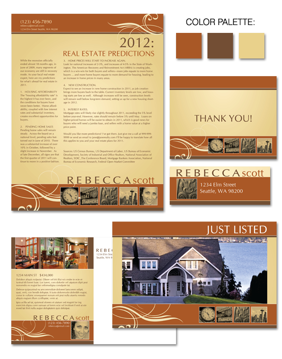
Do you think brown = boring? We couldn’t disagree more! In fact, shades of brown can be very effective, depending on the message of your brand. Brown represents stability, orderliness, confidence, and reliability — all positive traits to have, particularly in an industry which is often viewed with skepticism by consumers. We’ve elevated basic brown […]
Why You Need Your Own “Brand,” by Denise Lones
By Denise Lones M.I.R.M., CSP A new client of mine was recently approached by her broker. He didn’t understand why the agent hired me to do “branding”. His comment? “Why do you need to spend money on that? We have company marketing materials that you can use.” Sound familiar? I bet it does. Many agents […]