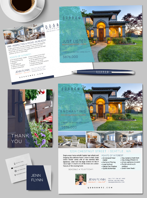
The starting point: Jenn owns her brokerage, Quorum Laurelhurst, and wanted a consistent look for her whole team that would span print and digital media. The target audience: Her team serves a wide variety of clients, so the brand needed to edify all kinds of content, from property marketing to agent marketing to team recruiting.
Posts Tagged ‘aqua’
Branding Spotlight: Teresa Nielsen
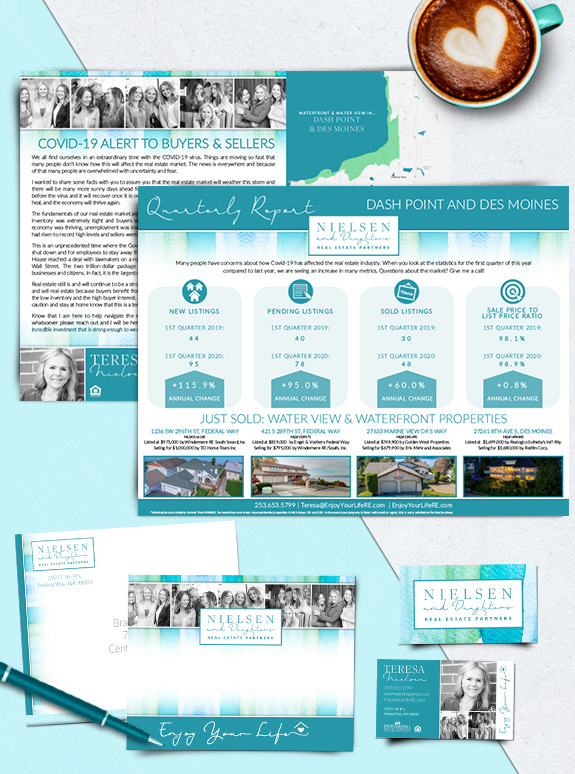
The starting point: Today, we’re revisiting Teresa Neilsen’s beautiful teal brand as she focuses on streamlining the value of her geo-farm marketing. The target audience: Teresa is building her niche in waterfront and water-view properties between Des Moines and Dash Point. The strategy: Clean but content-rich postcard mailers make a splash in every mailbox.
Branding Spotlight: Krista Riner Hefty
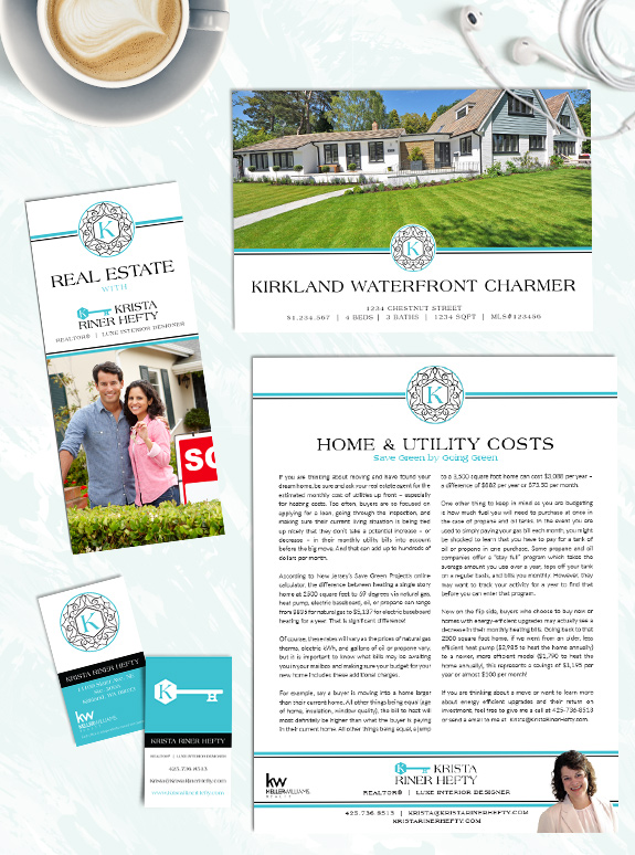
The starting point: Krista started with a unique logo and a teal color she loved, but she needed to get systematized with templates to maximize her marketing. She selected a Custom design package to give her brand a solid foundation. The target audience: Krista wanted a design that would work for her “casual luxury” clients […]
Branding Spotlight: Kitty Ballard
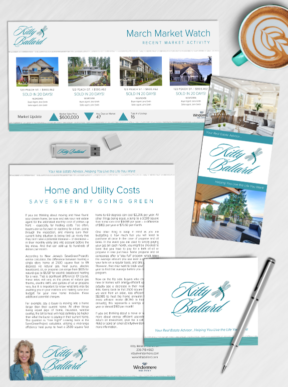
The starting point: Kitty Ballard has been in the real estate industry for 19 years. She’s a work-hard-play-hard kind of woman, with a passion for sports and an boutique business style. She has a sparkling personality and wanted to bring that into her new marketing. The target audience: While she loves her current and past […]
Branding Spotlight: Lauri Carter
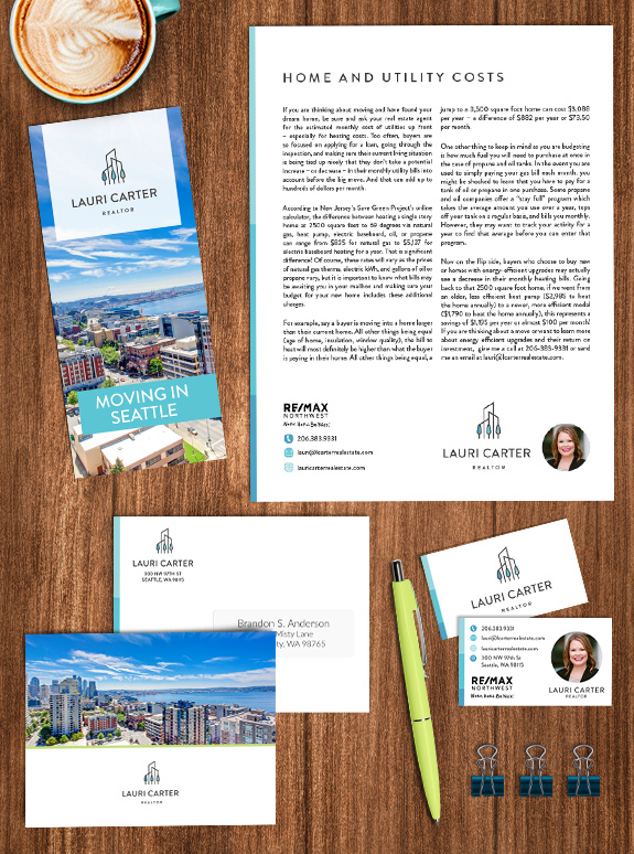
The starting point: Lauri entered real estate after a wrist injury ended a 25-year career as a chef and restaurant owner. Fortunately, the organization and business skills from her first career transferred well and she took on the Mastery program to bring her marketing to the next level. The target audience: She enjoys working with […]
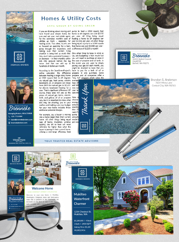
Branding Spotlight: Shawna & Russell Brenneke
The starting point: Shawna and Russell have been in the business for many years and wanted a custom brand to take their business to the next level. Their personalities perfectly complement each other, and their design needed to highlight their teamwork. The strategy: They selected a Custom branding package to get the maximum versatility and […]
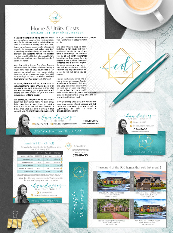
Branding Spotlight: Chan Davies
Chan Davies wanted a refreshing brand design that appeals to new buyers in Bothell. The crisp geometric pattern around the edge of her marketing materials creates a soft frame for her valuable content. The rich teal tone combined with luxe gold perfectly blend to convey modern minimalism. To provide additional approachability and comfort, her name […]
Branding Spotlight: Jen Suemnicht
Jen Suemnicht is making a splash with her new Semi-Custom PRO brand. The bright townhome imagery and leafy pattern in Jen’s new branding are tied together by her new logo. The modular layout separates the branding from the content, keeping everything neat and organized, which is perfect for an analytical thinker like Jen! These brand […]
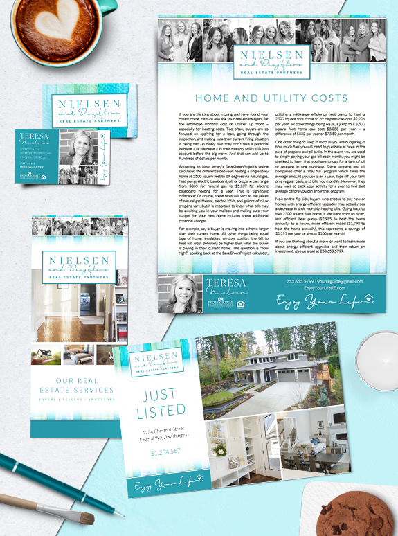
Branding Spotlight: Teresa Nielsen & Daughters
A genuine family business, Teresa Nielsen and her daughters wanted something very personal and approachable in their Mastery brand. Teresa’s personal mantra is “enjoy your life”, and the unique use of candid shots in a black-and-white brings her message to life. The Nielsen team wanted fun, bright colors in their brand such as teal, aqua, […]