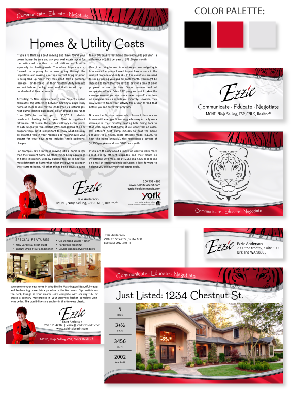
This week’s Branding Spotlight features the design of MASTERY agent Ezzie Anderson, from Woodinville, Washington. Ezzie has a bold and energetic business style, and is a self-proclaimed tigress at the negotiation table. She wanted a brand that would portray her fun-loving, outgoing personality and her wealth of professional experience and confidence. The focal point of Ezzie’s brand is a symbol of her favorite animal, a Bengal Tiger, and distinct tiger stripes. The combination of the tiger imagery provides her with versatility among her branded materials and equips her with the flexibility to seamlessly maintain a consistent brand image across all marketing materials and platforms.
The soft fabric textures and delicate curves in the header and footer of Ezzie’s brand soften the rich red-black-and-white palette. The background features a soft and luxurious white-silk texture. Her unique name has always been a stand-alone brand mark, so we updated it with a new font that is modern and slightly artsy. We paired this energetic name font with an approachable-looking semi-serif font for headlines and her fitting tagline, “Communicate, Educate, Negotiate.” Ezzie’s brand perfectly embodies her natural prowess to provide fierce advocacy to her clients.
Want to learn how branding can make a difference in your real estate business? Call us at (360) 527-8904, email solutions@thelonesgroup.com, or learn more: ![]()


 Posted in
  Tags:
Tags: 
