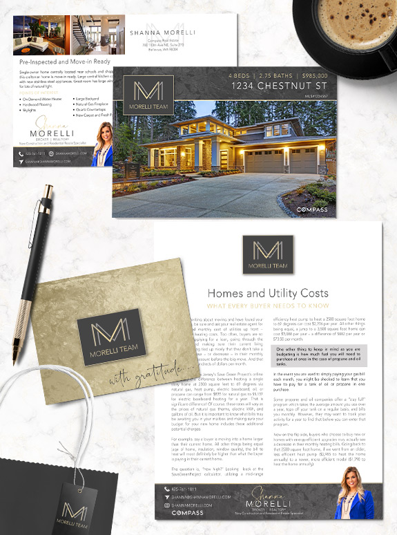
With her eye on the luxury market, Shanna wanted a brand that would help her stand out from the competition and put her content on an elegant pedestal. She selected a charcoal and champagne-gold palette, with a lavish metallic texture. Her double-M logo establishes her as the “face” of the team but also indicates that her team is right behind her. The brand uses a single sans-serif font throughout for a minimal and easy-to-read layout, which a signature script font used in her signature.
As simple as it might appear, the minimal layout with plentiful white-space allows her content to take center stage. The neutral tones compliment the edge-to-edge photography without clashing, no matter the home’s style or color. Now Shanna has the tools to take on a variety of marketing campaigns and client-oriented systems with a classic look that accentuates her natural charm.
Call us at 360-527-8904 or email solutions@thelonesgroup.com today!

Curious about how your personal style can be represented in a professional brand? Book a branding consultation today!


 Posted in
  Tags:
Tags: 
