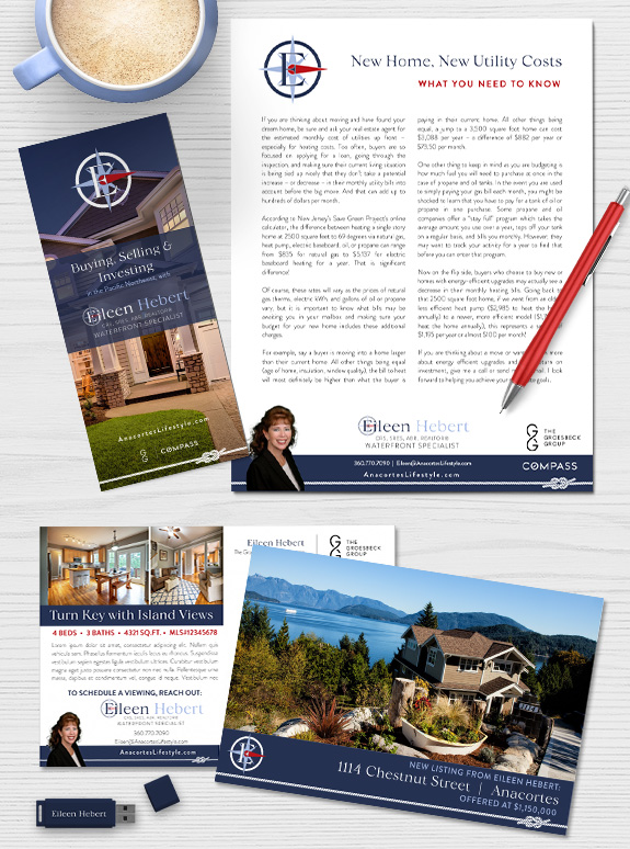
For the luxurious waterfront market on Anacortes, Eileen wanted a nautically inspired brand that would be easy to work with. It was important to her that her design would be modern and minimal enough to blend with her broker’s branding. Through our branding process, our design team determined that a red, white, and navy color palette with two graphic elements would give a nod to the coastal lifestyle without going over-the-top.
We started with a footer-only layout, with a knotted rope (or line, to use the sailing term) overlaid on a field of navy. Her logo uses a pop of red to point East and to Eileen in her name treatment and a touch of periwinkle softens the otherwise austere palette. A classic serif for her headlines is contrasted with a very modern sans-serif font used for all other text on her branding. Overall, her new branding uses a few strong elements to make an elegant statement.
Call us at 360-527-8904 or email solutions@thelonesgroup.com today!

Curious about how your personal style can be represented in a professional brand? Book a branding consultation today!


 Posted in
  Tags:
Tags: 
