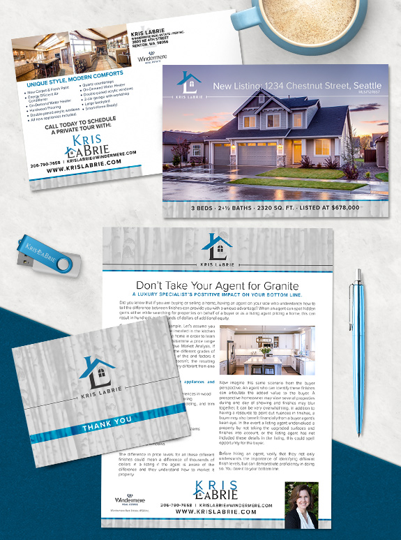
Kris LaBrie refreshed her first brand to streamline the structure and lock-in an iconic logo. The logo was the primary focus of her brand refresh. As the roofline intersects the monogram, the down-stroke of the L becomes a chimney and the horizontal leg becomes the foundation of a house. With a window filling the space between, the whole logo looks like a stylized house silhouette.
Through the rest of the brand, she retained the soft birch texture, and streamlined her color selection for to include a pop of bright blue backed by soft, light grays. This created a minimal and natural combination that helps her stand out and streamlines her marketing workflow.
To talk to a branding expert and discover how branding can make a difference in your real estate business, call us at (360) 527-8904, email solutions@thelonesgroup.com.

Curious about how branding in social media templates can streamline your online marketing? Book a branding consultation today!


 Posted in
  Tags:
Tags: 
