Logos often grab the spotlight when it comes to branding. They are a great marketing asset, and we have created hundreds of logos for our clients. Some clients come to the branding process without a clear idea of a logo. Other clients come with a partial or complete logo, and we build a brand around those themes and elements to take advantage of brand equity.
One logo that went through this journey belongs to Candie & Richard Webb. They started their branding process with a logo from another design company, but it wasn’t quite right yet. Our designers started by identifying the elements the Webbs liked and didn’t like about their logo. The elements they wanted to keep included tree concept, the script font, and the roof line. The things they didn’t like was the overall shape, the floating leaves, and the W in the background.
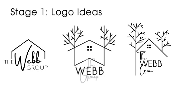
With this information, we pitched some ideas to the Webbs. Here are 3 that influenced the final logo:
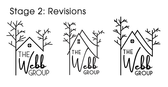
 Through several rounds of design revisions and feedback, the trees gained organic branches and the angle of the roof increased. The script font also migrated to the Webbs’ name, where it better fit the personality behind the word. Here are a few of the revisions:
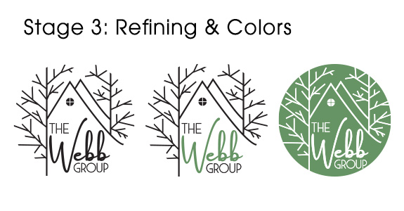
 Finally, the whole logo was confined to a perfect circle for better utility and a concise footprint.

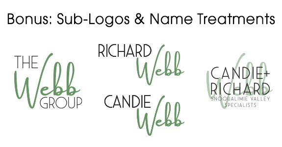
Best of all, our designers were able to extend the design elements to other sub-logos and name treatments:

With so many options that seamlessly work together, they have a versatile branding element that will translate well to print, digital, and promotional product marketing. We are excited to see where they take their new logo.
Curious about how branding gives you an edge? Book a branding consultation today!
To talk to a branding expert and discover how branding can make a difference in your real estate business, call us at (360) 527-8904, email solutions@thelonesgroup.com.


 Posted in
  Tags:
Tags: 
