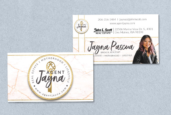
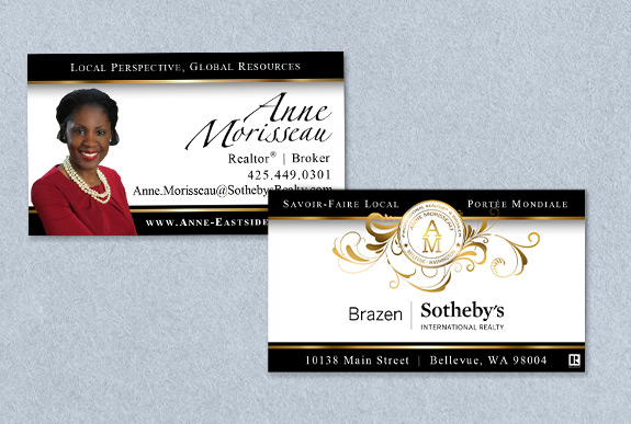
Today, we are taking a look at technical emblem logos. This is a style of logo that looks like an official stamp of approval–which is perfect, because everything you place your logo on should receive your full confidence! Important characteristics include a central icon or monogram, a frame, and some additional information wrapped around the central element. These logos can appear quite complicated and official, which has served these two agents very well in their branding.
 Jayna Pascua: Name and Key
Jayna’s logo packs a lot of punch with a three-part tagline and her website included in the information surrounding her central element. The hand-drawn key and hand-written script contrast the official vibe from the logo layout, which perfectly balances her friendly personality with her technical expertise and attention to detail.

Anne Morisseau: Sealed with a Flourish!
Before working in real estate, Anne was a structural engineer, so this official style of logo is a perfect match. Her emblem packs in her monogram, name, title, and location for a great all-in-one branding tool. It comes with an optional flourish to soften the austere design and elevate her luxurious black-and-gold branding.
Both technical emblems pack a lot of information into a small space, which is great for branding promotional products, social media, and creating labels and stickers right from the office printer. When you are ready to put your stamp of approval on your personal brand, perhaps this style will inspire you.
Technical Emblem logos are one of many different styles our team has experience creating. Curious about what style fits you and your business? Take our Design Style Analysis for a little insight and reach out for more information.
To talk to a branding expert and discover how branding can make a difference in your real estate business, call us at (360) 527-8904, email solutions@thelonesgroup.com.


 Posted in
  Tags:
Tags: 
