The starting point: Born in Finland, Susanne is drawn to minimal, Nordic design and all things outdoors. From hiking and boating to snowboarding and beyond. She started the branding process with a delightful eclectic request: she wanted to include an octopus into her brand.
The target audience: “Sisu” literally translates to “go” in Finnish, but the concept extends to a sense of strength, perseverance, and determination. This fits well with Susanne’s love of adventure and her desire to assist families relocating to a new area. She is particularly inspired by sustainable building practices.
The strategy: The pacific octopus, a local in the Puget Sound ecosystem, is also famous for its strength and determination. This made the unusual choice a perfect fit with Susanne’s personality and business style.
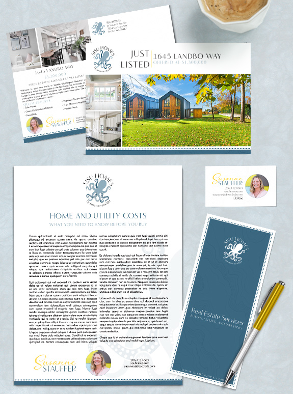
The final design: Cool ocean blues give a sense of depth and calm to the palette. The octopus from her logo is repeated as a watermark on select pieces. A line of dots and a pop of yellow complete the brand to make it friendly, approachable, and perfect for Susanne.
To talk to a branding expert and discover how branding can make a difference in your real estate business, call us at (360) 527-8904, email solutions@thelonesgroup.com.


 Posted in
  Tags:
Tags: 
