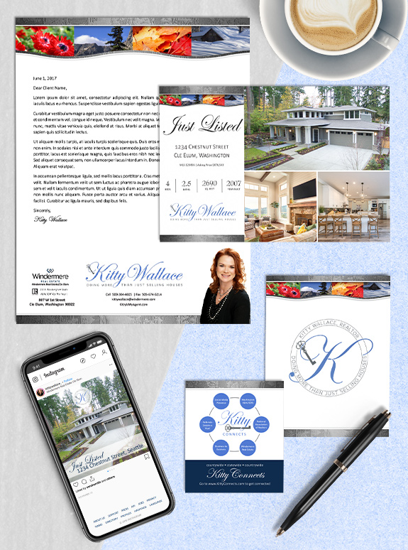
The starting point: Kitty already has a unique and eye-catching brand that we recently refreshed, but she wanted bring a little more color and versatility to her logo and name treatment.
The target audience: Kitty is from Cle Elum, Washington, and wanted her logo to stay true to the brand equity she had already built within her sphere.
The strategy: Combine colors from her signature header bar with Windermere’s colors for a professional and approachable effect. We also added an elegant key to make sure her profession was clearly represented.
The final logos: Kitty now has 4 logo variations, including her full name treatment, a shortened name treatment that only includes her first name, a round seal with a monogram, and a simplified square monogram. Even though she has a variety of logos, they all use the same colors, fonts, and key element, so it is easy for her audience to tell that they belong to the same person, no matter the application.
To talk to a branding expert and discover how branding can make a difference in your real estate business, call us at (360) 527-8904, email solutions@thelonesgroup.com.


 Posted in
  Tags:
Tags: 
