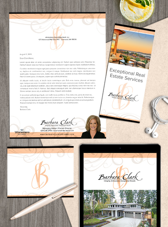
The starting point: After ten years using her well-known brown and gold brand, Barbara Clark decided she was ready for a brand refresh.
The target audience: She specializes in luxury and waterfront properties, and has a reputation for her impeccable taste in interior design and staging. On top of that, she always provides 5-star service to all her clients.
The strategy: We wanted to preserve her established brand equity by keeping the calligraphic swirls, original signature font, and linear layout. Placing those elements on a clean white background with pale salmon accents warms the design and maximizes the space for content.
The final brand: Barbara had a vision for a new monogram logo that combined the energy of the swirls with the rough edge of her name treatment. Barbara collaborated with us every step of the way to achieve her new look, and we couldn’t be happier with the result.
To talk to a branding expert and discover how branding can make a difference in your real estate business, call us at (360) 527-8904, email solutions@thelonesgroup.com.


 Posted in
  Tags:
Tags: 
