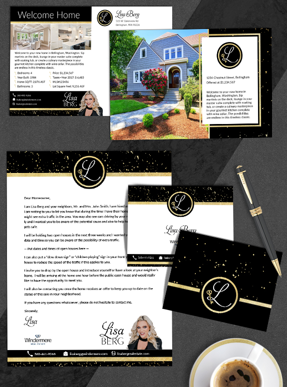
The starting point: Lisa needed a logo that was as bold and dazzling as her personality. She is well-known in the Whatcom County community due to her high-visibility marketing efforts, community involvement, and her graciousness to other brokers. Her original logo featured a hand drawn key, but she wanted a key emblem with more Victorian style.
The target audience: Denise had a strong vision of Lisa working with buyers and sellers in the luxury market. To do this, Lisa needed a logo that was highly polished, elegant and personal.
The strategy: We started by designing a custom key graphic that matched key artwork hanging in her office. Since most people know Lisa by her first name, we used a big, bold L for her monogram. We choose an elegant and easy to read font, and paired it with her favorite color combination of gold and black.
The final brand: This past month, Lisa ended up with her dream logo and so much more. From the options in her custom logo package, she selecting the stylish loopy L monogram logo. The lower loop in the L wraps around the key, holding it in a powerful and graceful fashion. The logo inspired the brand built around it. Lisa had an incredible vision to use gold flakes over bold black lines to create a dramatic and striking brand image, that fits her personal style to a T. Over the past week we created a letterhead, notecard, house flyer, just listed postcard and return address label with her gorgeous new design.
To talk to a branding expert and discover how branding can make a difference in your real estate business, call us at (360) 527-8904, email solutions@thelonesgroup.com.


 Posted in
  Tags:
Tags: 
