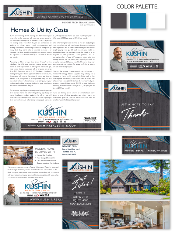
This week’s branding spotlight features the brand and marketing of MASTERY agent Brian Kushin, from Kent, Washington. Brian wanted a polished brand that conveyed his energy and experience. We used overlapping fin-shapes in the corners of his design to professionally convey his dynamic business style that isn’t deterred by challenges or obstacles. The color palette uses dark tinted wood, rich teal, and a pop of bright red-orange. The main font in his brand is a modern typeface that provides a clean and functional appearance, paired with a script font for special hand-written elements to add a personal touch. His design alternates between a crisp white background for content-heavy pieces and an edge-to-edge dark texture for statement pieces. This rich, dramatic brand communicates Brian’s fierce loyalty to his clients.
Want to learn how branding can make a difference in your real estate business? Call us at (360) 527-8904, email solutions@thelonesgroup.com, or learn more:


 Posted in
  Tags:
Tags: 
