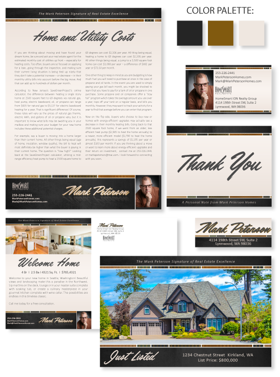
This week’s Branding Spotlight features the design of MASTERY agent Mark Peterson, from Lynnwood, Washington. Mark came to the branding process with a mental brand image of “rugged luxury.” The timeless earth-tones create an inviting platform for his content, with crisp white lines between each shape. The charcoal header and footer add weight and contrast. The blocks in the header and footer display a subtle rugged/natural halftone texture, and the smaller color blocks feature an additional ornate, luxurious gold pattern. The background features a tranquil pearlescent color that helps make the text pop.He loves retro script fonts with a strong slant, and we paired his final selection with a modern sans-serif font to enhance readability. To increase the drama of the name treatment, we used the satin gradient colors from the background and applied a soft and sweet reflection. Overall, this classic design matches Mark’s soft-spoken personality and the timeless style will propel his business forward.
Want to learn how branding can make a difference in your real estate business? Call us at (360) 527-8904, email solutions@thelonesgroup.com, or learn more: ![]()


 Posted in
  Tags:
Tags: 
