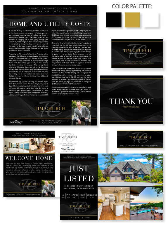
This week’s design spotlight features the brand of MASTERY agent Tim Church, from Issaquah, Washington. Tim wanted a simple but dramatic design that would appeal to his luxury clients. His palette is predominantly black with a pop of warm goldenrod. Gentle watermark waves in the background add interest and soften the impact of his crisp linear structure but don’t distract from his important content. His header and footer are solid black to keep his contact information and tagline easy to read. His casual portrait captures his northwest business style, which is both professional and friendly. His stately name treatment is softened with the use of an organic brush font for his initials.
Want to learn how branding can make a difference in your real estate business? Call us at (360) 527-8904, email solutions@thelonesgroup.com, or learn more:


 Posted in
  Tags:
Tags: 

Love this branding Joe! Congratulations!