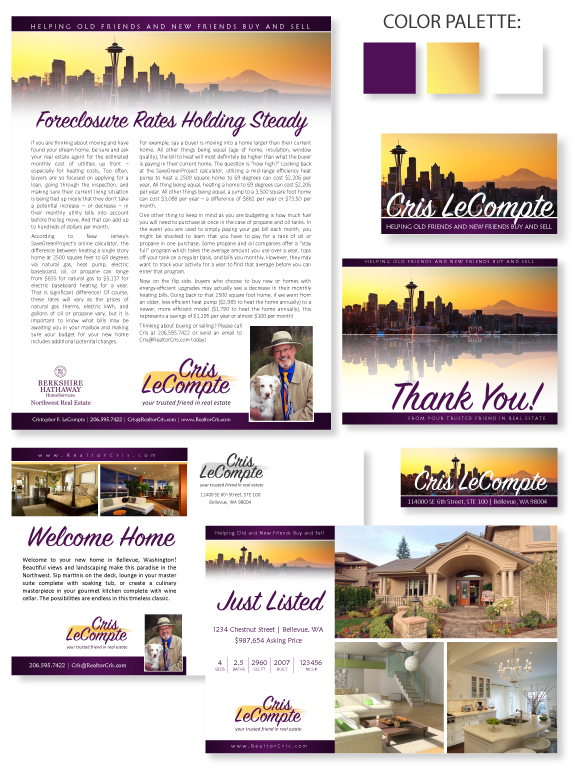
This week’s design spotlight features the brand of MASTERY client Cris LeCompte, from Bellevue, Washington. Cris has a dramatic and eclectic design style, which is a rare combination! He wanted a design that conveys professionalism and approachability, as he is dedicated to personalized and friendly customer service, which he has spent his lifetime developing. This attractive image of a sunrise over Seattle has special meaning for Cris, and was taken by a friend’s photography company called Some Like it Shot. On special pieces, such as the notecard, we use the image with a reflection, which enhances the overall impact.
The image features deep shades and a gold to orange color scheme, which is repeated across property marketing materials. The colors of the dawn sky are radiant, contrasting with the purple banners and headline text. The modern brush-script font for his headline and name treatment is easy to read and casual. His portrait features his trademark fedora and his deaf Australian Shepherd, Junior. While most clients do not request such an eclectic style, this unique brand perfectly represents Cris’ friendly and competent business style.
Want to learn how branding can make a difference in your real estate business? Call us at (360) 527-8904, email solutions@thelonesgroup.com, or learn more:


 Posted in
  Tags:
Tags: 
