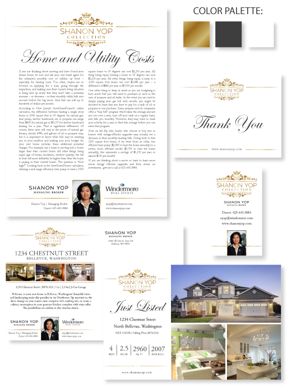
This week’s design spotlight features the brand of CUSTOM BRANDING client, The Shanon Yop Group, from Bellevue, Washington. Shanon’s team offers global real estate services, so she wanted a no-nonsense, highly functional and minimal brand that connects with her market. The color palette of gold, white, and contemporary charcoal, combined with a majestic crown and ornate swirls convey a tone of regency. The straight lines and symmetrical layout symbolize Shanon’s professional stability and reliability, while the fading lines in the header and footer communicate softness and approachability.
The font combination features an elegant script font, paired with a classic serif font. Small dots on the insides of the header and footer lines echo the logo, perfectly tying together Shanon’s brand.
Want to learn how branding can make a difference in your real estate business? Call us at (360) 527-8904, email solutions@thelonesgroup.com, or learn more:


 Posted in
  Tags:
Tags: 
