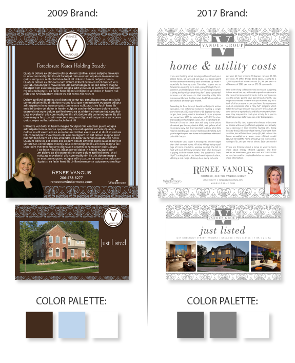
This week’s design spotlight features the refreshed brand of ENCORE member, Renee Vanous. Renee has been working to build a successful real estate team under the name “The Vanous Group” and wanted a brand to reflect her new team dynamic. Renee purchased her first brand through The Lones Group in 2009, and returned in 2016 for her brand refresh. Renee’s focus for her 2016 brand refresh was to achieve clean, minimal branding, using a very limited color palette of gray and white, with extra focus on achieving whitespace.
She selected a highly modern magazine-style font for her name treatment, logo, and headline, paired with an easy to read and highly functional sans serif font for content and contact information. To take advantage of the existing brand equity Renee has built over the past seven years, we utilized the Victorian Damask pattern repeated in the linear header and footer of her brand. Renee also updated her portrait with one that truly represents her professionalism and business success.
Do you have a brand in need of an update to help you continue to stand out in your market? A brand refresh can be as simple as updating a portrait and brokerage logo on all templates, or as intricate as changing colors, graphics and fonts on an existing Lones Group brand. Call us today for a free brand refresh consultation to help you maximize your professional potential.
Want to learn how branding can make a difference in your real estate business? Call us at (360) 527-8904, email solutions@thelonesgroup.com, or learn more:


 Posted in
  Tags:
Tags: 
