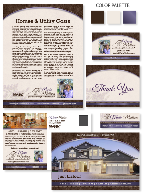
This week’s design spotlight features MASTERY agent Marie Mattson, from Bothell, Washington. As an avid horse lover, Marie’s goal was to highlight her experience with rural and equestrian properties with her brand design. Her idea was to reflect the rougher side while maintaining the elegance and refinement of horses. To that end, her final design features rich leather textures and large stitching to emphasize the discipline associated with both horses and real estate. We added satin-styled ribbons for an elegant and feminine touch. The background features a suede texture and lavender watermark. Easy-to-read slab serif fonts pair perfectly with the expressive and clean script font to give the brand a polished and sporty feel. The purple and brown palette is warm and welcoming. Gradients and drop-shadows give an otherwise flat page depth. The arched header keeps the brand open while reflecting shapes commonly seen in horse barns and tack. She even included her horse, Latte, in her portrait, which adds a personal touch. Finally, her logo features a jumping horse that symbolizes the heights Marie will reach to help her clients achieve their dreams.
Want to learn how branding can make a difference in your real estate business? Call us at (360) 527-8904, email solutions@thelonesgroup.com, or learn more:


 Posted in
  Tags:
Tags: 
