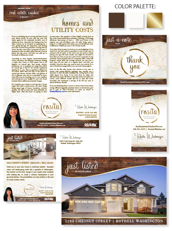
This week’s design spotlight features MASTERY agent Rosita Wischmeyer, from Bothell, Washington. When we started Rosita’s brand, she was hoping for a “fun brand” that reflected her love of traveling with a subtle nod to wine culture. Structurally, she was drawn to designs that featured a soft curve. Rosita’s globetrotting experience is reflected in the soft maps in the background of her brand. Wine-barrel wood textures in the header and footer bring a natural feel to the brand and creates great contrast with her neutral color palette. Glossy gold gradients accent her brand’s structure without being too flashy. Our design team was inspired by her passion to be a “real estate match maker.” The fonts she selected give her headlines and signatures personality and a special personal touch. Her unique logo combines a watermark ring from a wine glass or coffee mug and an Ensō circle, which symbolizes natural creativity, strength, and balance. This symbols is repeated in areas outside her logo, like on the Thank You note card. It also ties the brand together as this symbol is recognizable when traveling to far-east countries.
Want to learn how branding can make a difference in your real estate business? Call us at (360) 527-8904, email solutions@thelonesgroup.com, or learn more:


 Posted in
