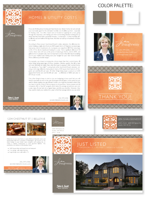
This week’s design spotlight features the brand of our MASTERY agent Jen Shaughnessy, from Seattle, Washington. Operating in West Seattle for the last 9 years, particularly in the high income range market, Jen excels in finding not only the perfect property for her clients but the lifestyle they desire. She favors a mixture of modern color sensibilities, bold presentation, and subtle textures. Her brand is a great example of bright colors tastefully integrated with an understated layout.
Jen’s palette choices are exciting and memorable. Neutral taupe and white backgrounds create a wonderful stage for her vibrant apricot-orange brand elements. The distressed textures add tonal variety to the orange so that it is not overpowering. The interlocking-circle pattern in her header and footer compliment her intricate logo. Her name treatment features a handwritten font for her first name and a clean sans-serif font for her last name. Between the bright colors and personal-looking fonts, Jen’s brand is sure to brighten up any Seattle day!
Want to learn how branding can make a difference in your real estate business? Call us at (360) 527-8904, email solutions@thelonesgroup.com, or learn more:


 Posted in
  Tags:
Tags: 
