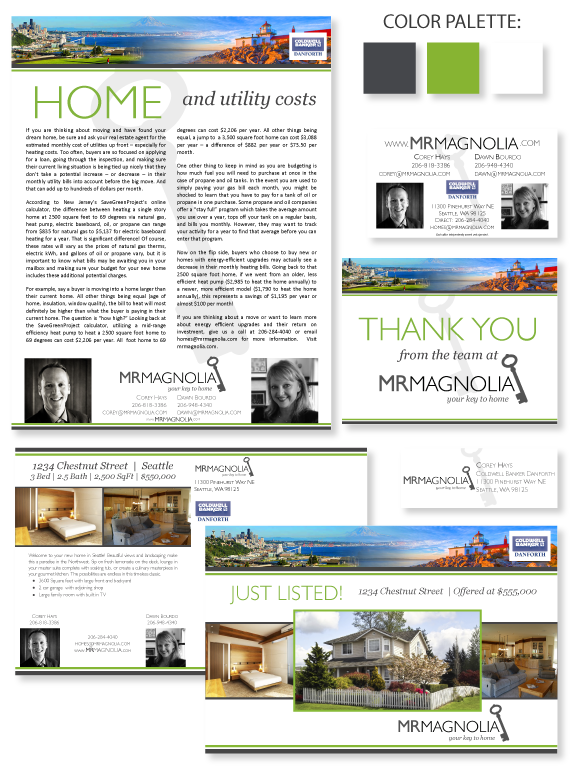
This week’s design spotlight features the brand of our MASTERY agents Corey Hays and Dawn Bourdo, the Mr. Magnolia team in Seattle. They work together like yin and yang as they focus on the Magnolia neighborhood. They have completely re-branded their business from the ground up, including logo, tagline, colors, and fonts. They wanted a design that was clean and easy to adapt to any market price point.
They chose a high contrast color palette with a fresh green accent to underscore the local photography in the header. Most of their tools feature the watermark key from their logo. Their black and white photography keeps the emphasis on their business. The font selection contrasts a modern sans-serif in all caps with classic serif font in lowercase italics. The final theme is striking and unique, and works well with the open background.
Want to learn how branding can make a difference in your real estate business? Call us at (360) 527-8904, email solutions@thelonesgroup.com, or learn more:


 Posted in
  Tags:
Tags: 
