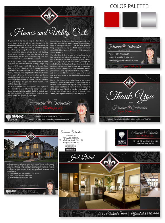
This week’s design spotlight features the brand of our MASTERY agent Francine Schneider, from the Eastside area in Washington. She originally hails from Montreal, Canada, and has moved to the Seattle area in 2008. She started in professional staging and it turned into a real estate career that she loves. She specializes in luxury condos and homes and new construction. She has a strong attention to detail and was very involved in the development of her brand.
She is drawn to classic beauty and likes black, silver, and white with a strong red accent. She wanted a strong brand that would be applicable to any location. Her French Canadian heritage influenced the fleur-de-lis emblem at the top of her brand as well as the repeated fleur-de-lis in her name treatment. The script font emphasizes luxury and her personal approach. Gentle tone-on-tone swirls keep the dark background soft.
Want to learn how branding can make a difference in your real estate business? Call us at (360) 527-8904, email solutions@thelonesgroup.com, or learn more:


 Posted in
  Tags:
Tags: 
