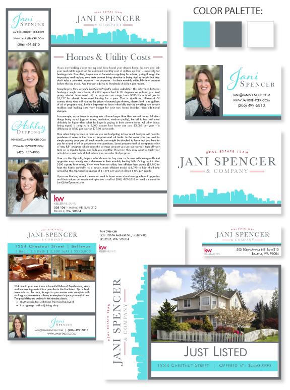
This week’s design spotlight features the brand of our MASTERY agent Jani Spencer, of Bellevue. Jani’s brand includes her assistant and protege, Ashley. She wanted a brand that was efficient and sensible. She brought the Jani Spencer & Company logo to the design. She specifically requested bight “Tiffany” blue and Bellevue imagery in a contemporary layout. The result is a striking “Tiffany” silhouette of the Bellevue skyline. The cool gray bars create a soft and stable structure for her content.
Jani and Ashley’s name treatment include a whimsical and friendly font for their first names. Their last names use the same font that is in the Jani Spencer & Company brand. This font is clean, professional, and easy to read. The crisp white background keeps things business-oriented. The header on her Just Listed card has a twist in order to accommodate the majority of house photos. The sideways orientation of the header also helps her postcards maximize visibility in the mailbox.
Want to learn how branding can make a difference in your real estate business? Call us at (360) 527-8904, email solutions@thelonesgroup.com, or learn more:


 Posted in
  Tags:
Tags: 
