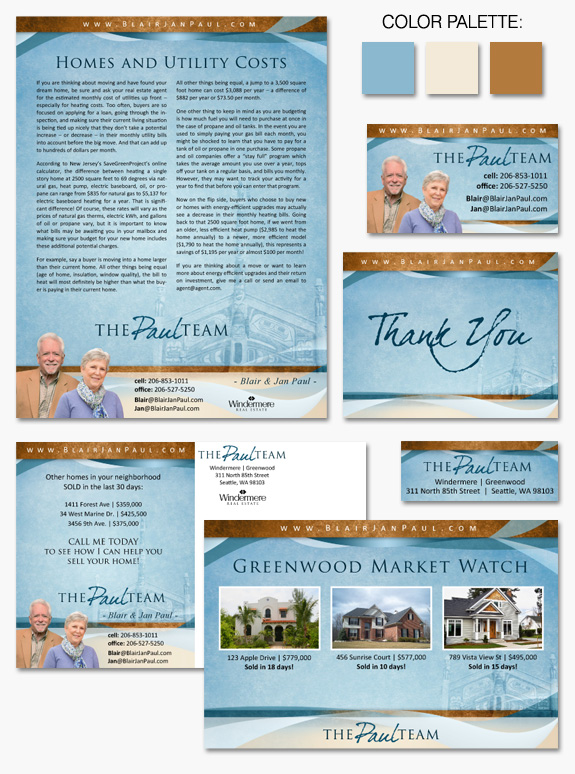
This week’s design spotlight features one of our MASTERY branding client duos, The Paul Team. Blair and Jan Paul came to us wanting a cohesive branding design that would stay true to their roots and give their marketing materials a professional polish. In the Paul’s brand we combined elements from several different Instant Identity templates, as well as some completely custom, original graphics. The Native American long house, shown in their design as a light background watermark, has been used in their branding since the beginning and continues to be a identifying mark for them. The long house represents for them a connection to the Pacific Northwest and an appreciation for the indigenous culture of the area.
A light blue textured background serves as a backdrop for text and photos giving the design a bright and distinctive feeling. Gold parchment style strips of color frame the top and bottom of the page giving it structure and further texture. Ribbons of shimmering blue give a free flowing, artistic edge that breaks out of the box. Finished off by bold professional fonts and a hand-written, pen-and-ink style script font, the Paul’s branding design is sure to grab your attention for years to come.
Want to learn how branding can make a difference in your real estate business? Call us at (360) 527-8904, email solutions@thelonesgroup.com, or learn more:


 Posted in
  Tags:
Tags: 
