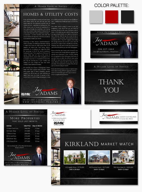
This week’s design spotlight features one of our MASTERY clients, Jay Adams. Jay came to us wanting a sophisticated brand that would represent him well both at home on the Eastside of Seattle and also abroad with international investors. With Jay’s affinity for the Asian culture, we wanted to show that influence in a subtle way. The carefully chosen photography in his brand displays nuances of of an Asian feel with bamboo and architectural features. A bright dash of red was also an important cultural feature to highlight, showing symbolism through color – red signifies something dynamic, good luck, celebration, and happiness.
In the end we were able to develop a brand that was both very professional and visually striking. An interesting eye-catching layout with a long vertical line of photographs is complimented by subtle swirl patterns across the dark charcoal background. Jay’s elegant name treatment with the artistic stroke of red is both memorable and definitive.
Want to learn how branding can make a difference in your real estate business? Call us at (360) 527-8904, email solutions@thelonesgroup.com, or learn more:


 Posted in
  Tags:
Tags: 
