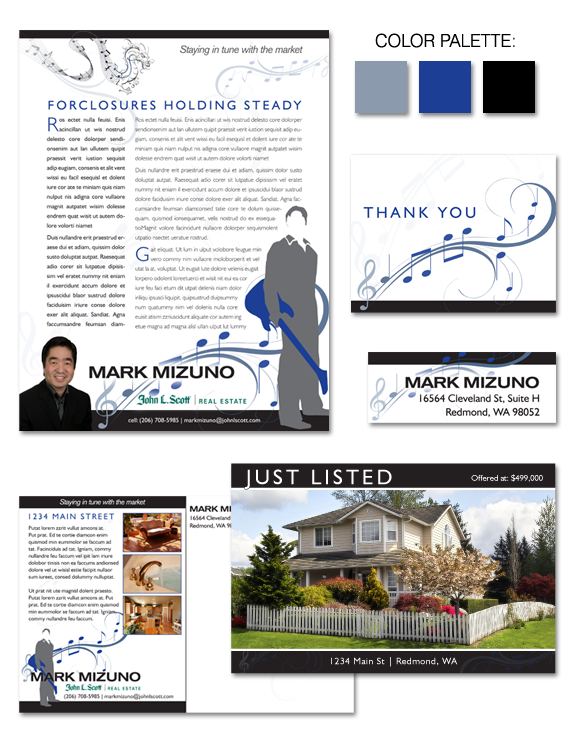
Mark Mizuno, a Signature Makeover client, came to us with very clear ideas about his branding design. He already had a logo that highlighted his love for music, but wanted to incorporate it into a cohesive brand that he could use across a variety of formats. He also expressed a desire to incorporate a dragon emblem as well, to represent him and his heritage. Mark’s design is a fusion of swirling musical elements, strong visual contrasts, and contemporary styling: flowing, yet grounded. Cadet blue, royal blue, solid black, and crisp white colors intertwine to give Mark’s branding a professional shine.


 Posted in
  Tags:
Tags: 
