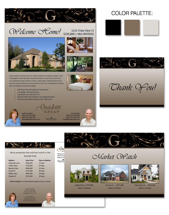
LeeAnn and Tony Guidotti have many years of success in the industry … but they wanted to boost their business even further by differentiating themselves in a marketplace saturated with real estate agents.
The eye-catching brand we created for them capitalizes on a sense of stability, maturity, and elegance. Strong, elegant headers and footers are balanced by more neutral center spaces — a perfect spot to provide information or showcase properties. That neutral space avoids feeling too flat or dull with the addition of a gradient … which also draws the viewers eyes down to Tony and LeeAnn’s contact information!
Trying to get “eyes” on your marketing? Call us today for help!


 Posted in
  Tags:
Tags: 
