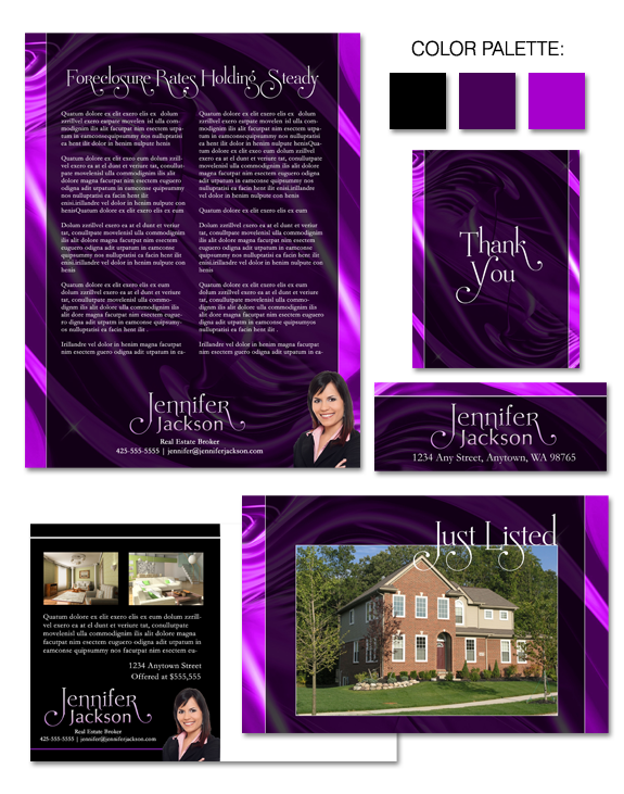
“Smooth as Silk” is our latest brand – and it’s a bold one!
Here, we’ve implemented a confident take on purple. As a color, purple blends the stability of blue and the energy of red. When used in a saturated manner as we have here, it creates a brand impact that will appeal to artistic and creative individuals.
Does that describe you, or your target market? If so, “Smooth as Silk” may well be the perfect brand for you.


 Posted in
  Tags:
Tags: 
